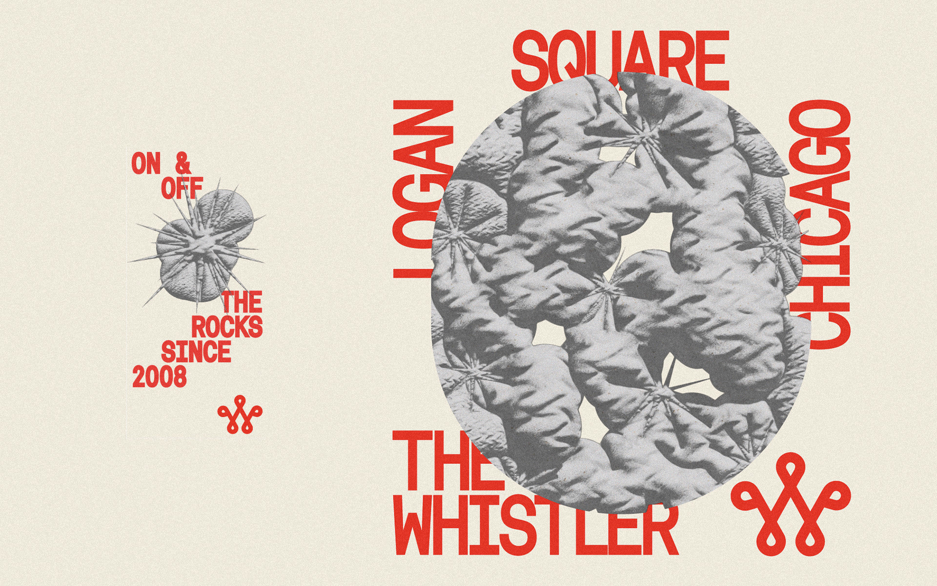
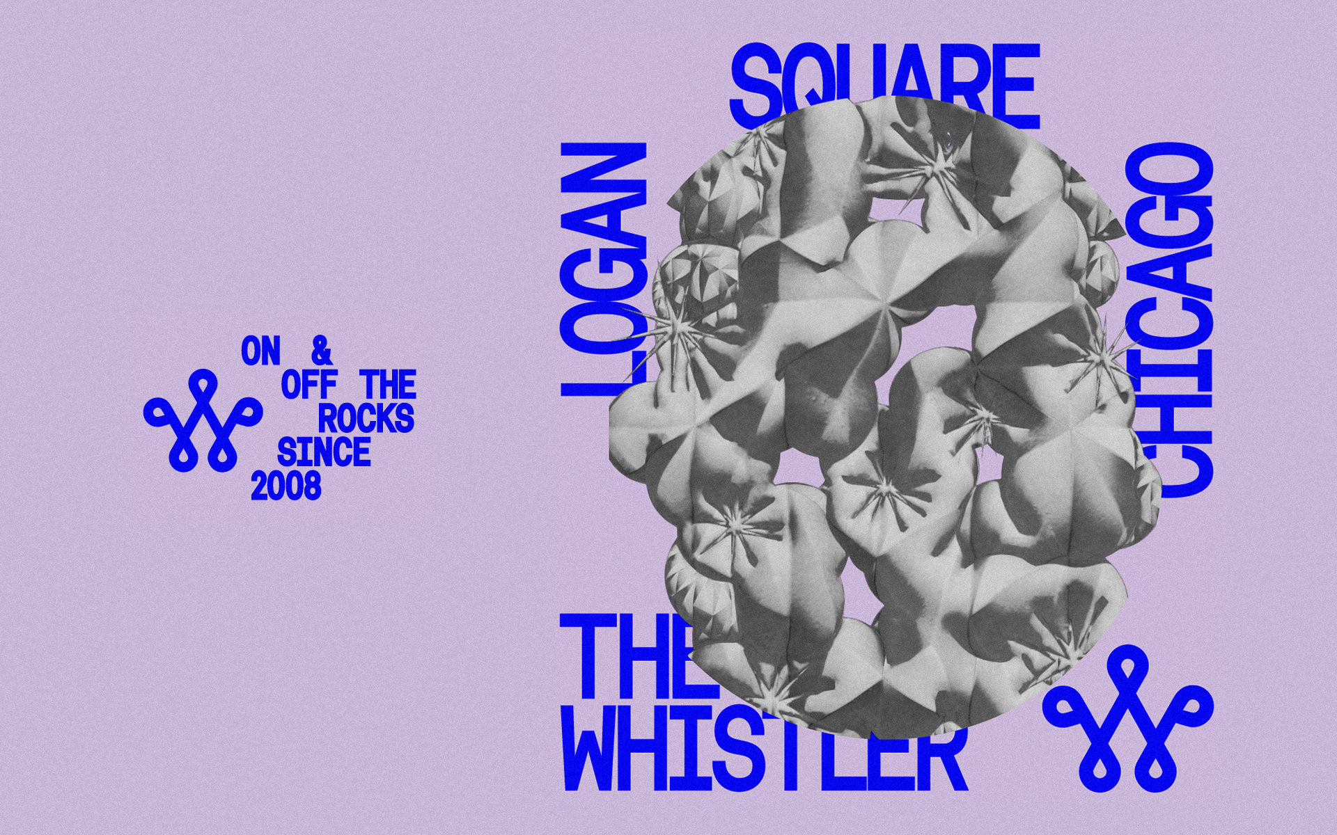
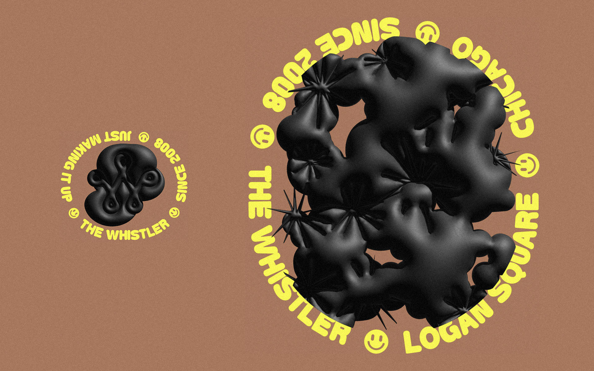
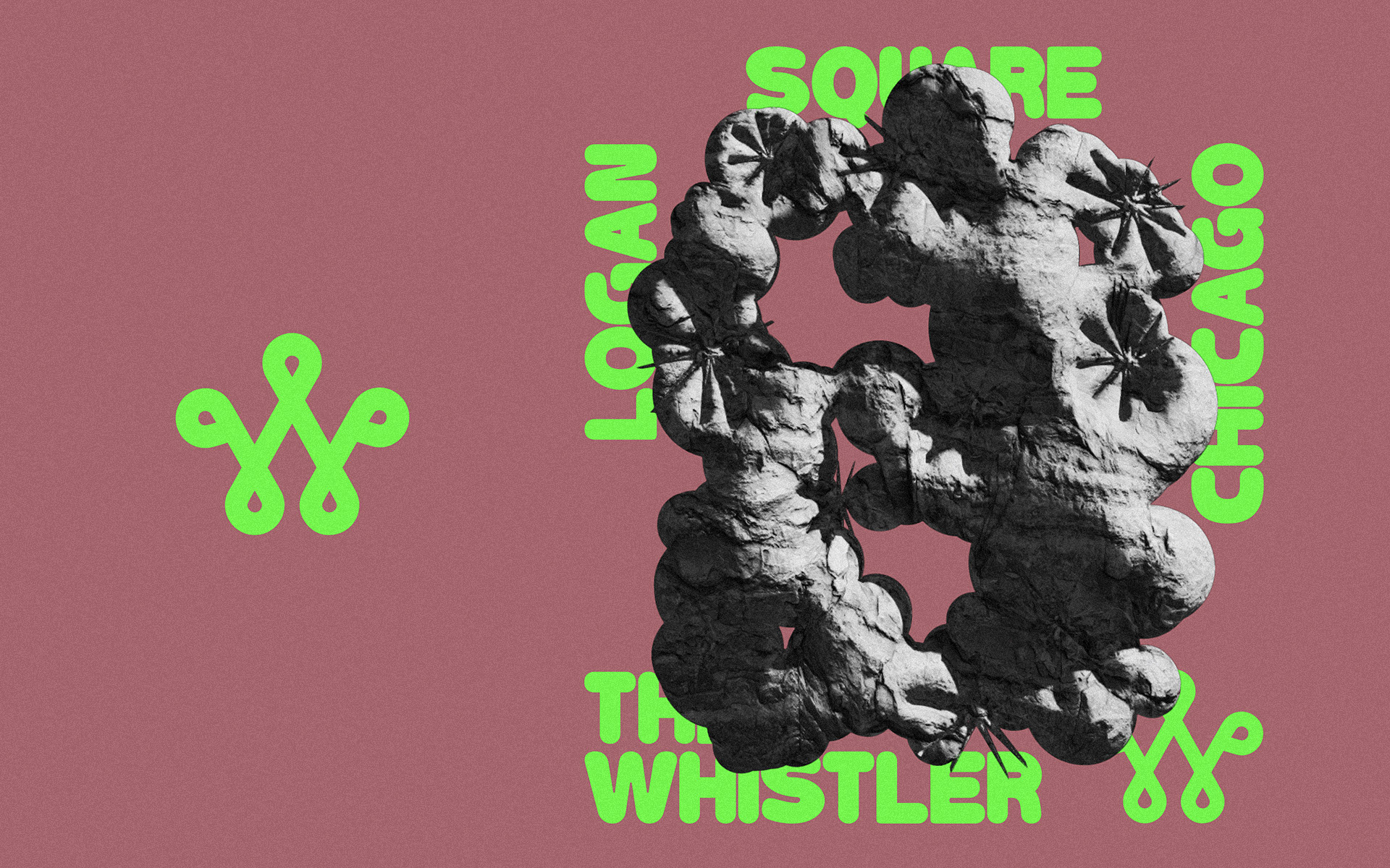
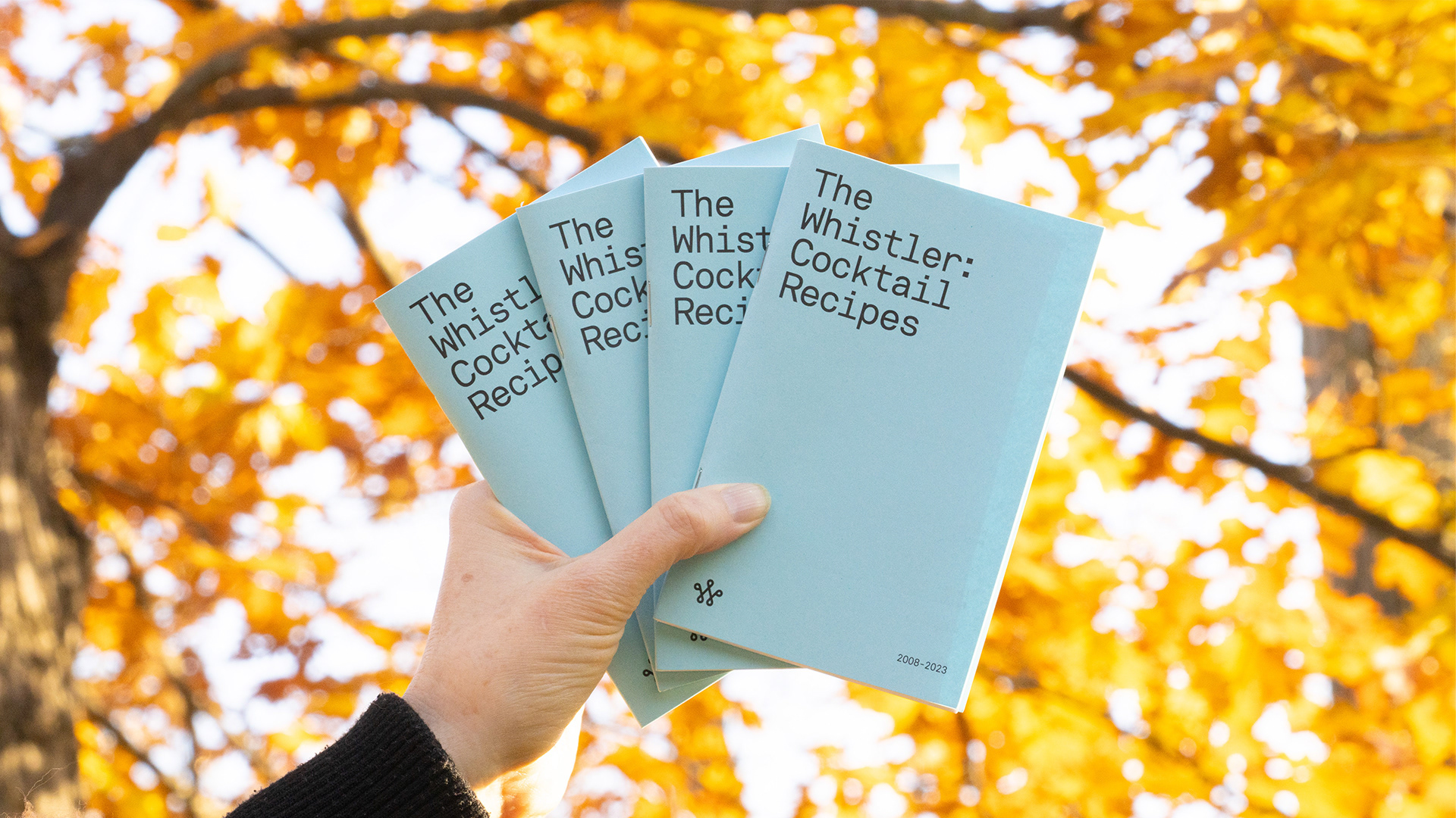
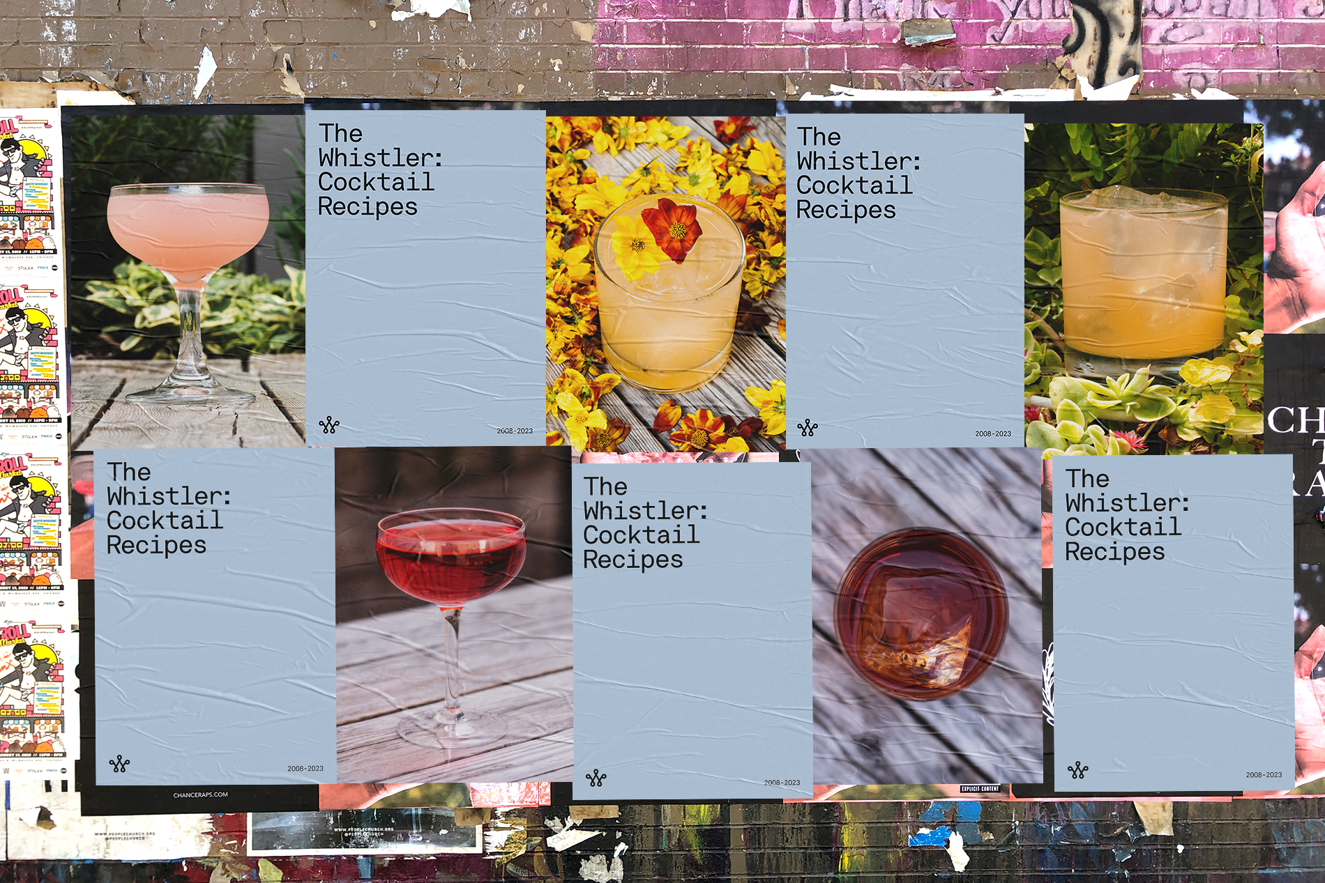
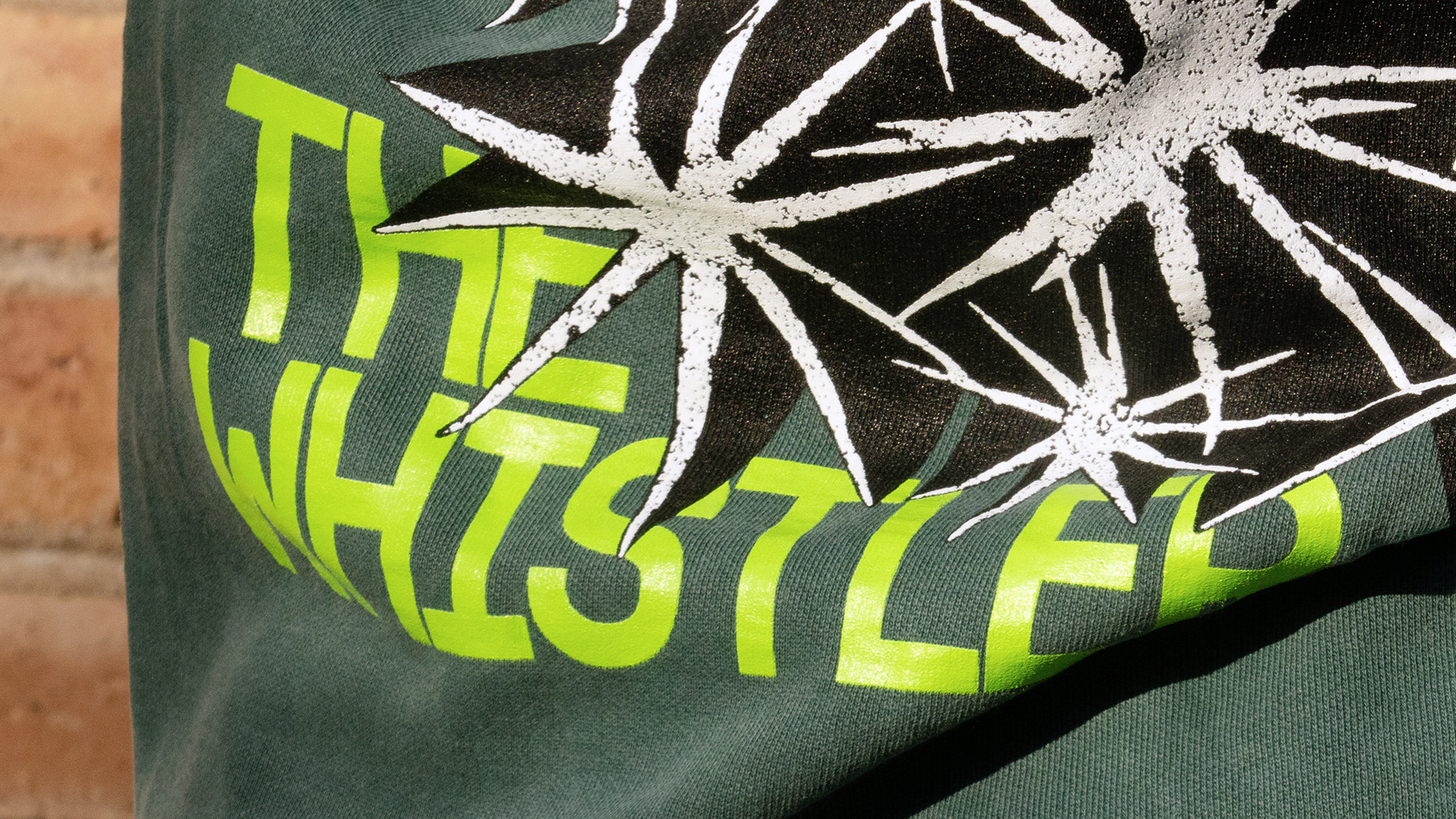
Concept and execution to celebrate 15 primo years of The Whistler, a bonafide Chicago institution where I myself spent 'seven whole years of good times'. As for the art, the recipe book stays close to The Whistler aesthetic—clean and minimal—going so far as to borrow a shade of blue from the venues interior. While the graphic approach pushes a hair outside of the brands comfort zone, we kept the apparel conceptually grounded within existing Whistler motifs.
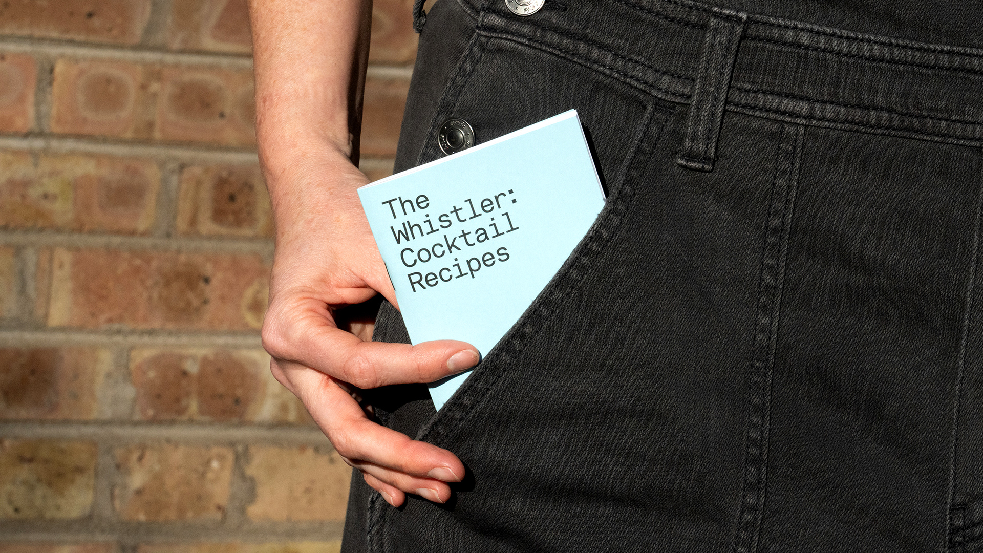
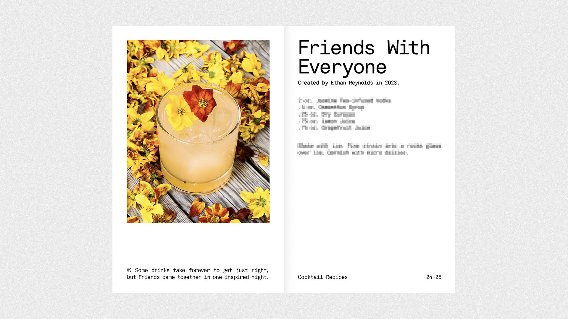
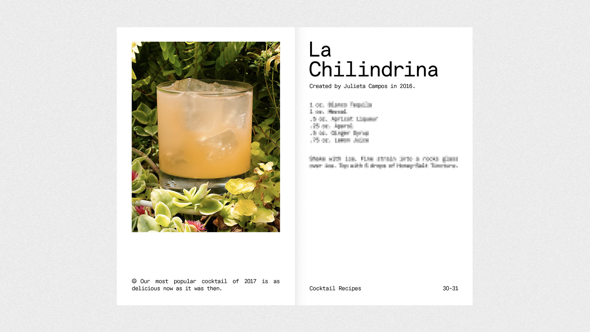
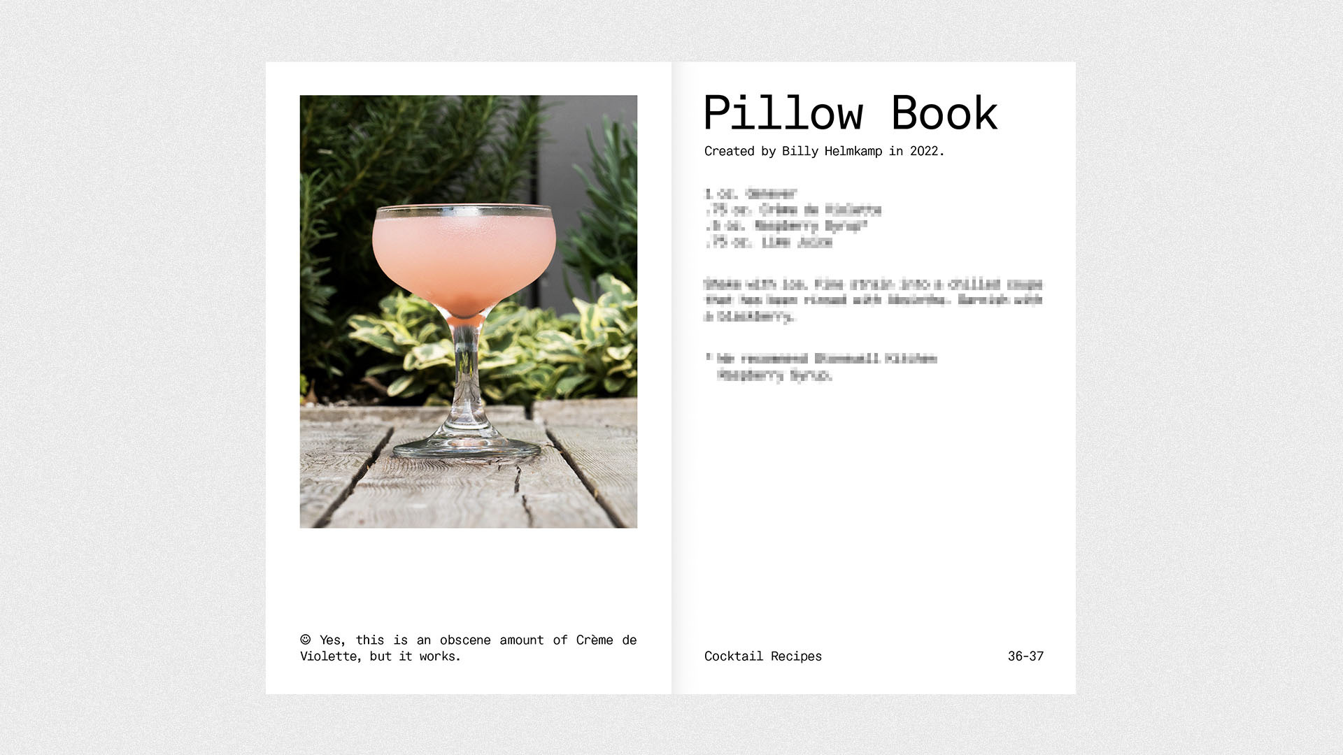
Support an iconic Chicago spot and grab the goods here. Photos by Robert Brenner.
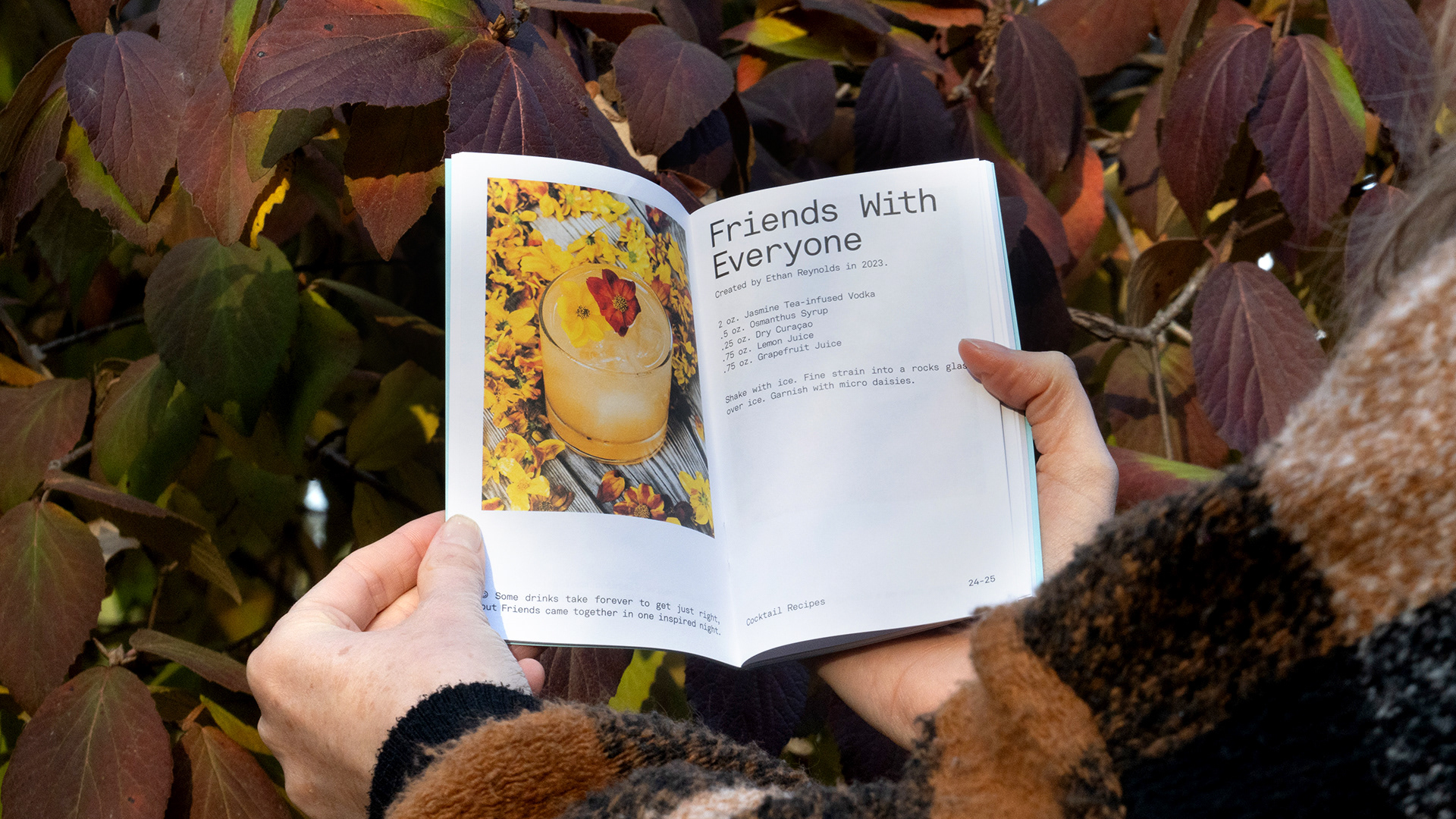
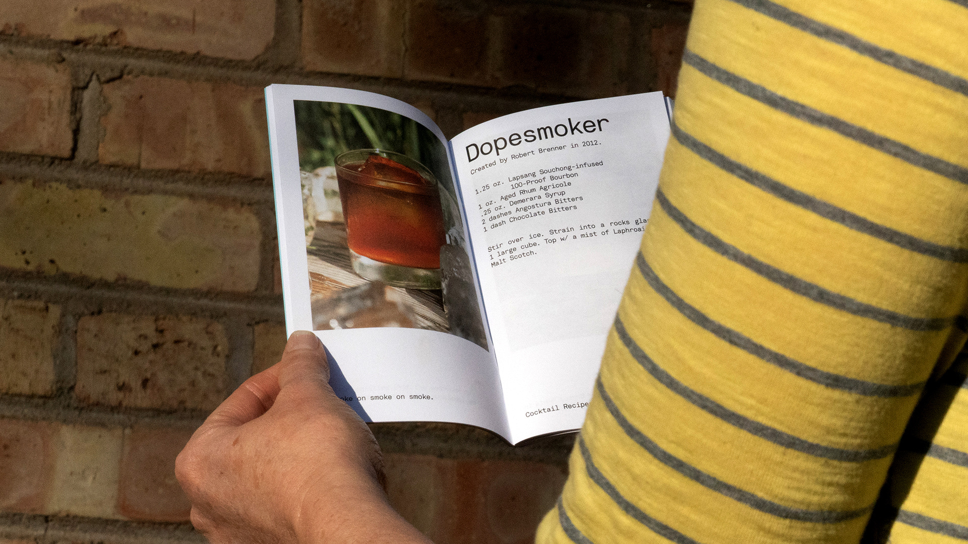
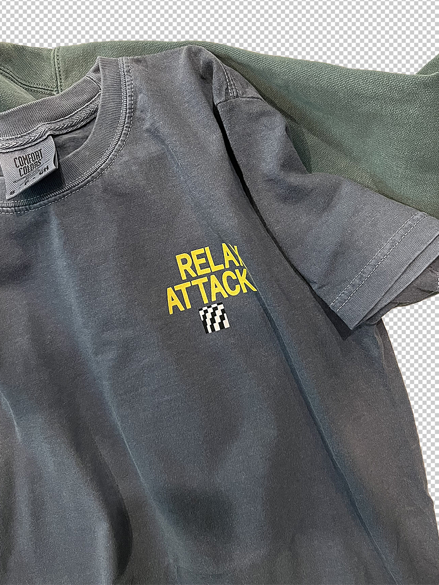
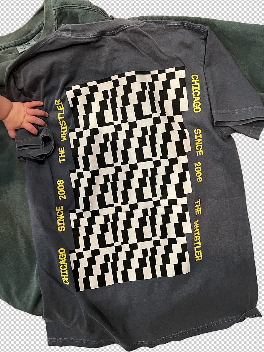
(fun fact: we used a single font for the entire collection)
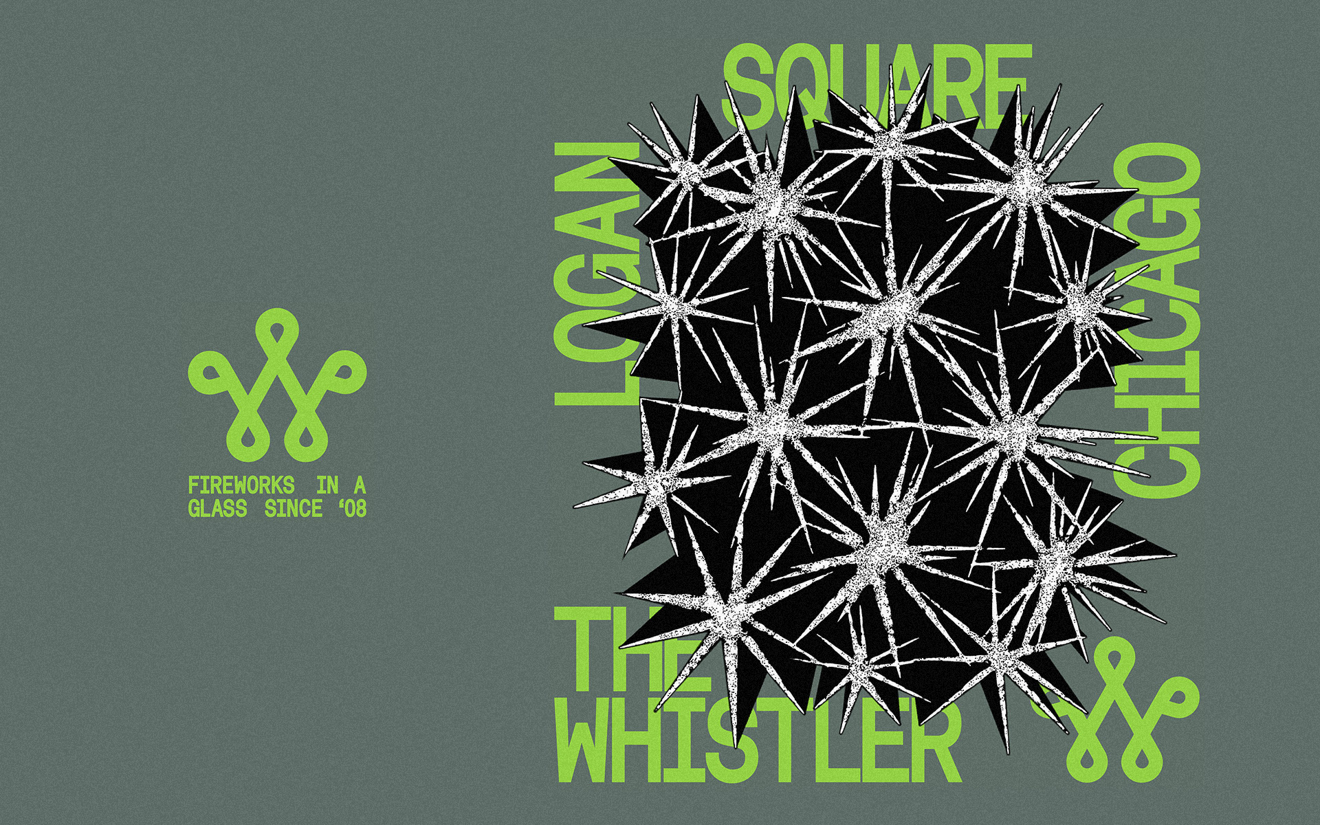
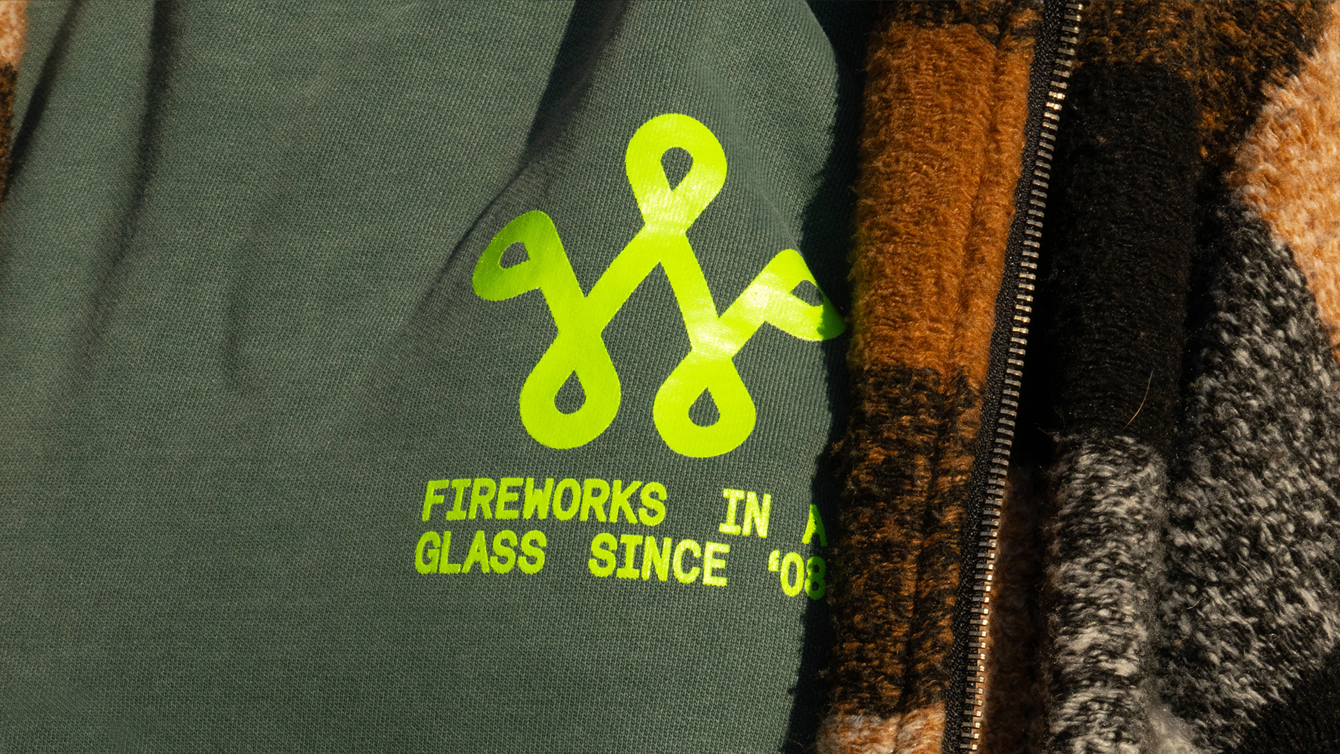
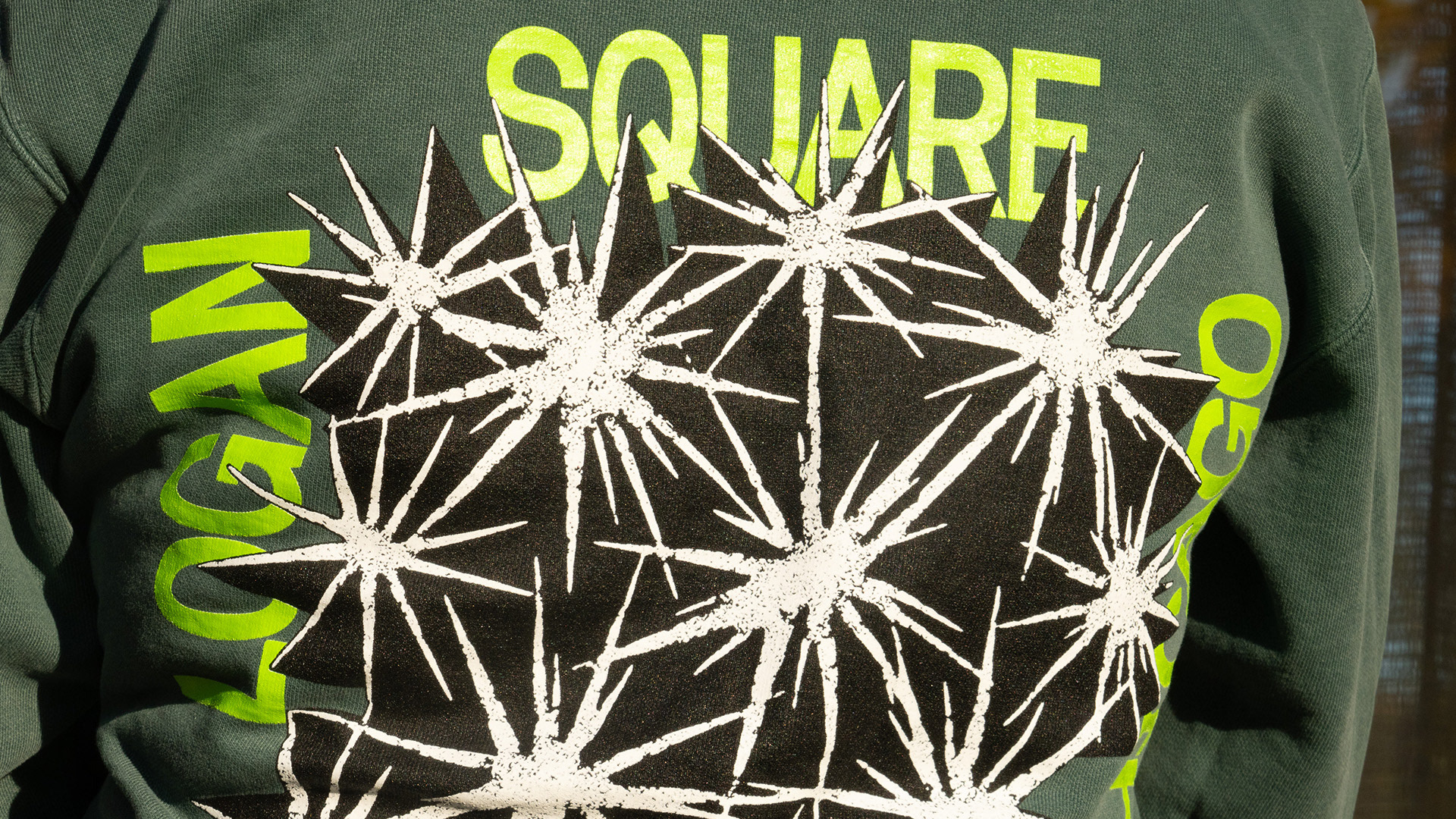
BOOM version: 15 fireworks for 15 years (fun fact: the W logo is the same size on the front and back)
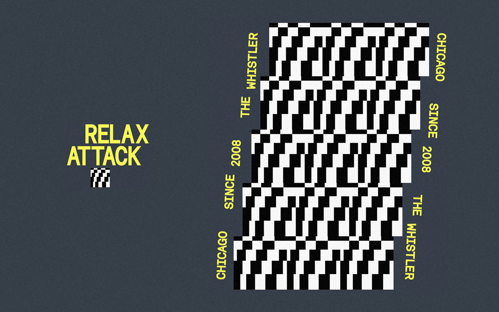
REPEATER version: 15 Relax Attack glyphs for 15 years
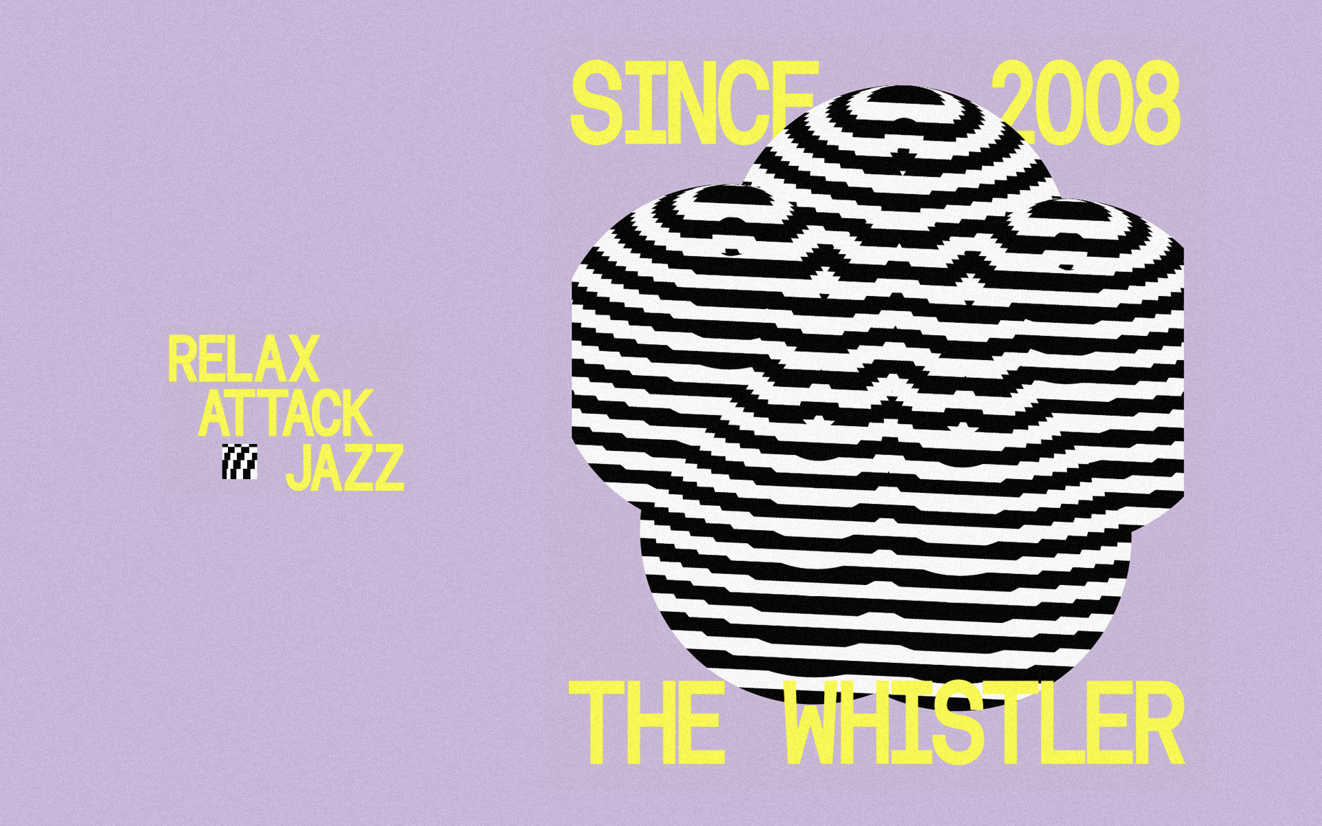
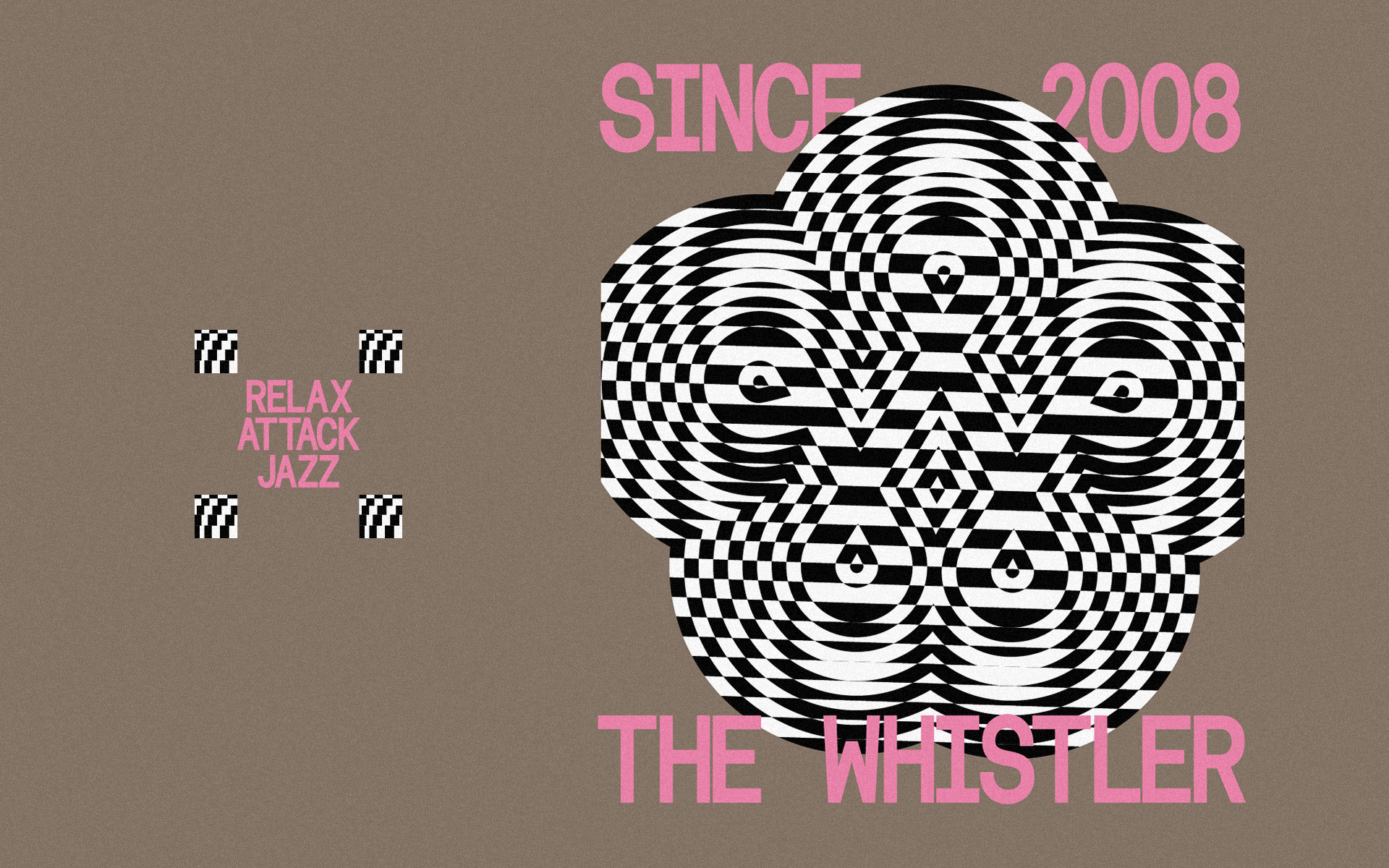
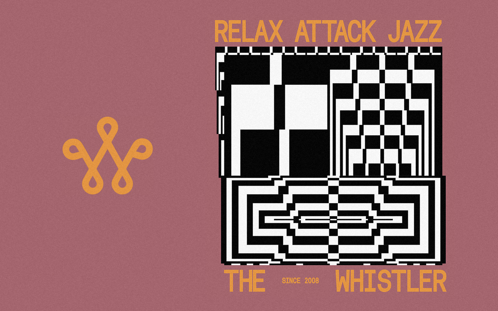
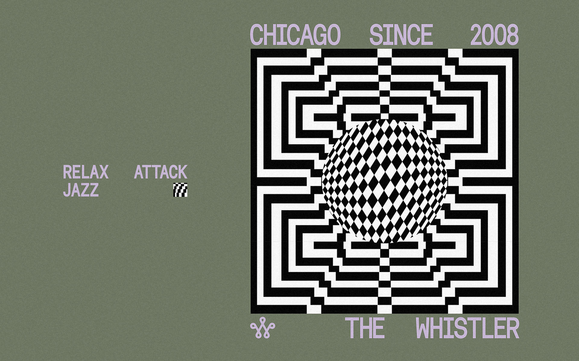
The cutting room floor: REPEATER looks flexing the Relax Attack aesthetic + BOOM textural explorations