From concept to execution for The Whistler's Relax Attack Jazz Series—a double header weekly event since 2008. Every note of this evolving brand refresh was conceptually rooted in different corners of the jazz ethos, an Anthony Burrill poster in my bosses office, and a Herbie Hancock story about Miles Davis. Hands-on between 2023 and 2024.
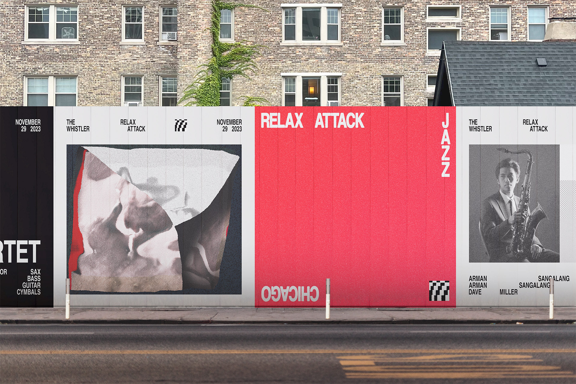
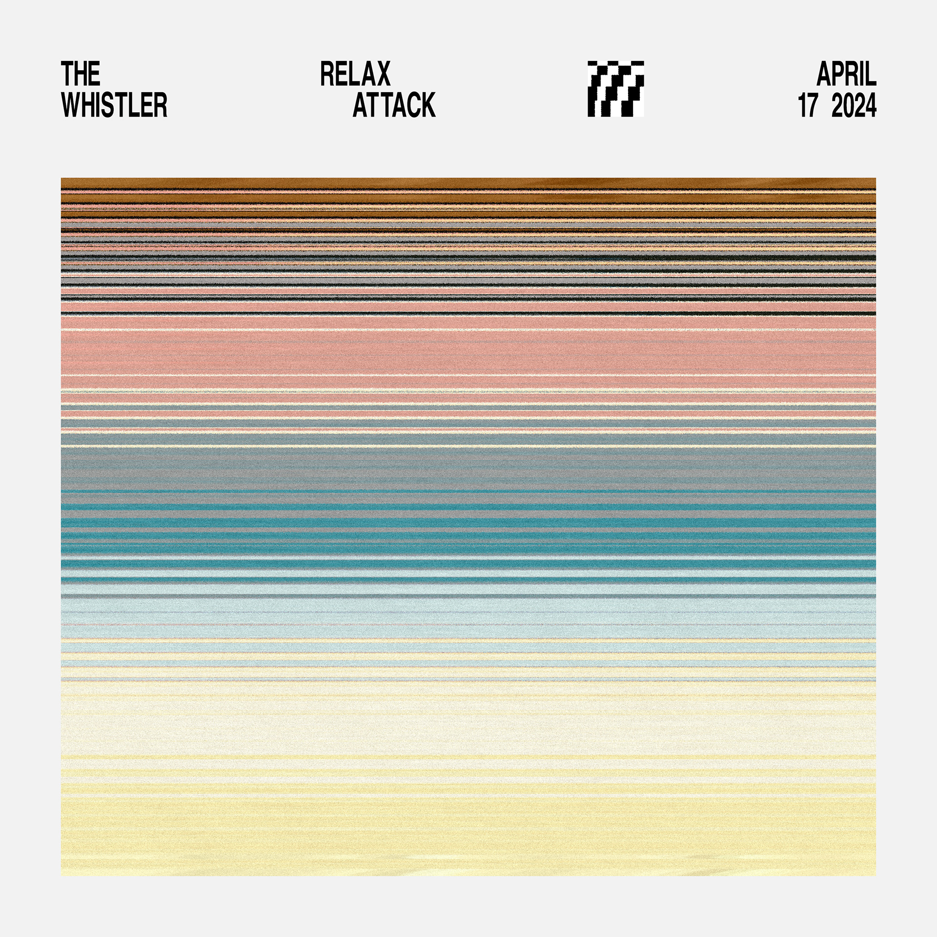
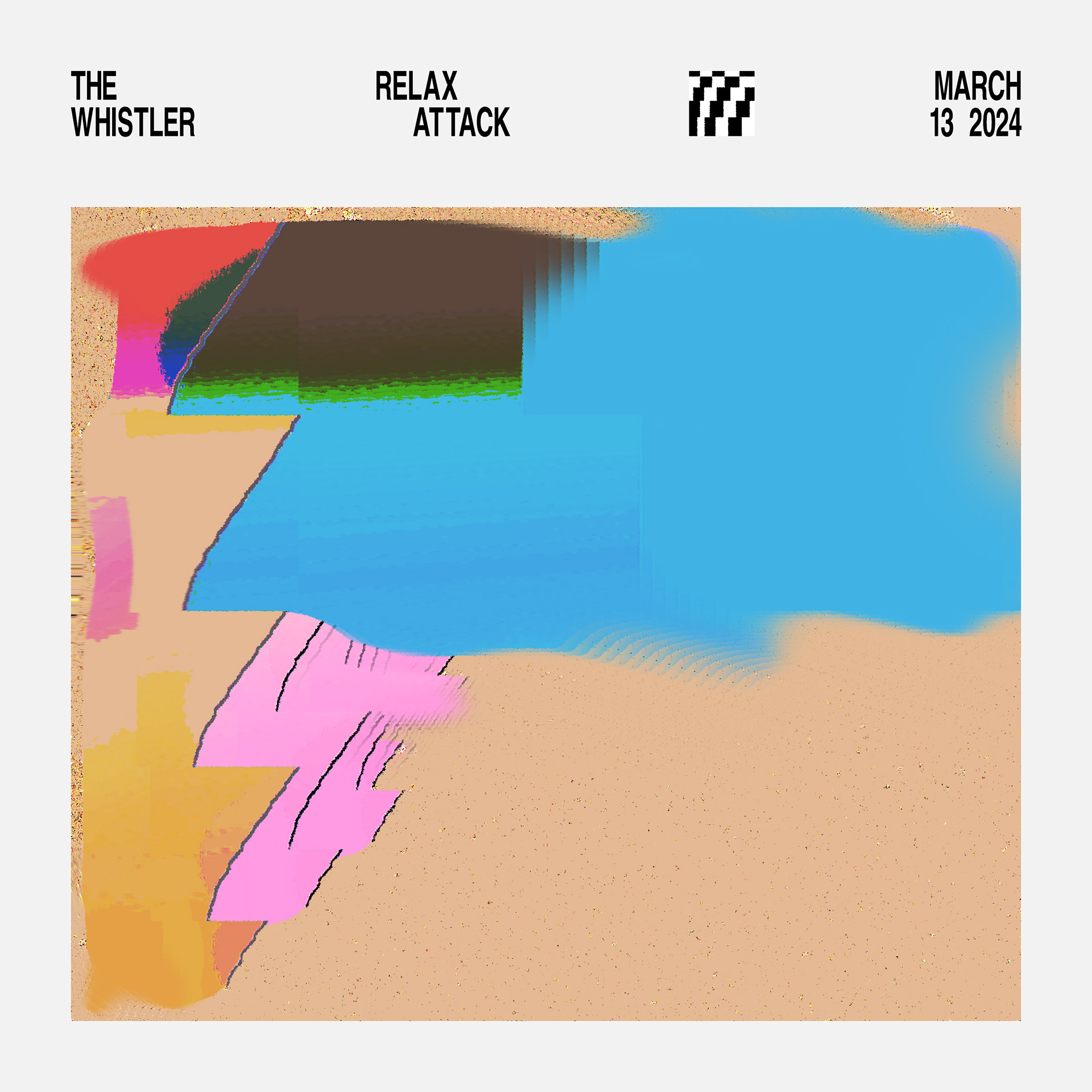
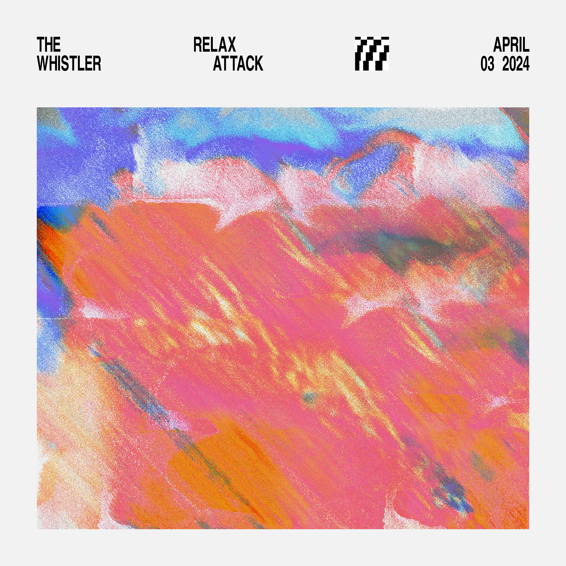
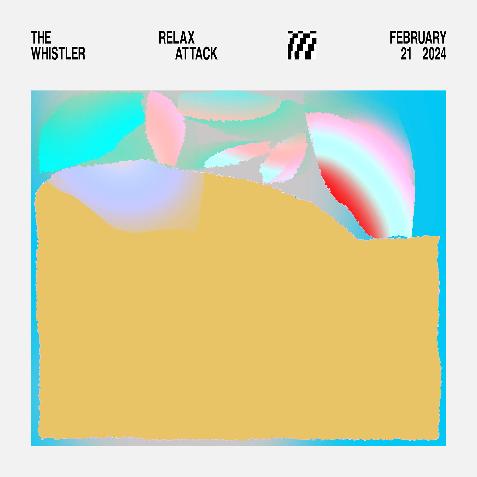
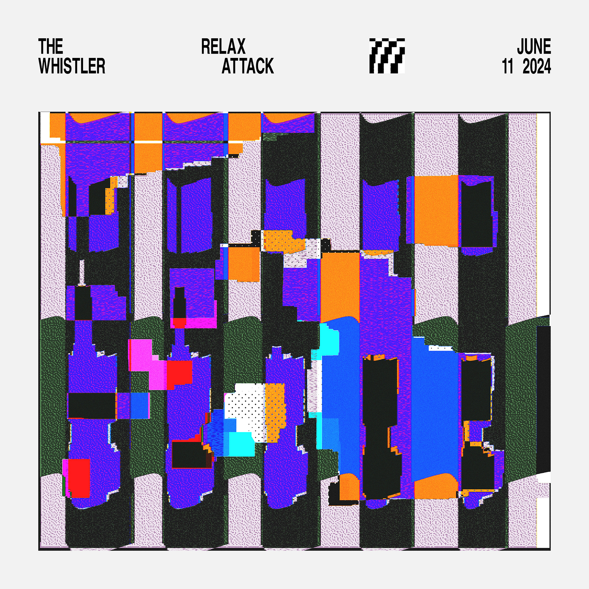
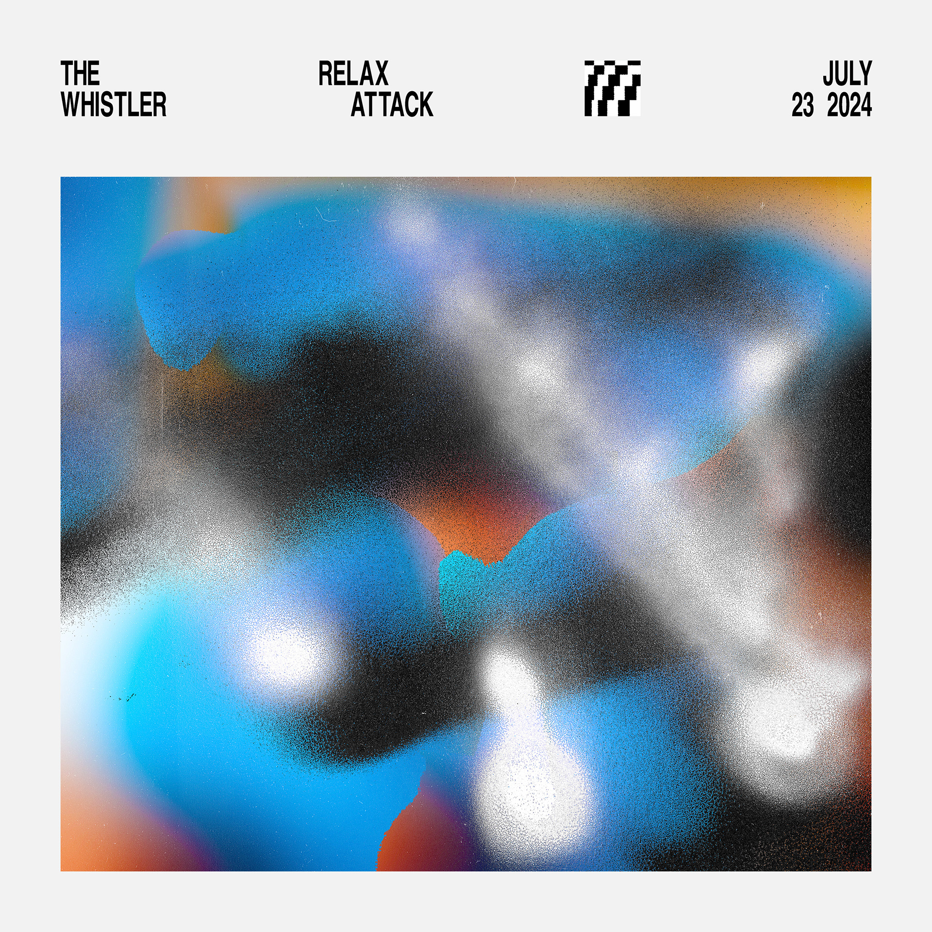
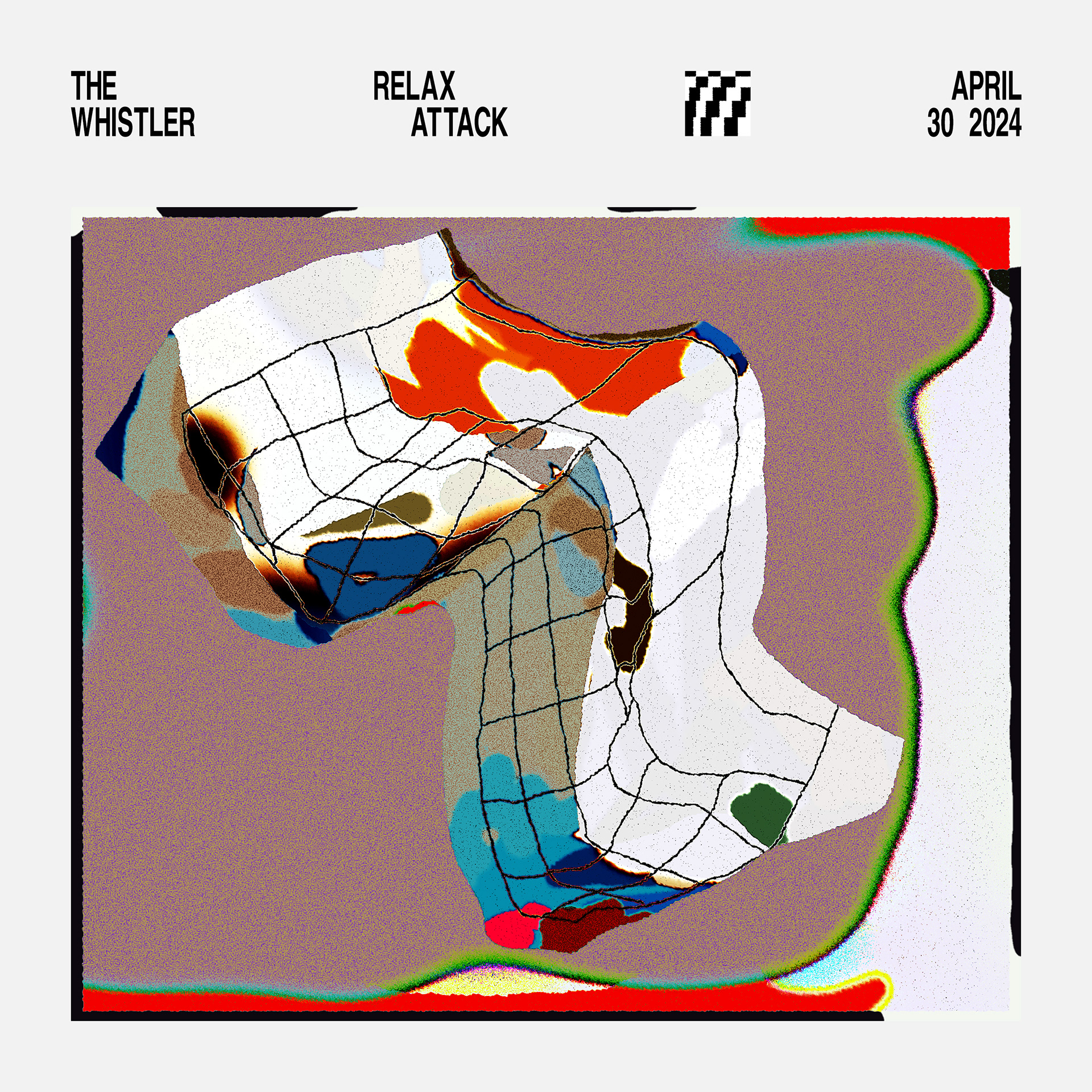
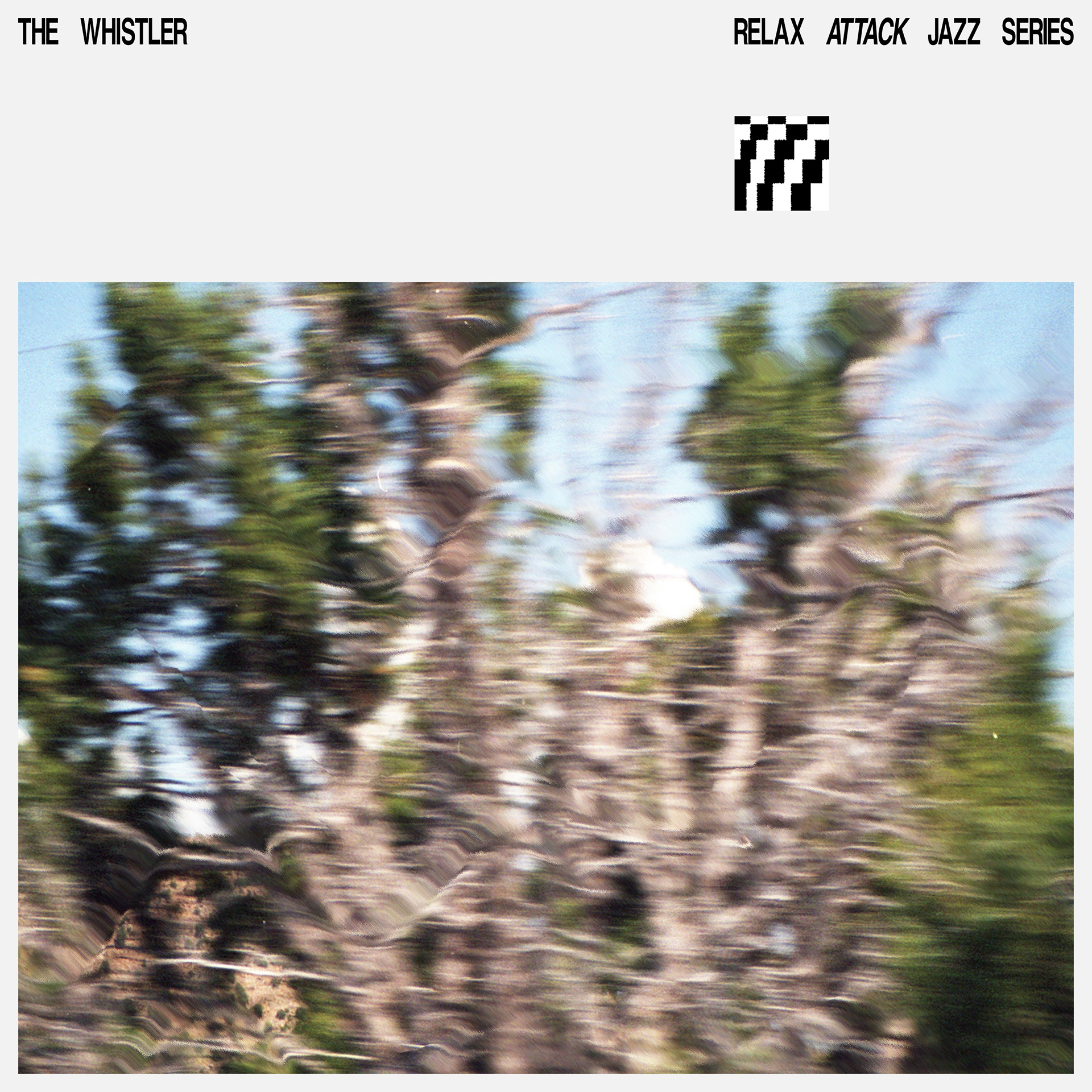
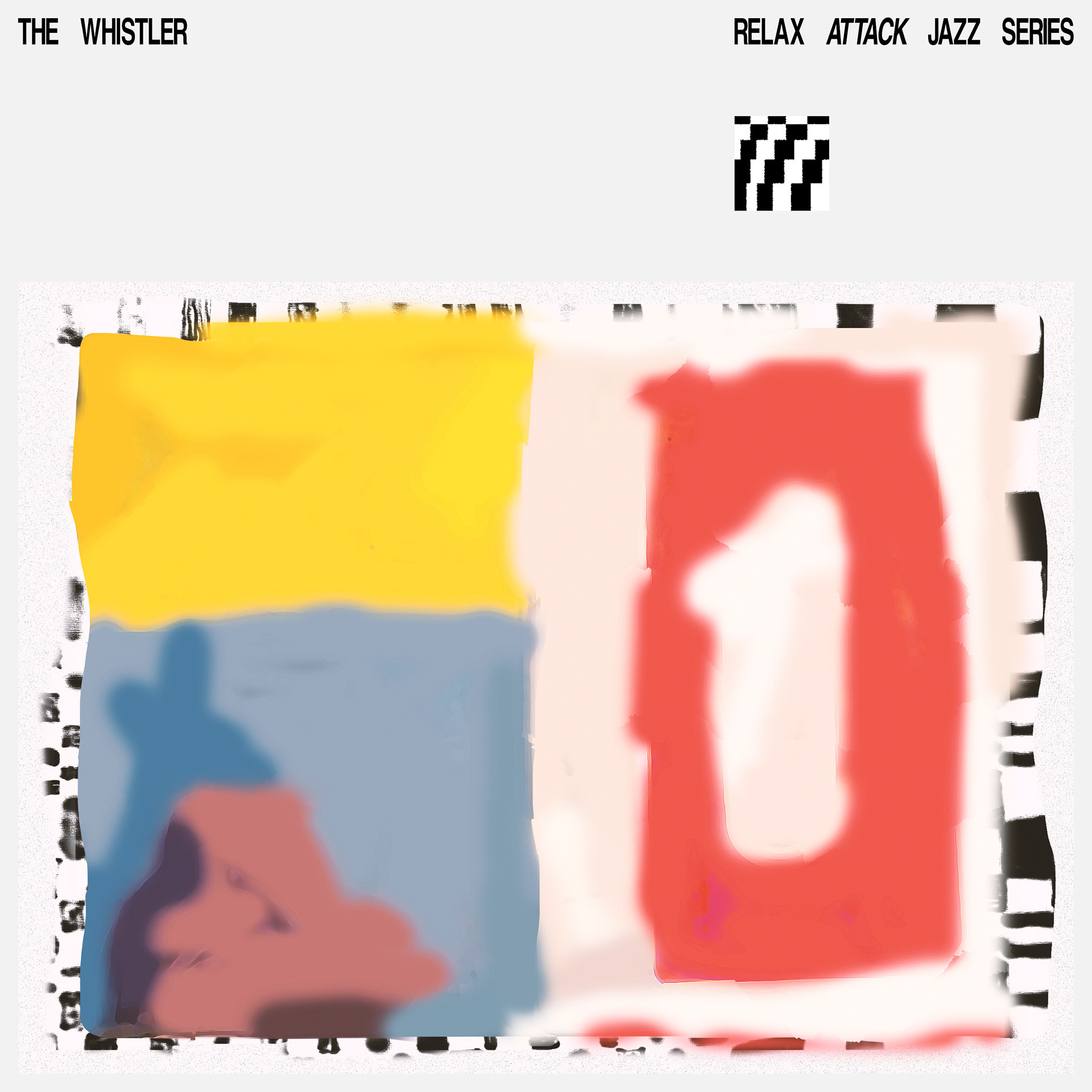
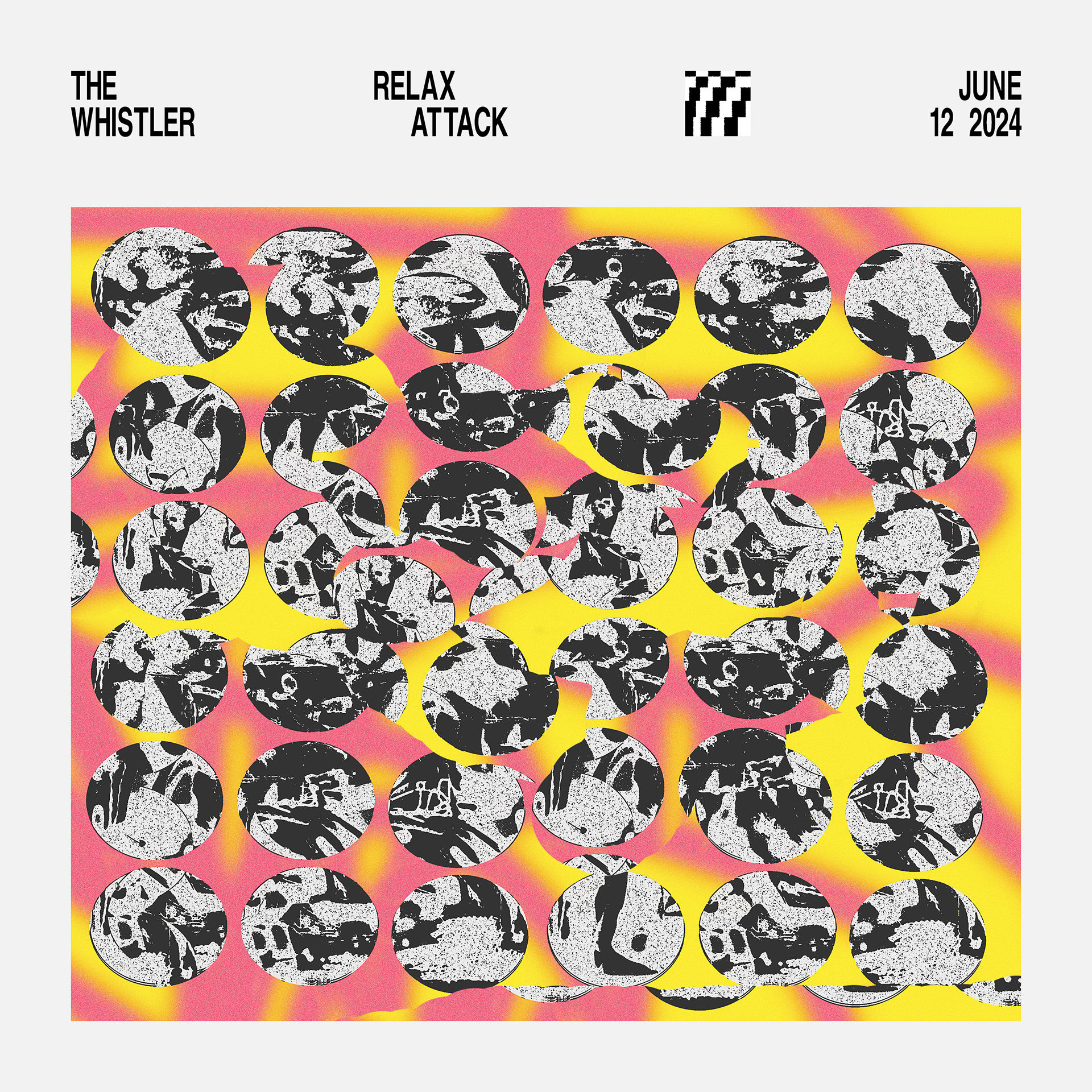
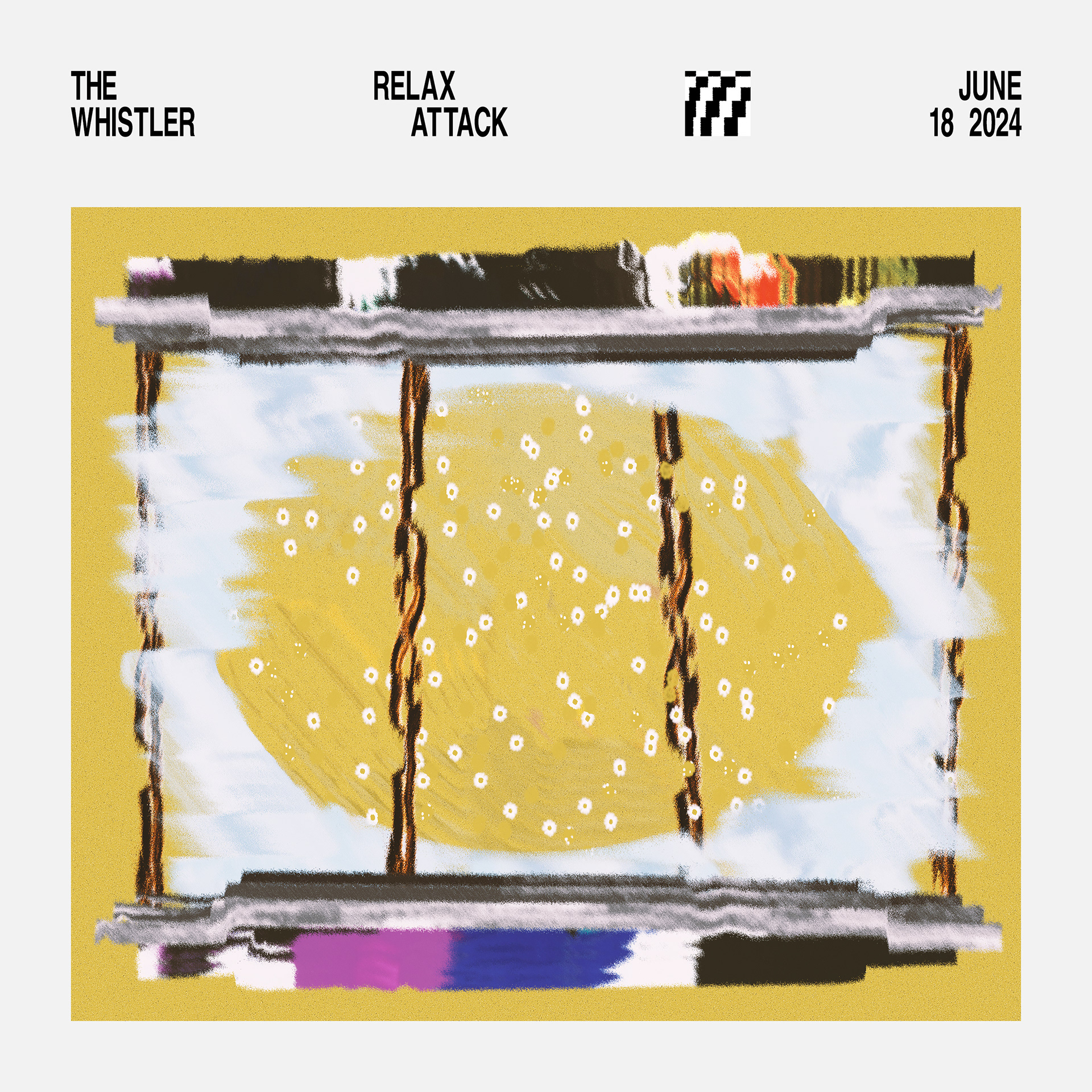
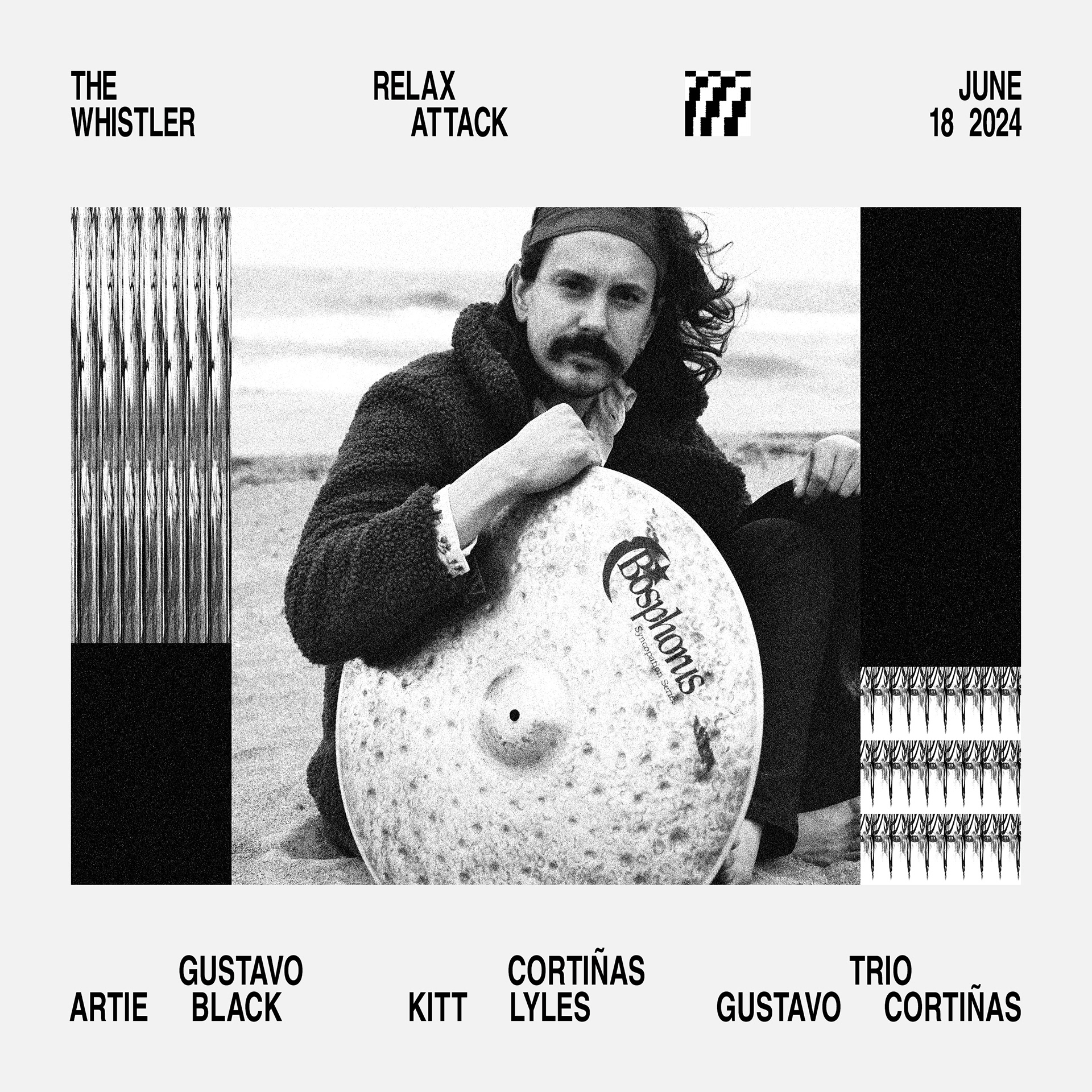
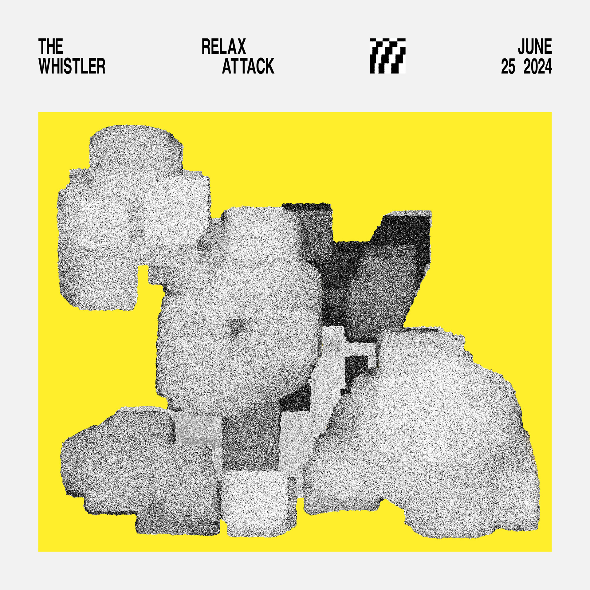
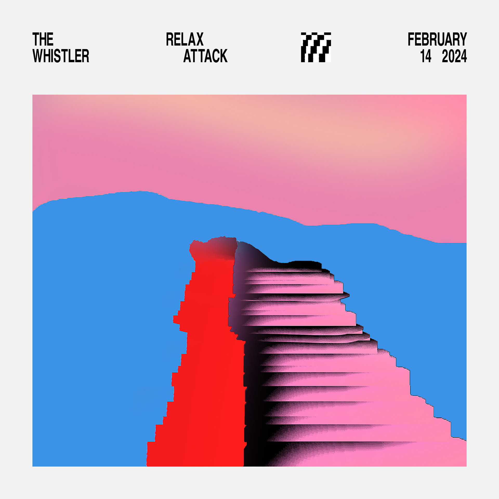
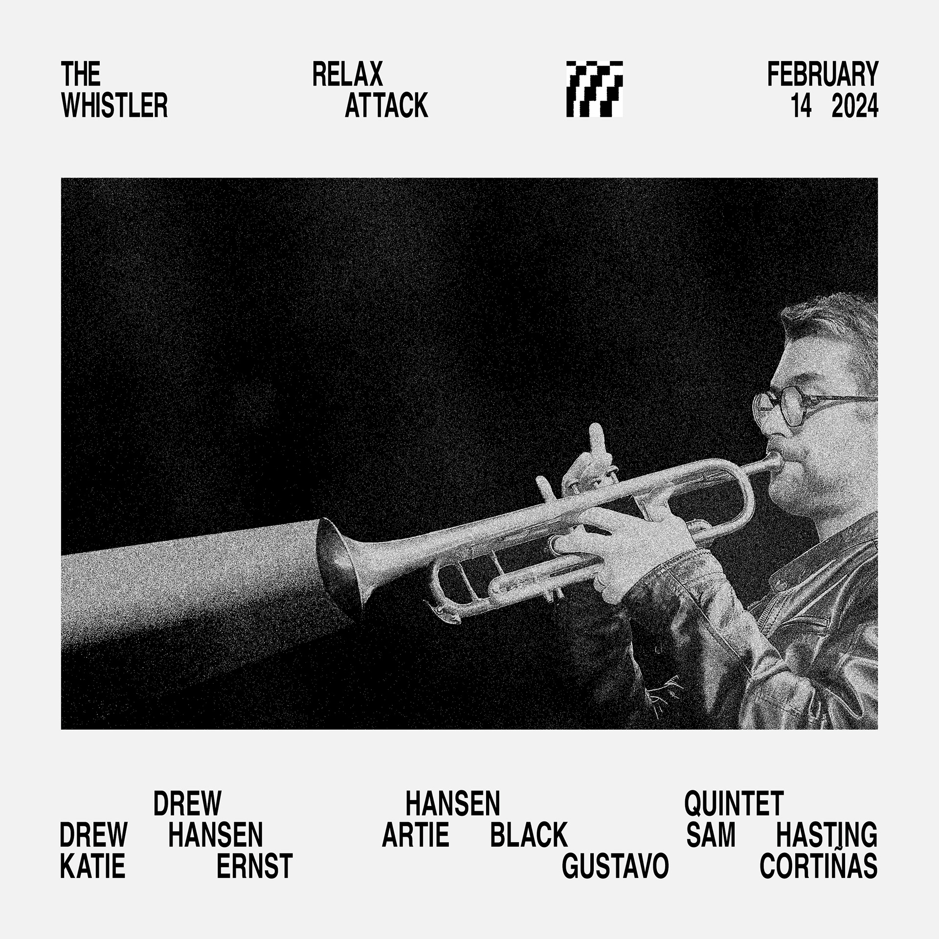
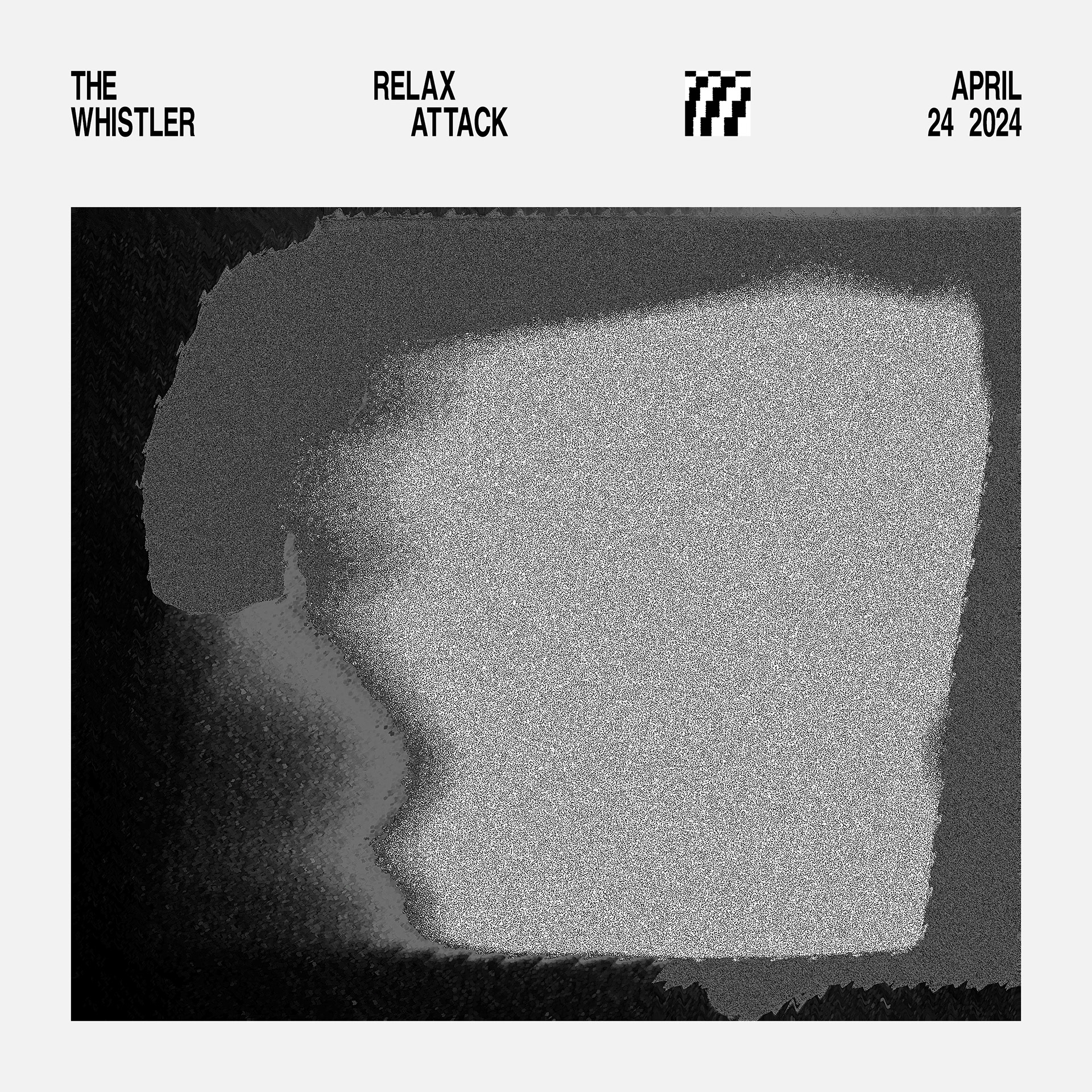
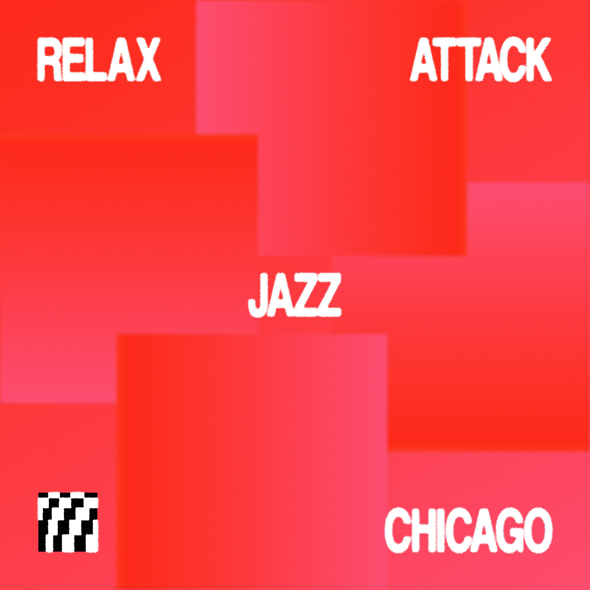
Jazz is all about space—for composition, improvisation, and arrangement. These were the main drivers behind the design considerations around type, artist imagery, art, and color. On the other hand, the identifier takes its cues more so from the wide spectrum of Jazz, from the traditional and familiar to the experimental and slightly off—either way it's always under control. All of this thinking comes together in a system built for speed and cross-platform flexibility, with an emphasis on twice weekly small-scale social feed delivery and the occasional big-time OOH wheat-paste promotion.
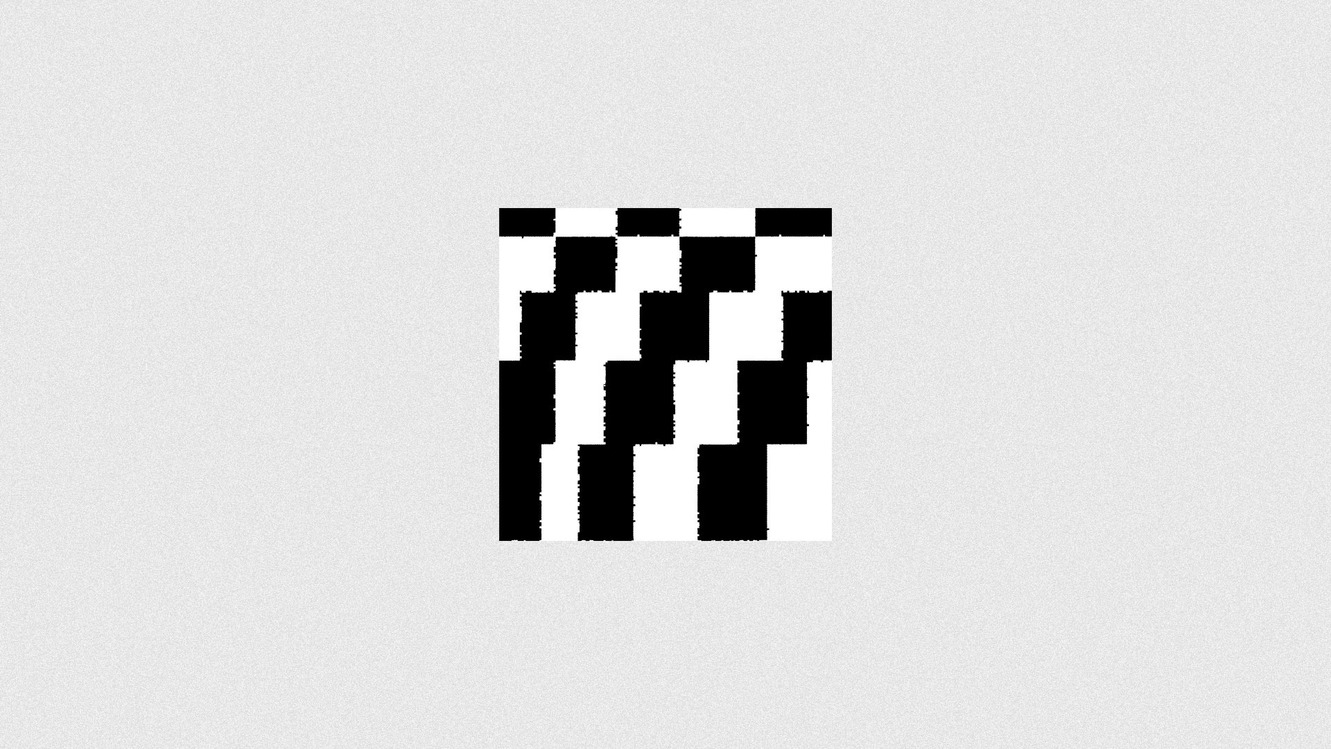
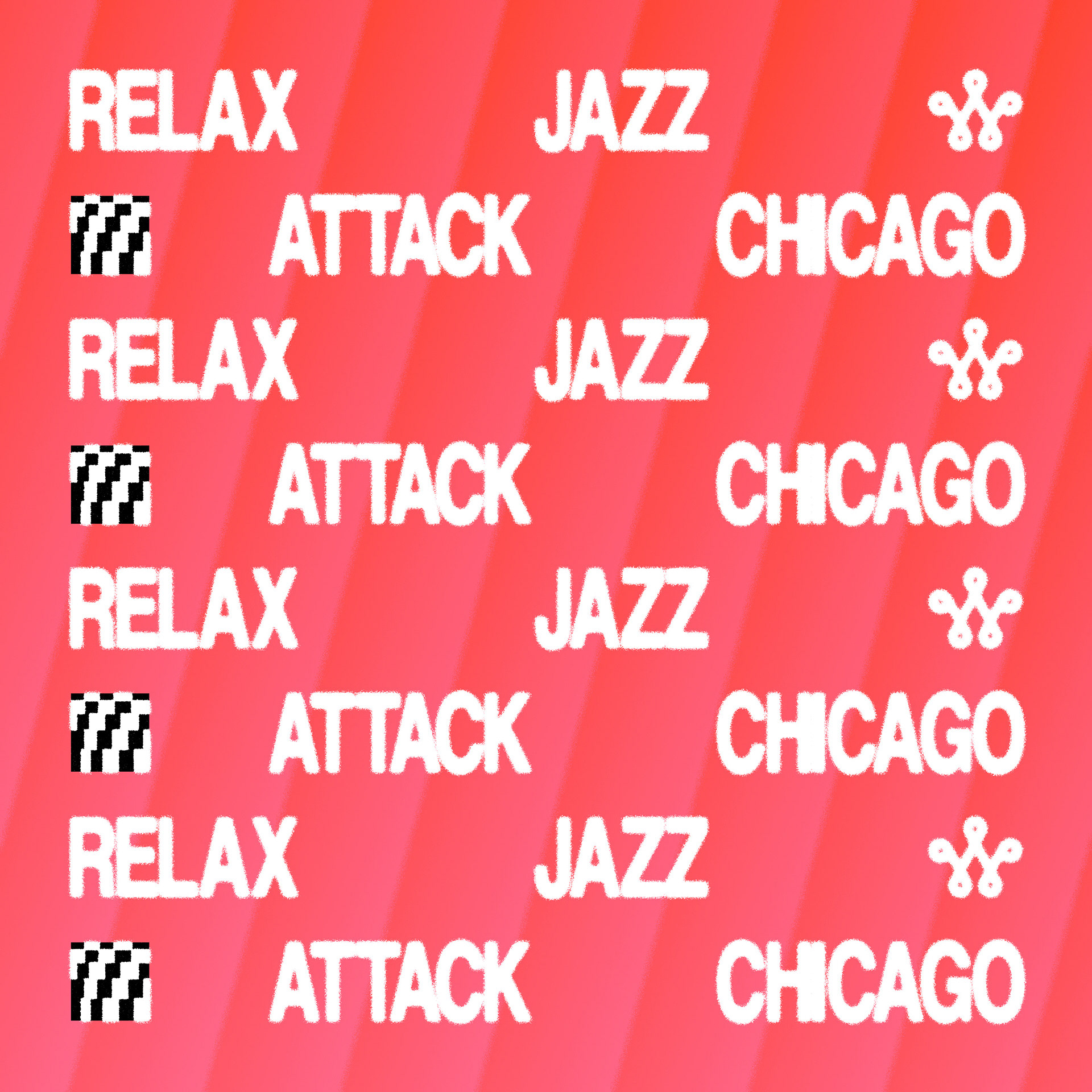
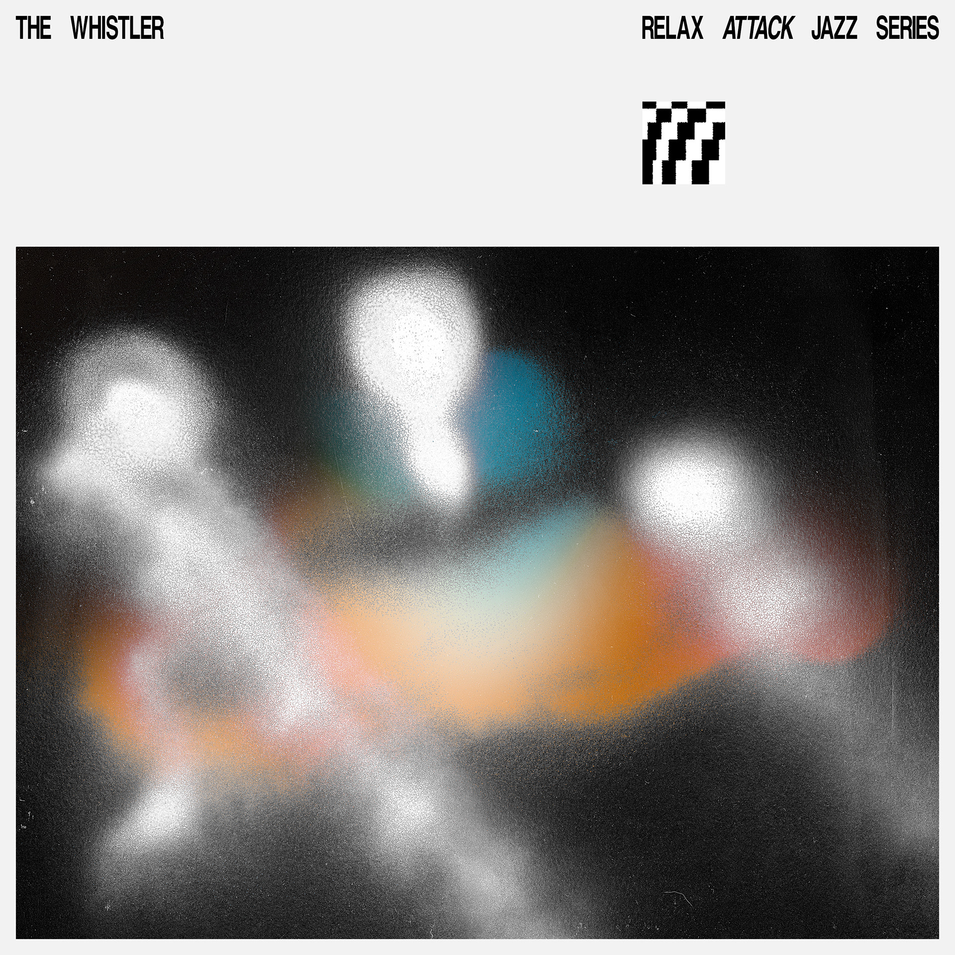
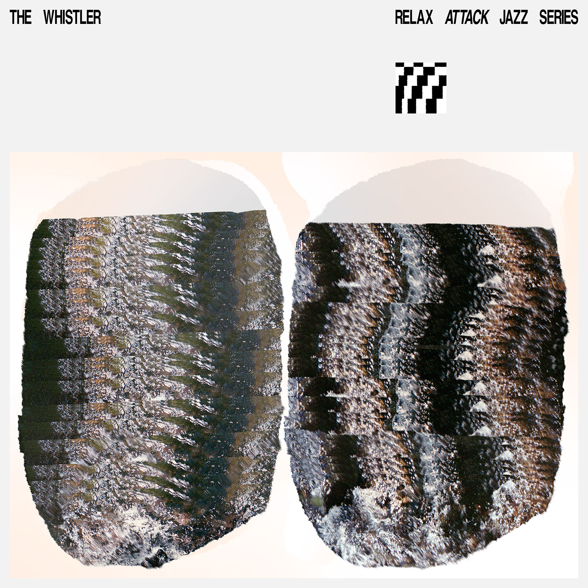
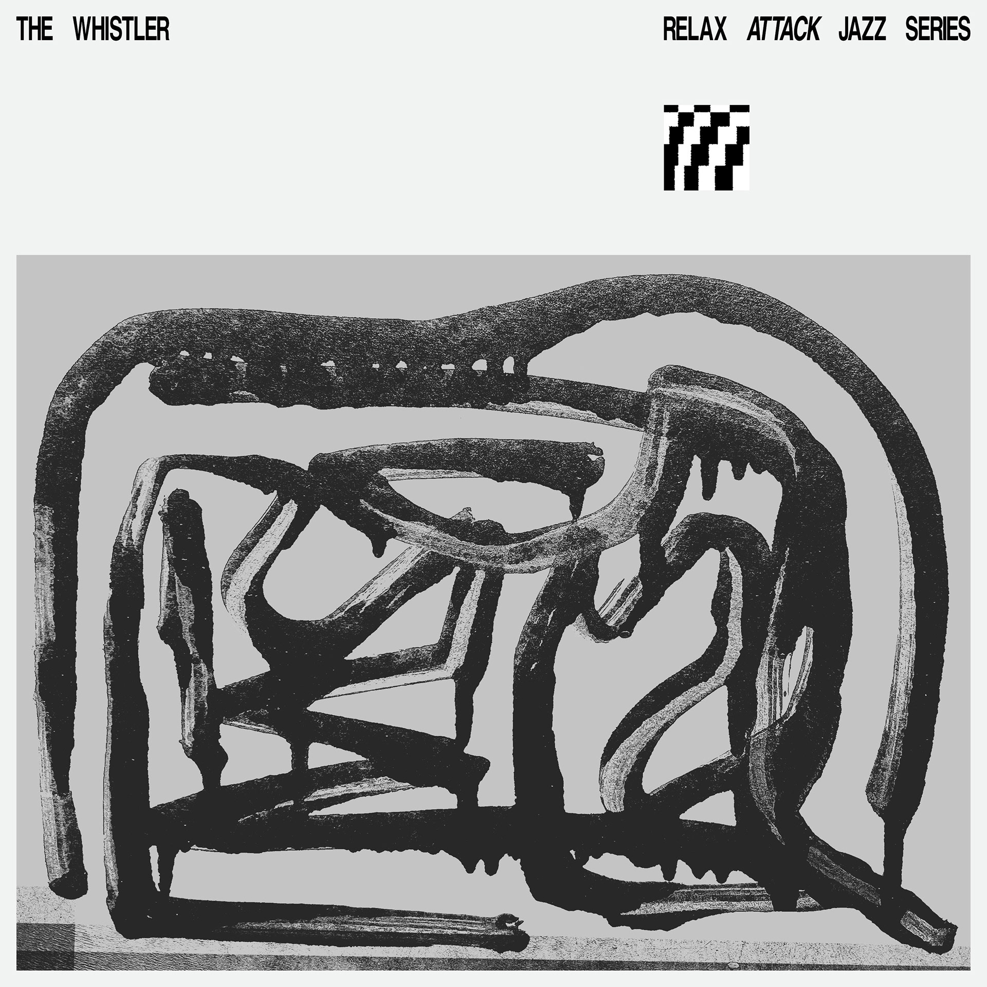
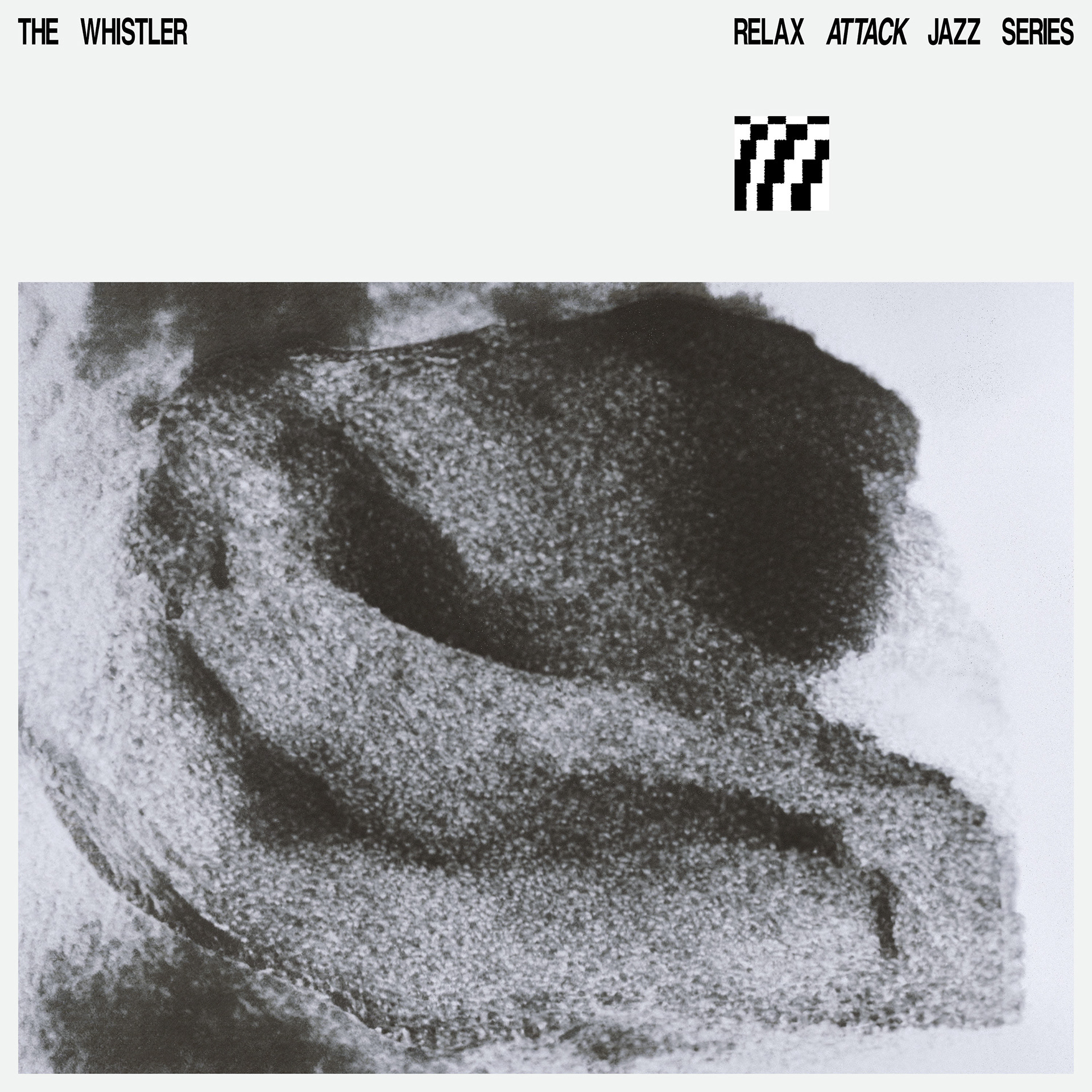
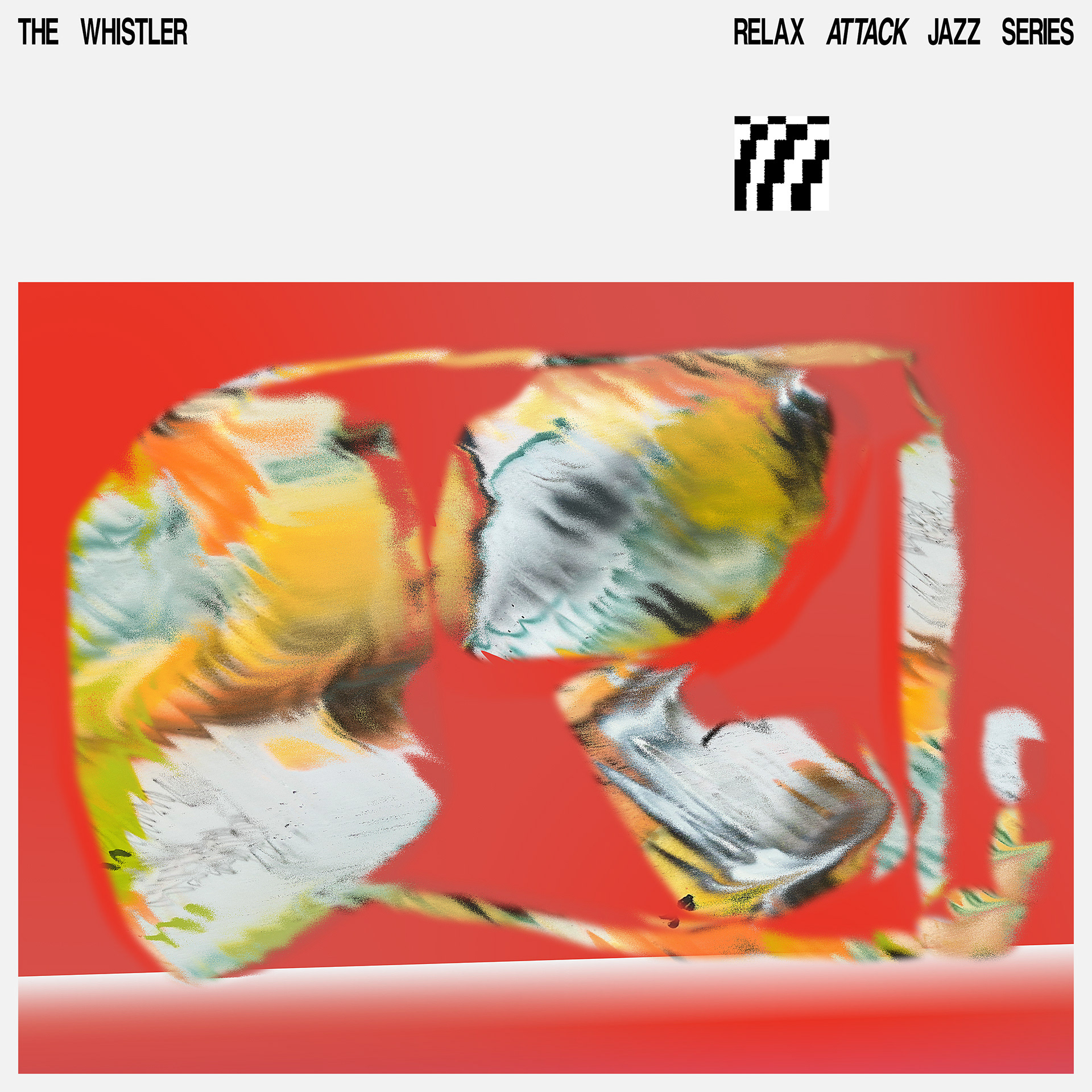
Inspired by the Yin and Yang symbol, the RA—JS identifier speaks to the Relax and Attack of the night. In balance, yet slightly off...
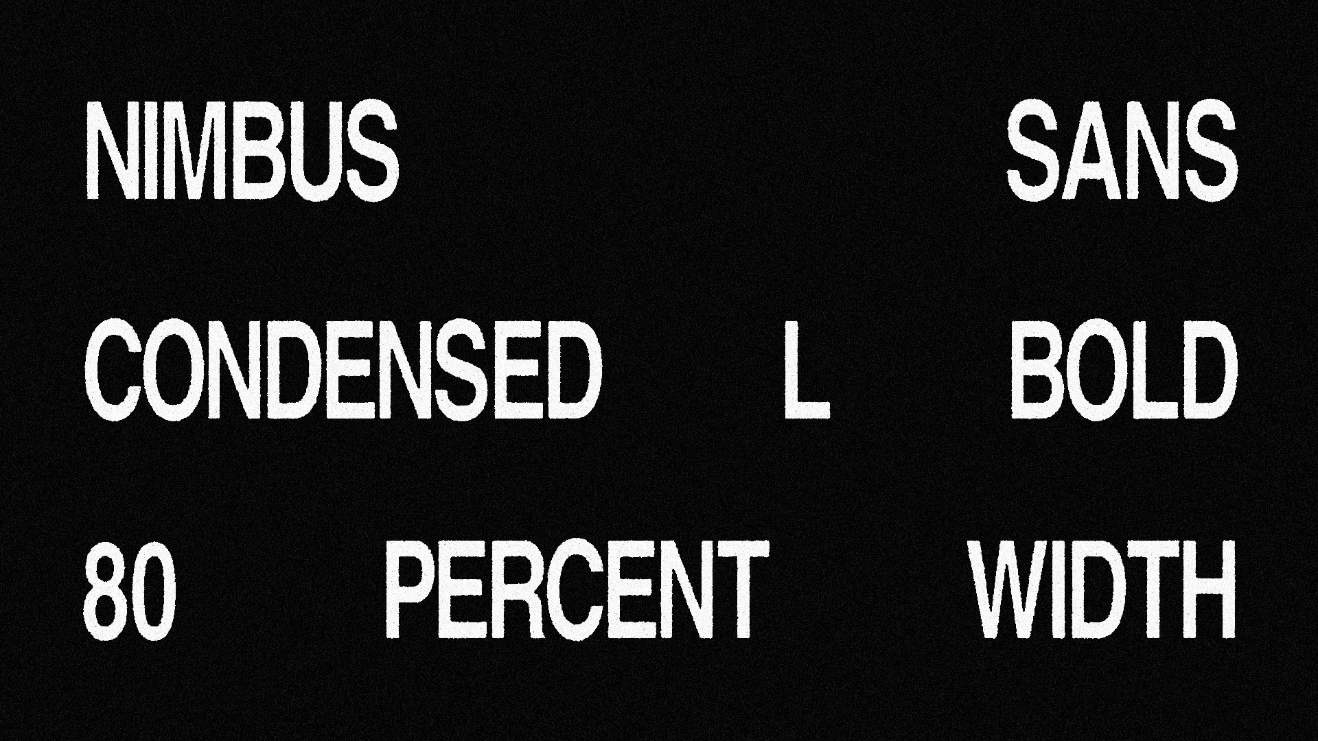
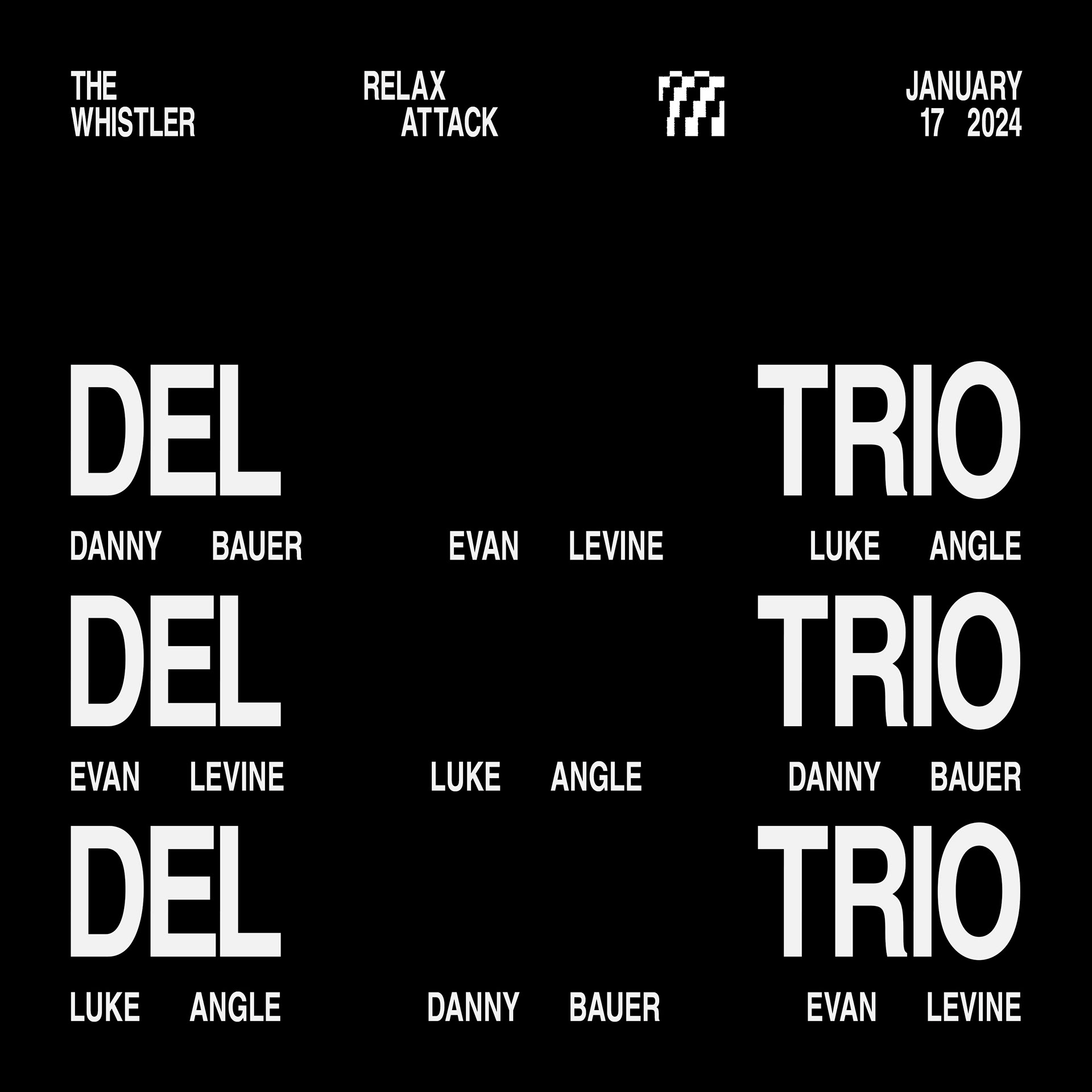
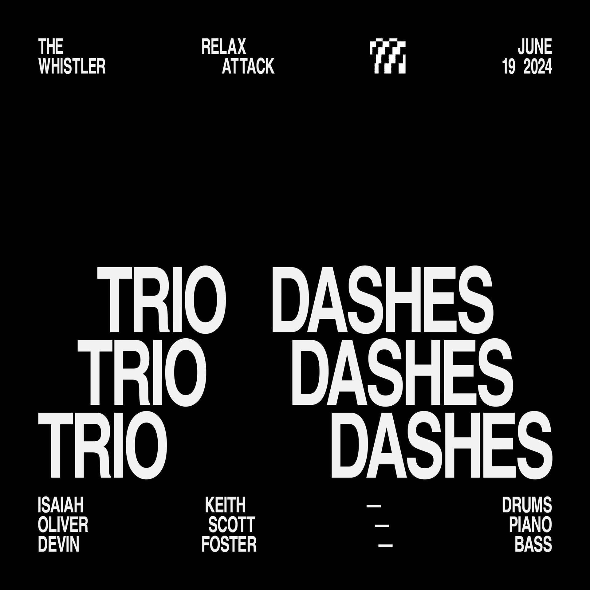
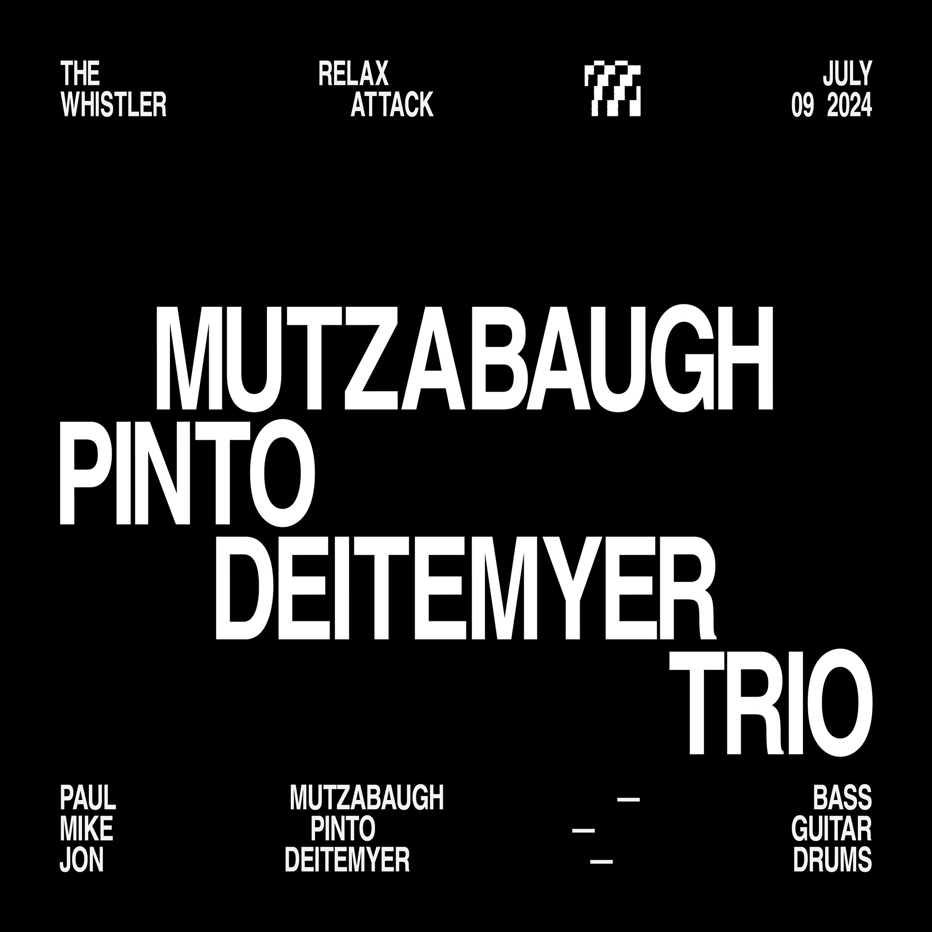
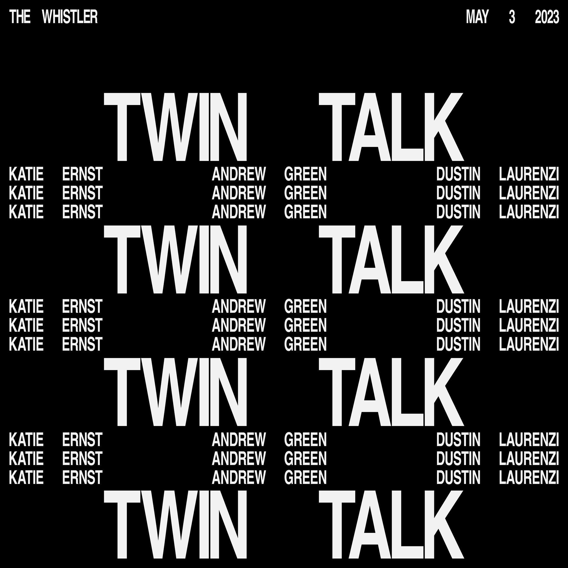
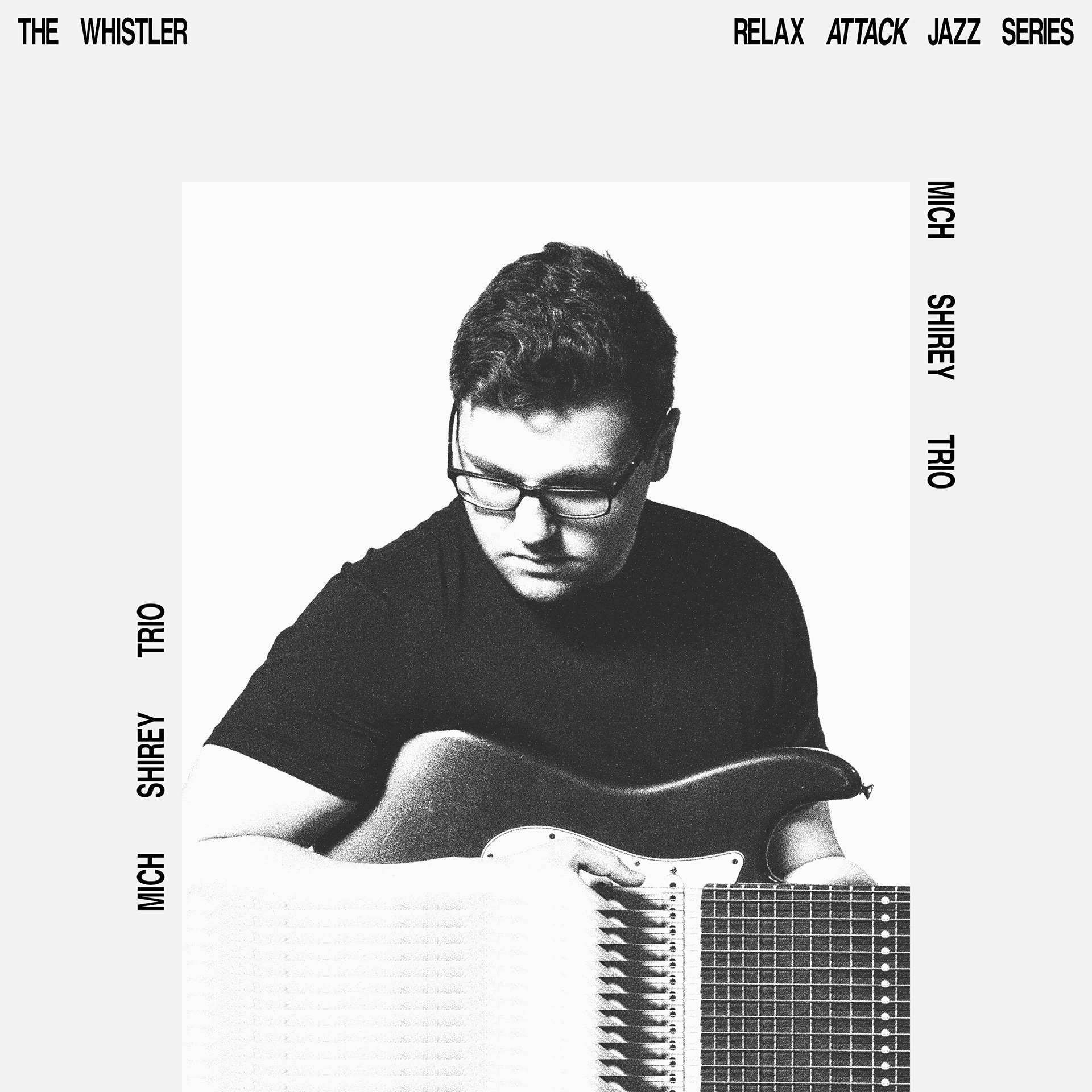
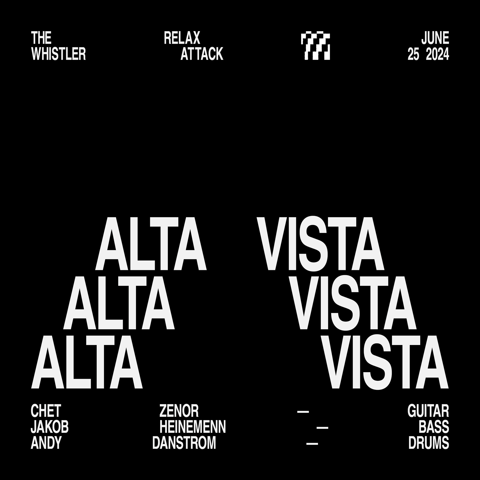
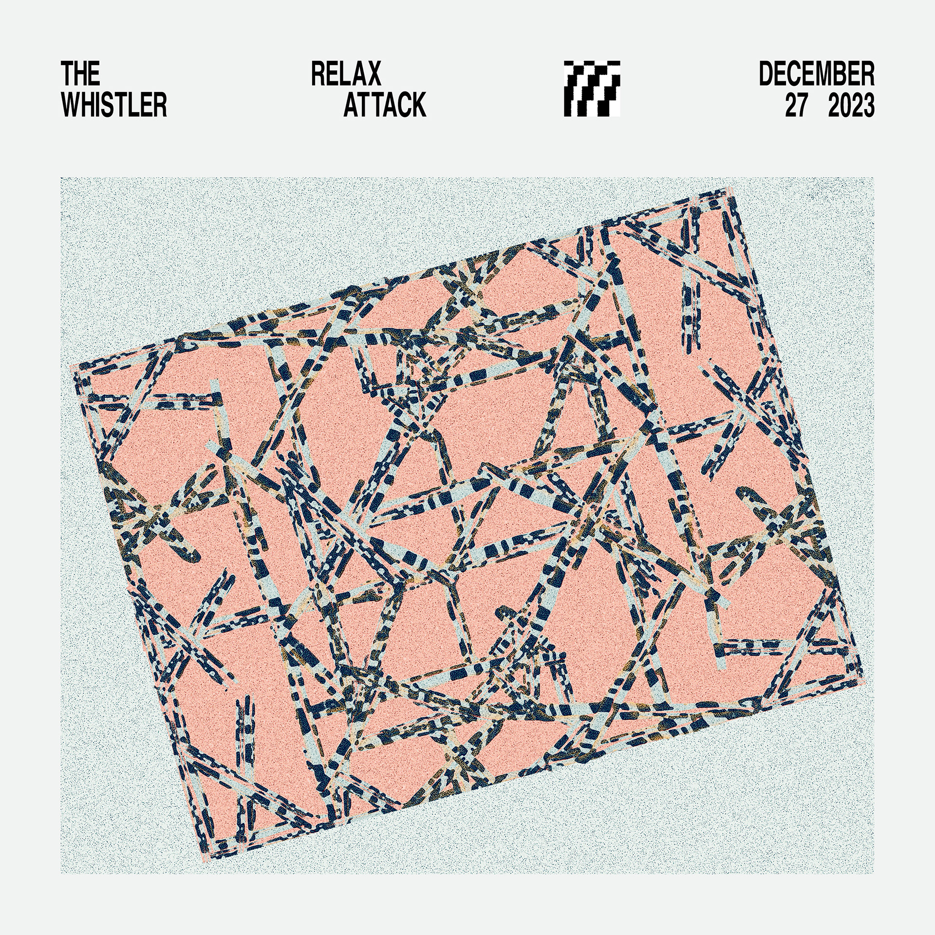
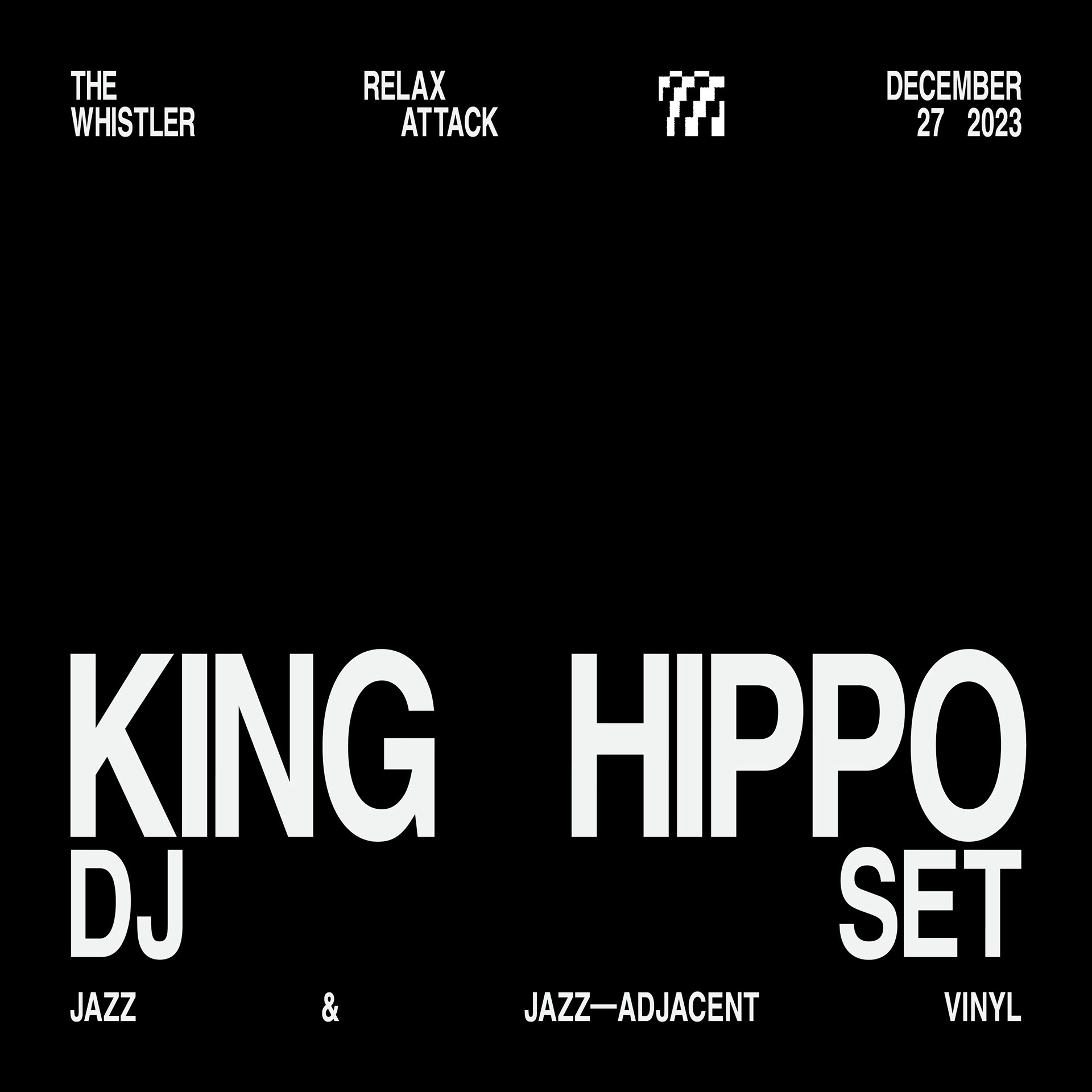
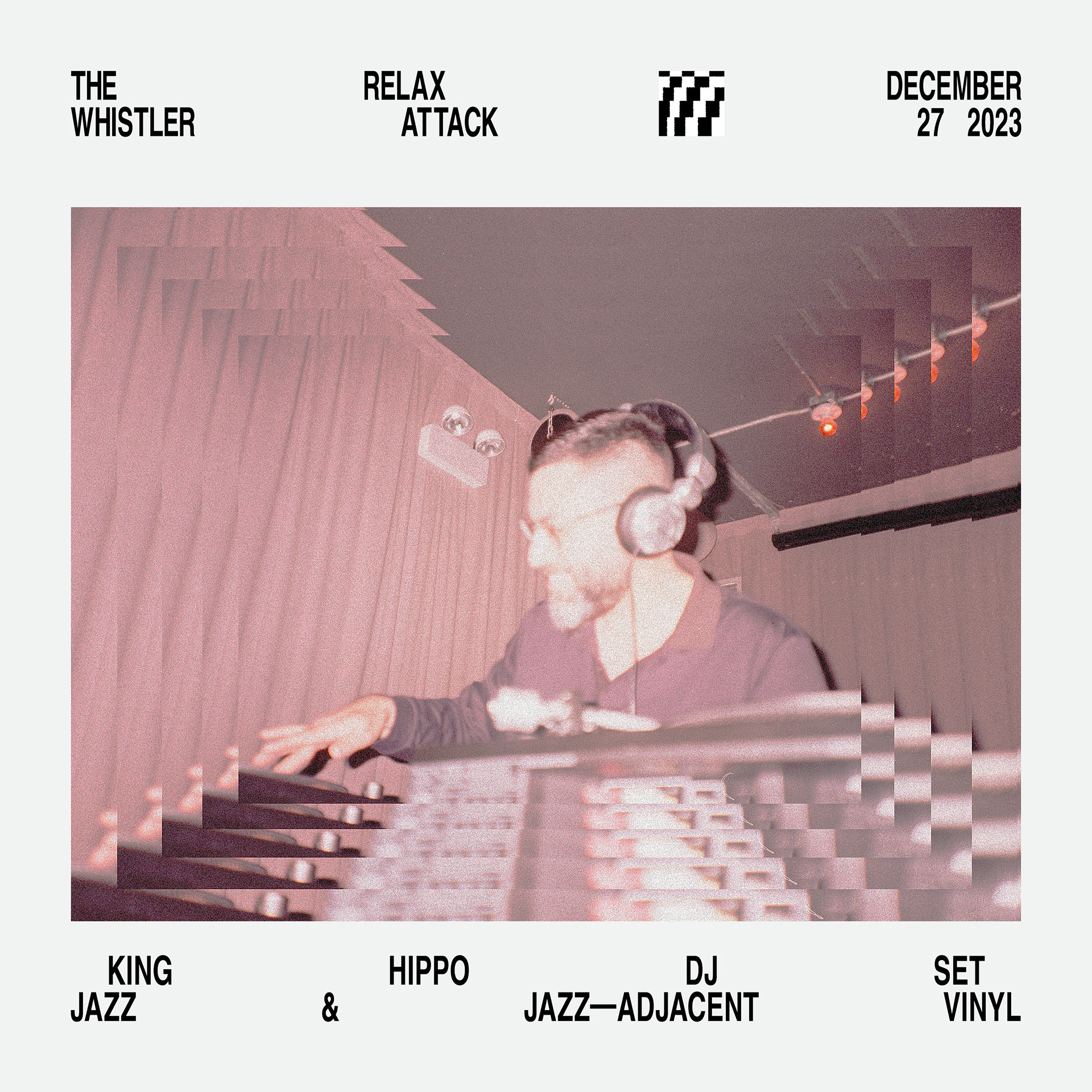
A single typeface felt right. Stylistically it's a nice callback to Jazz sleeves from the 1960s. 80% width BECAUSE JAZZ!
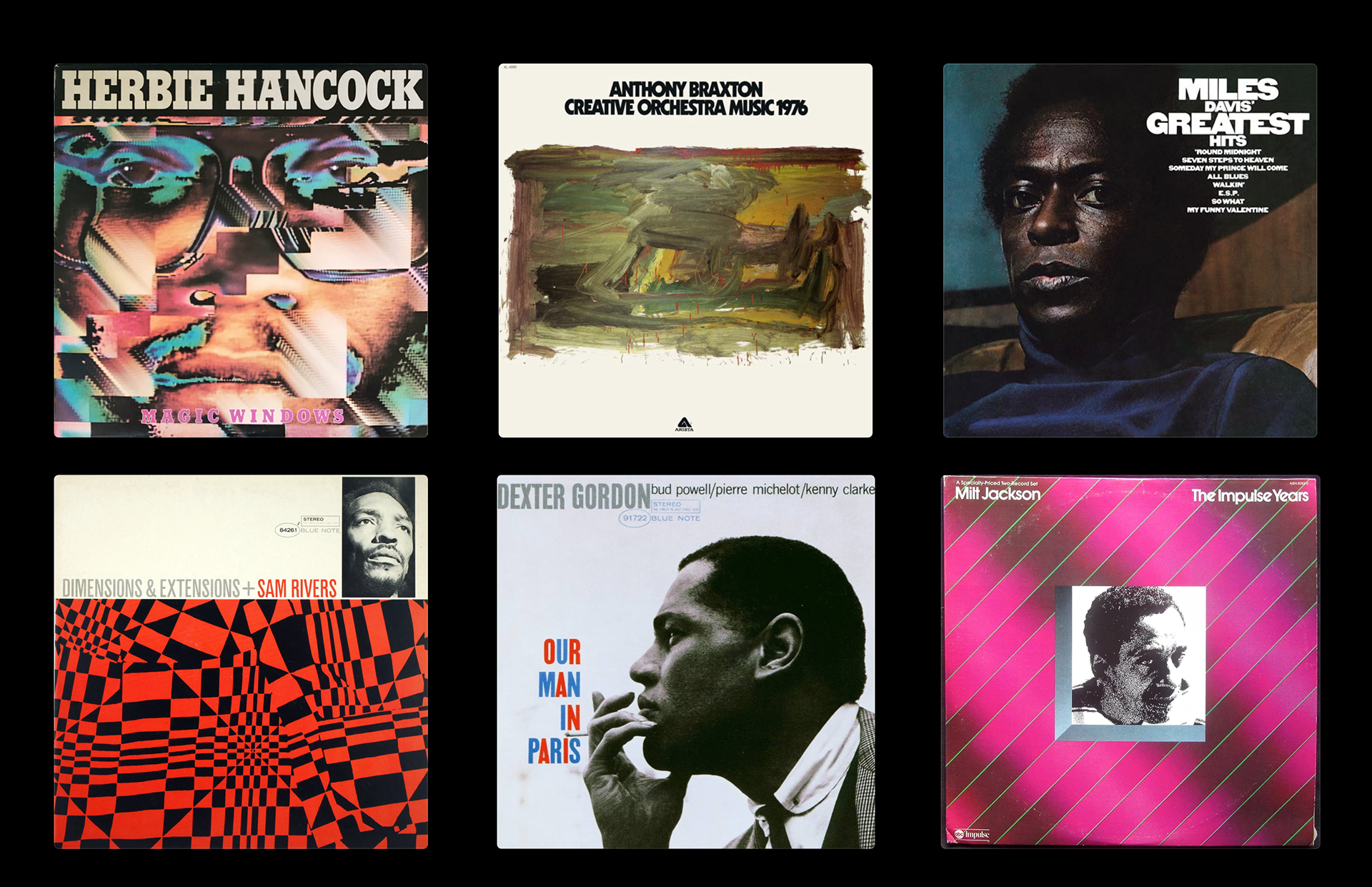
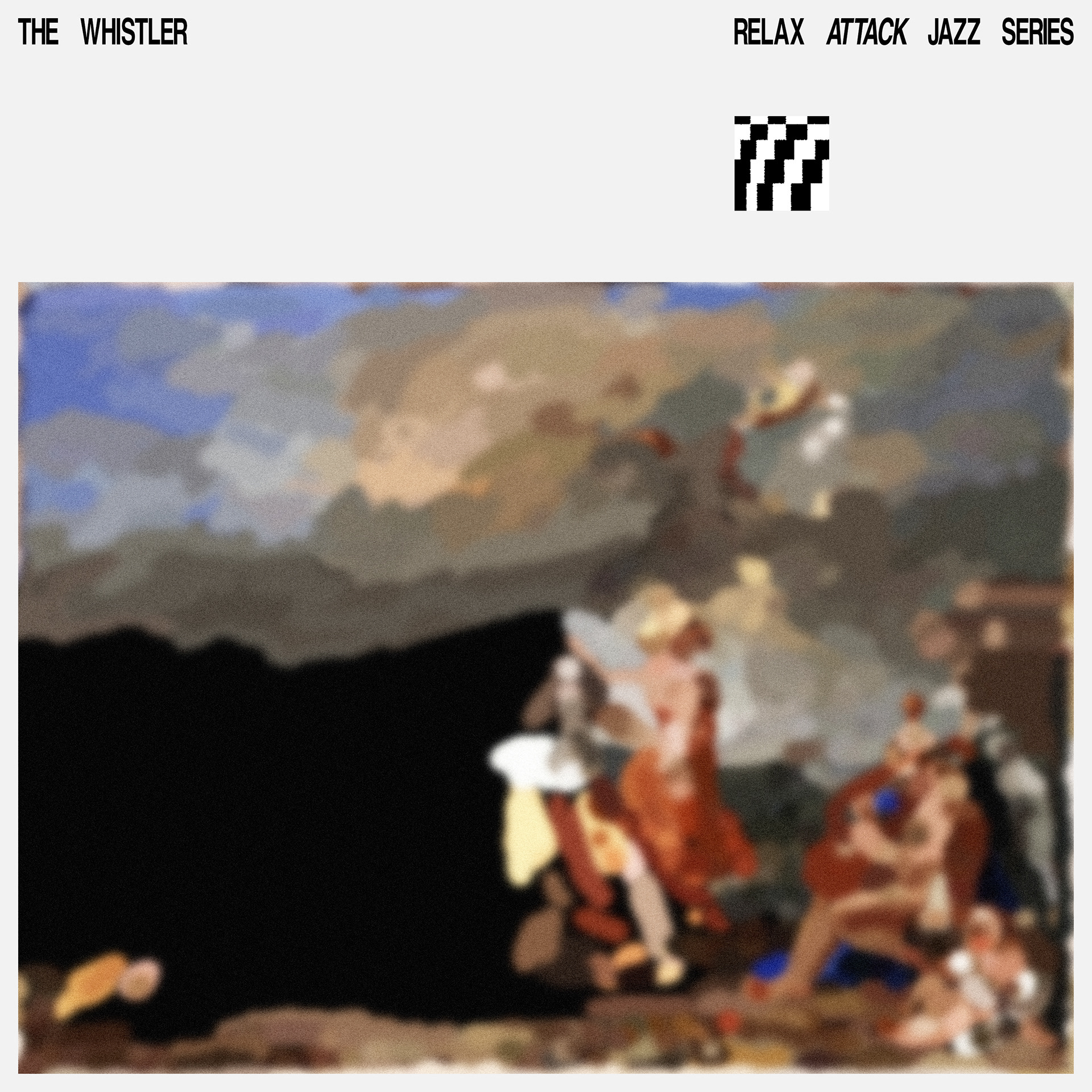
A couple of pulls that had a big influence on this stream of work.
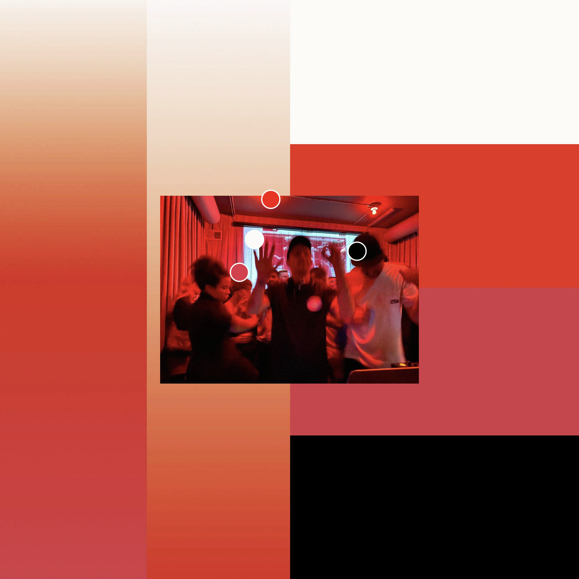
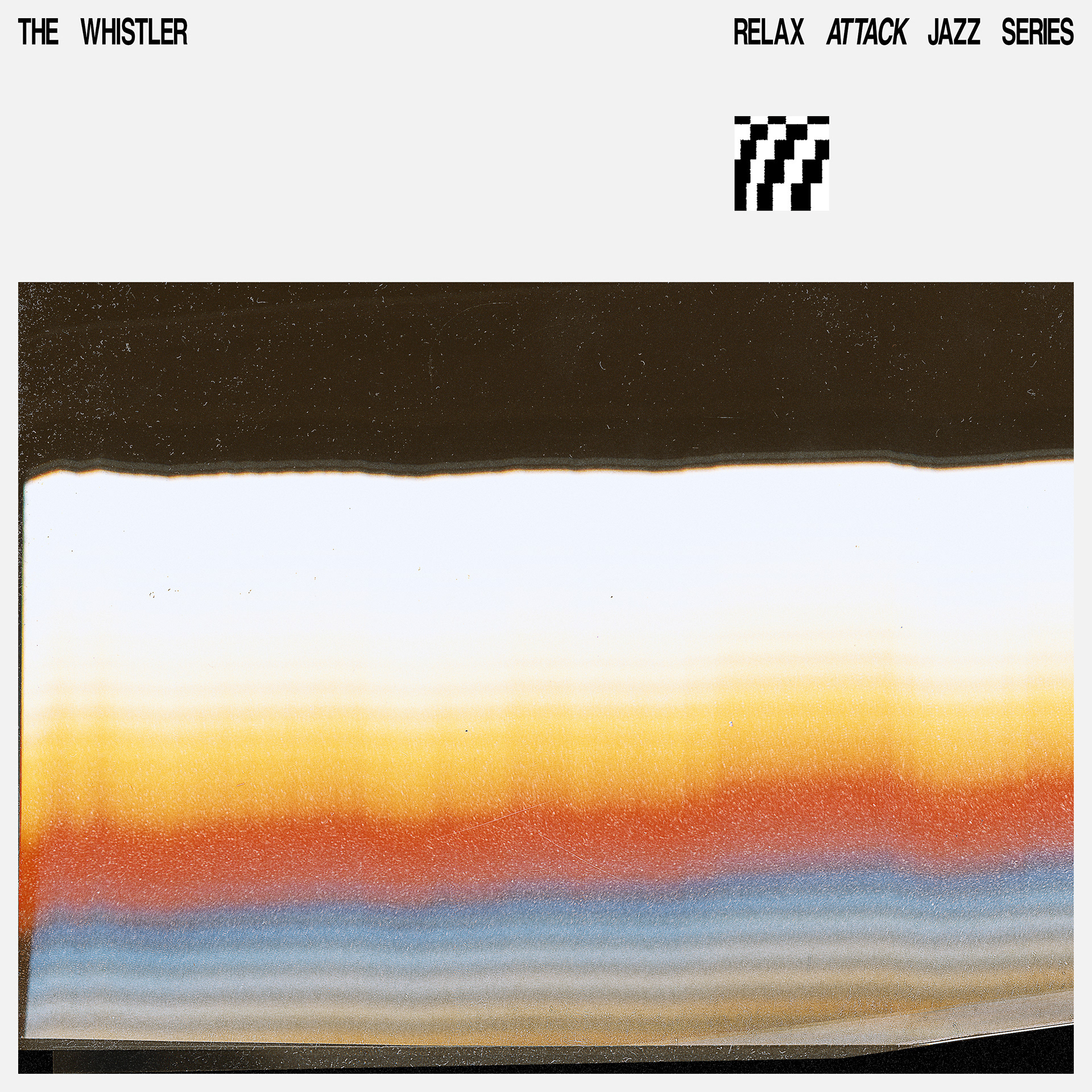
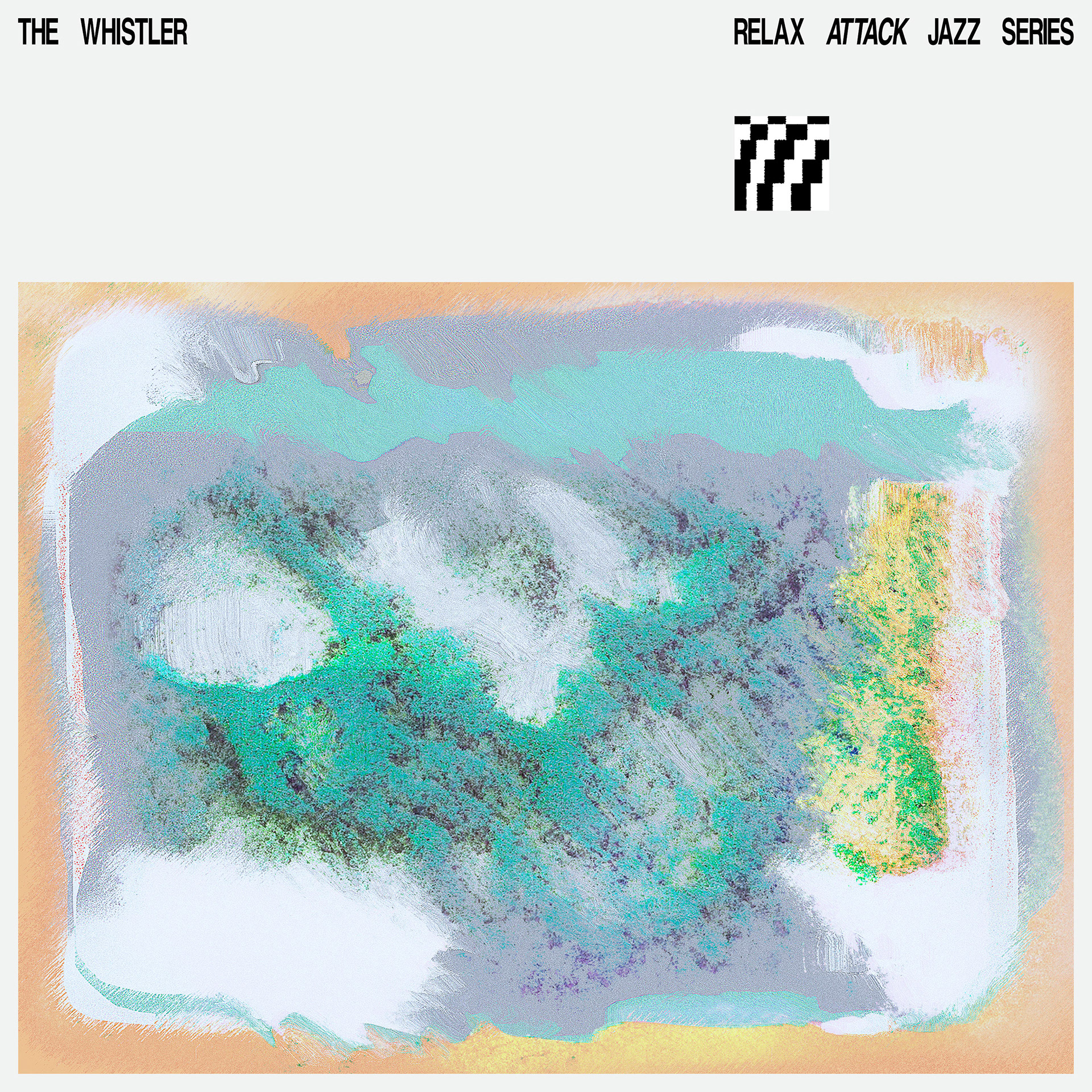
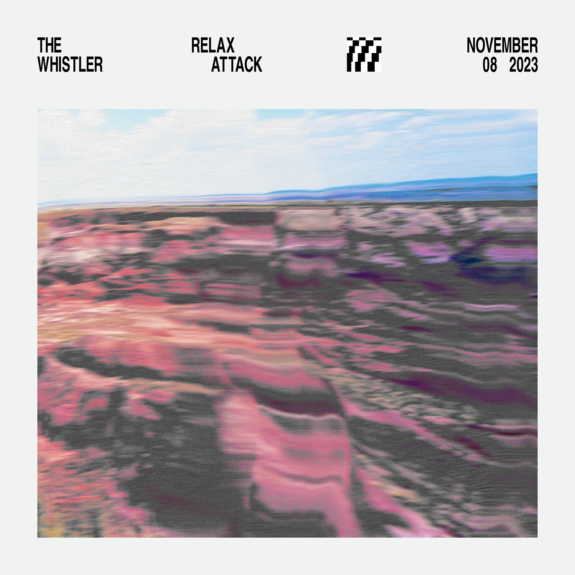
Our palette comes from the source (Brasstax during our farewell show at The Whistler)
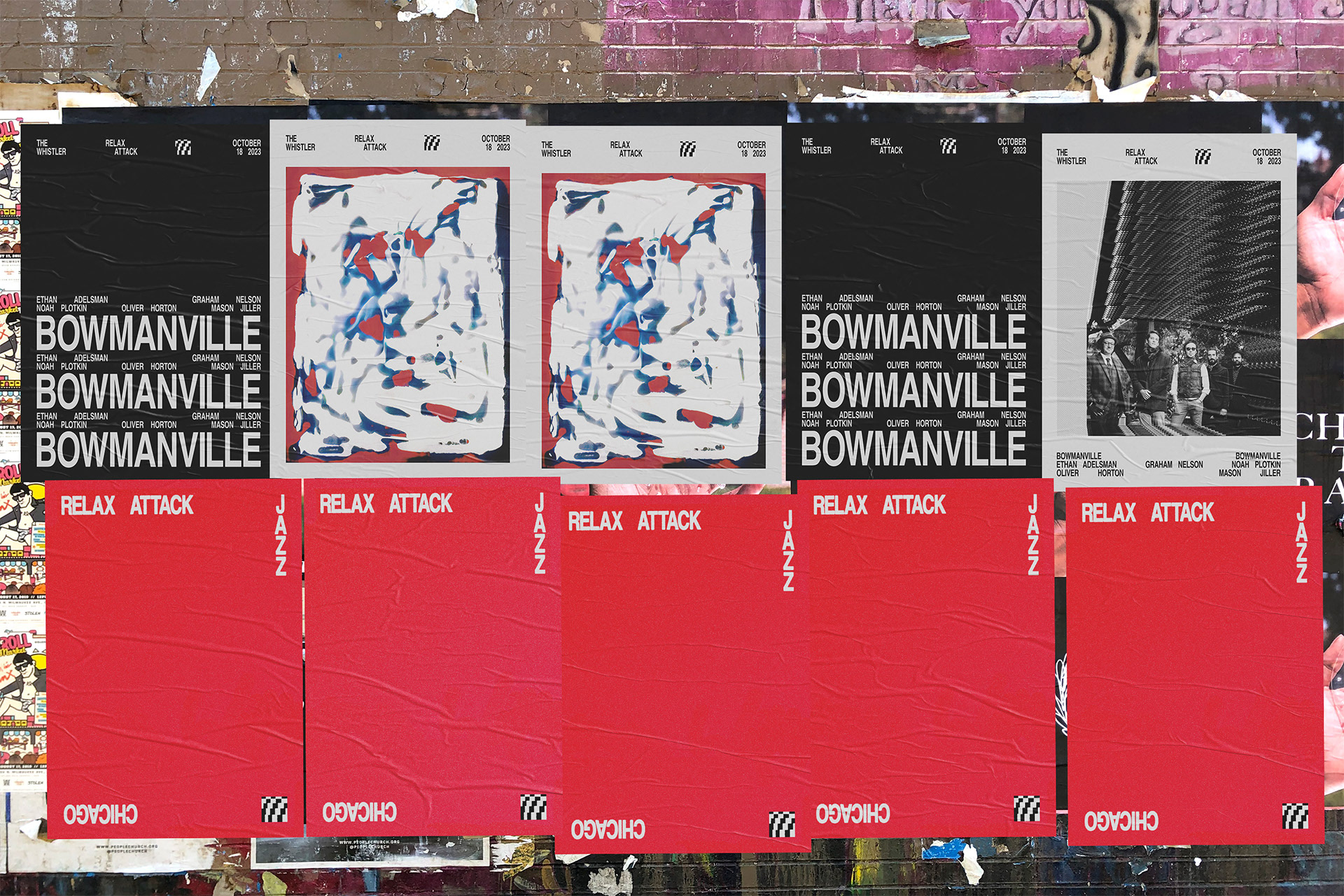
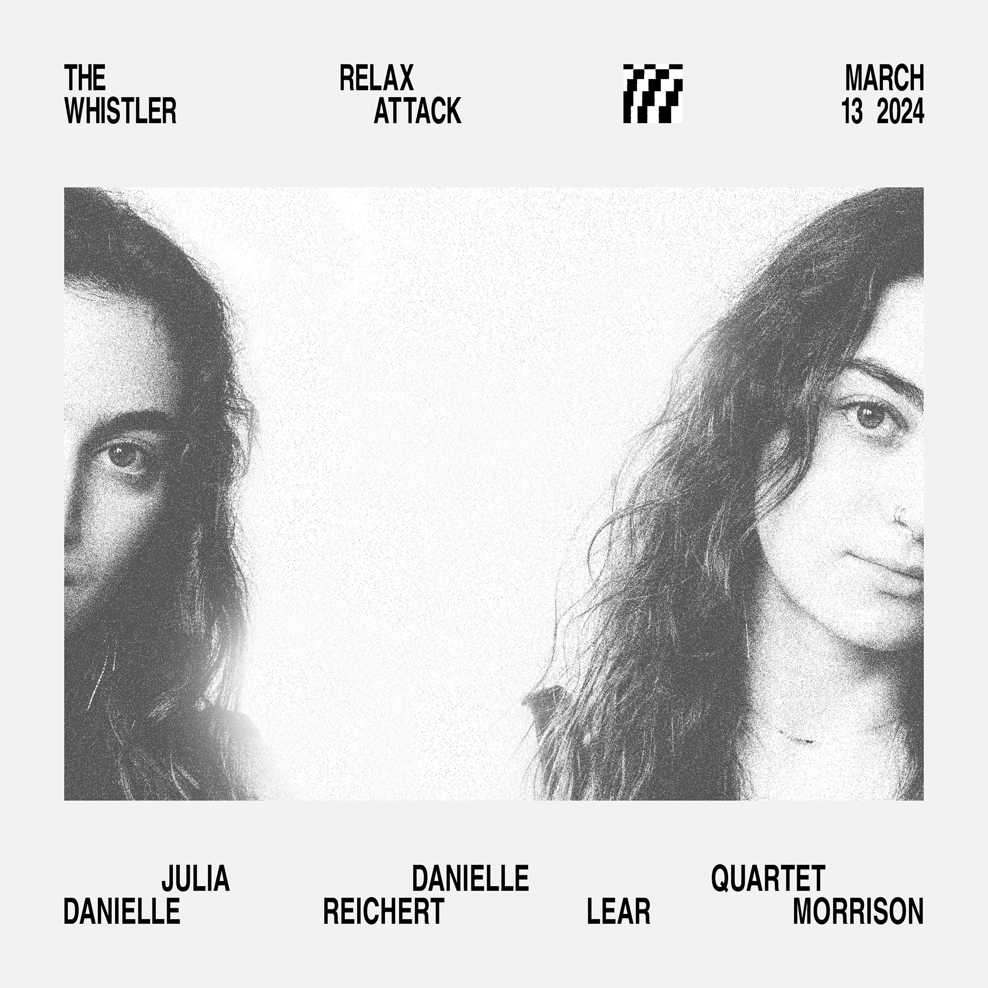
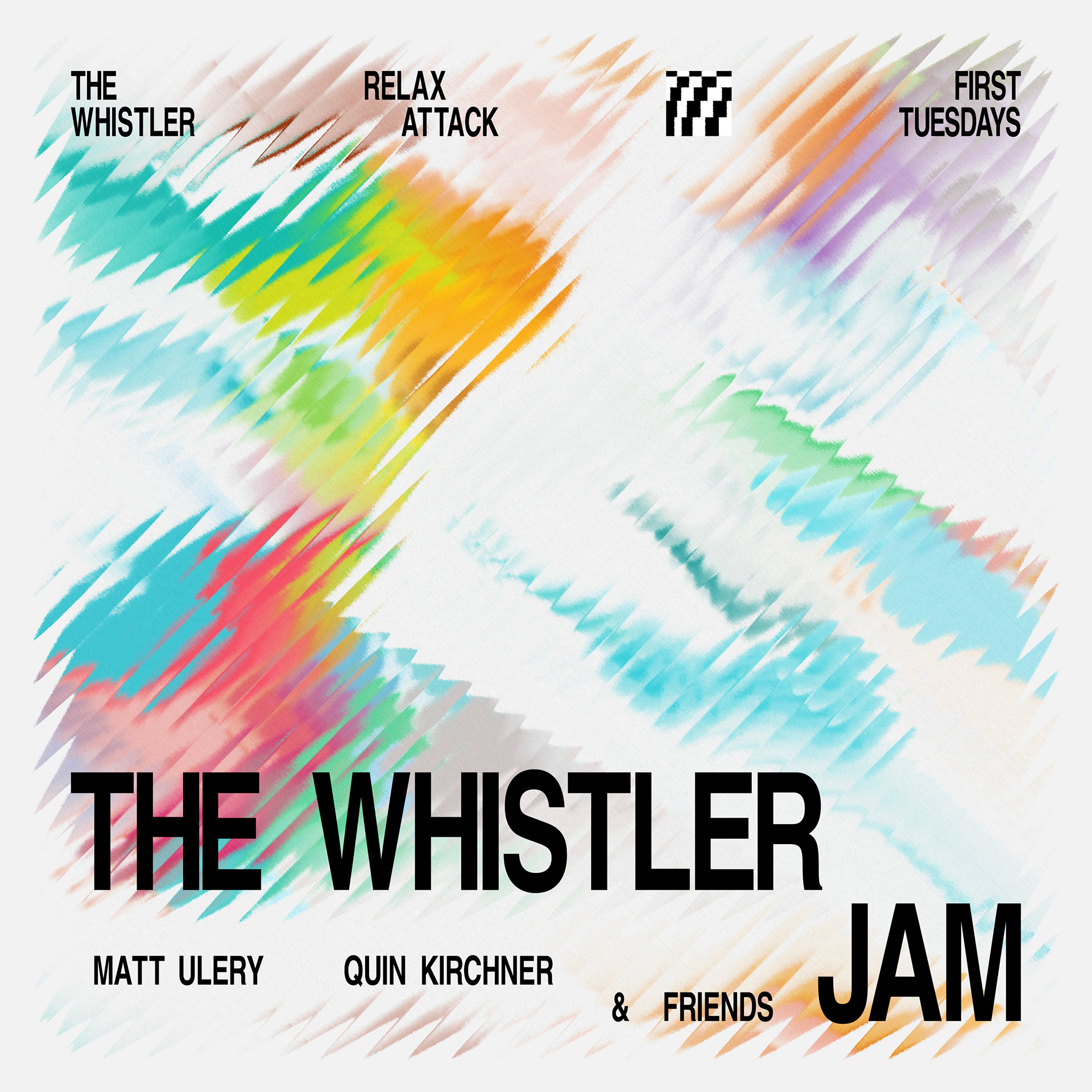
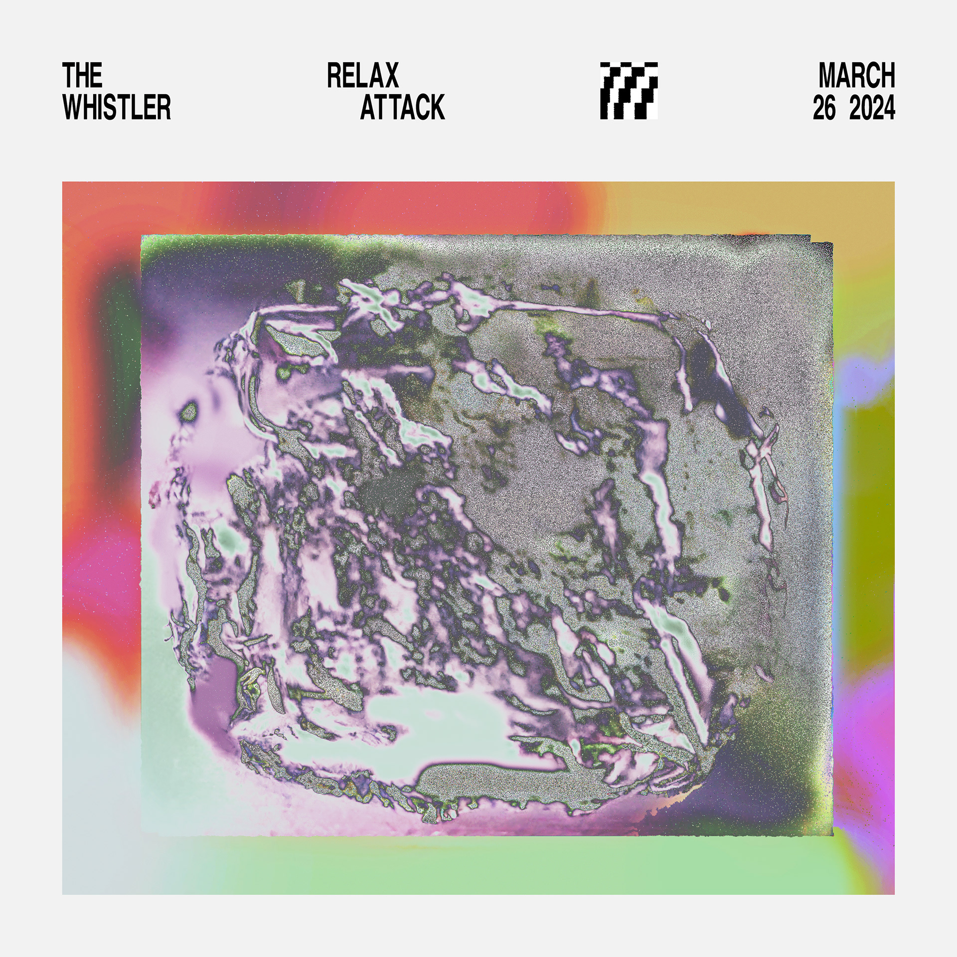
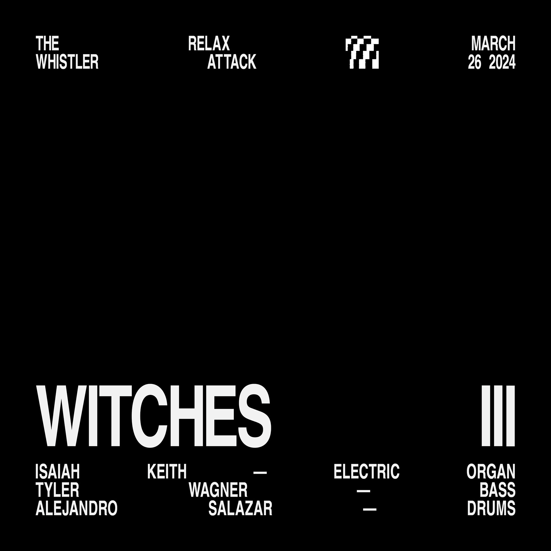
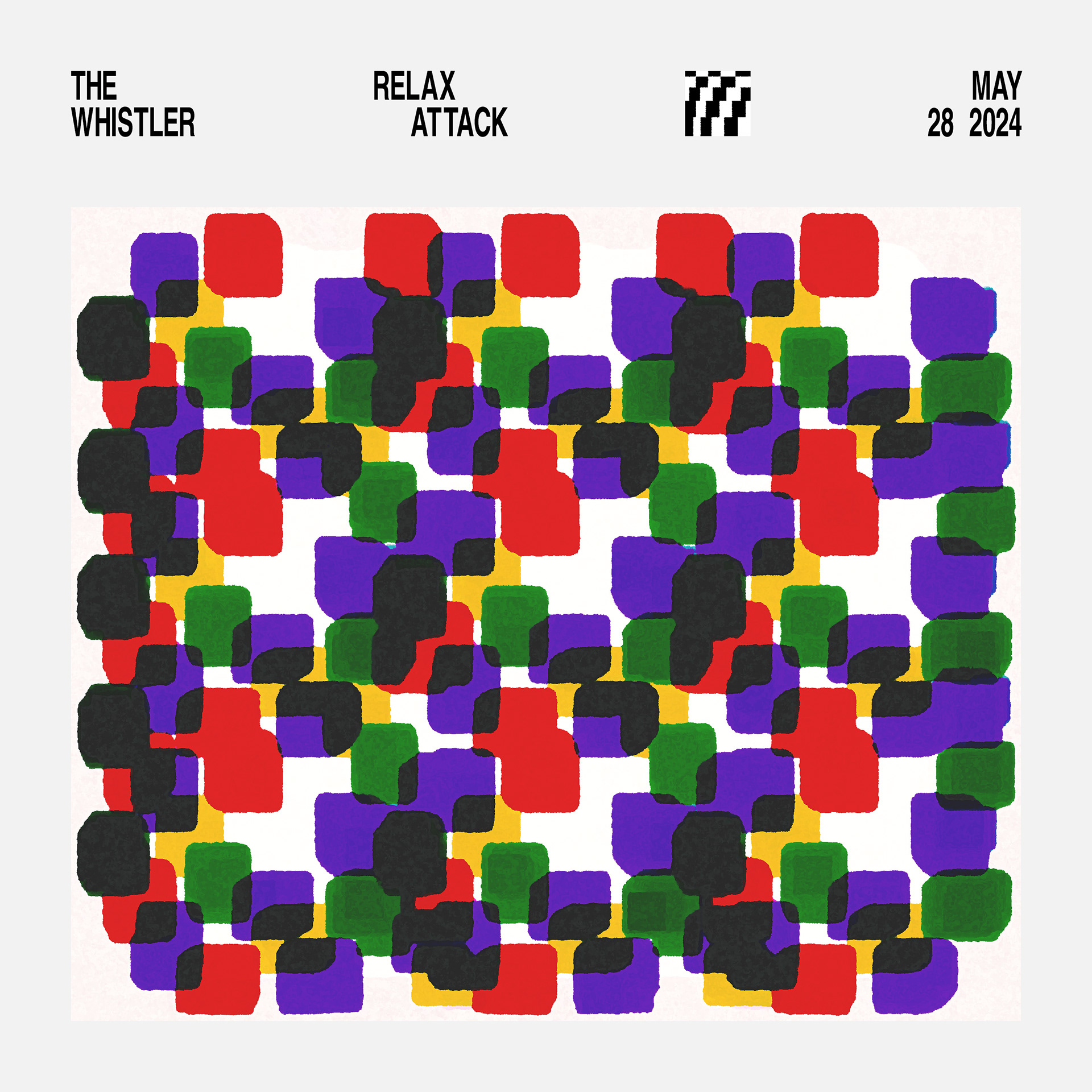
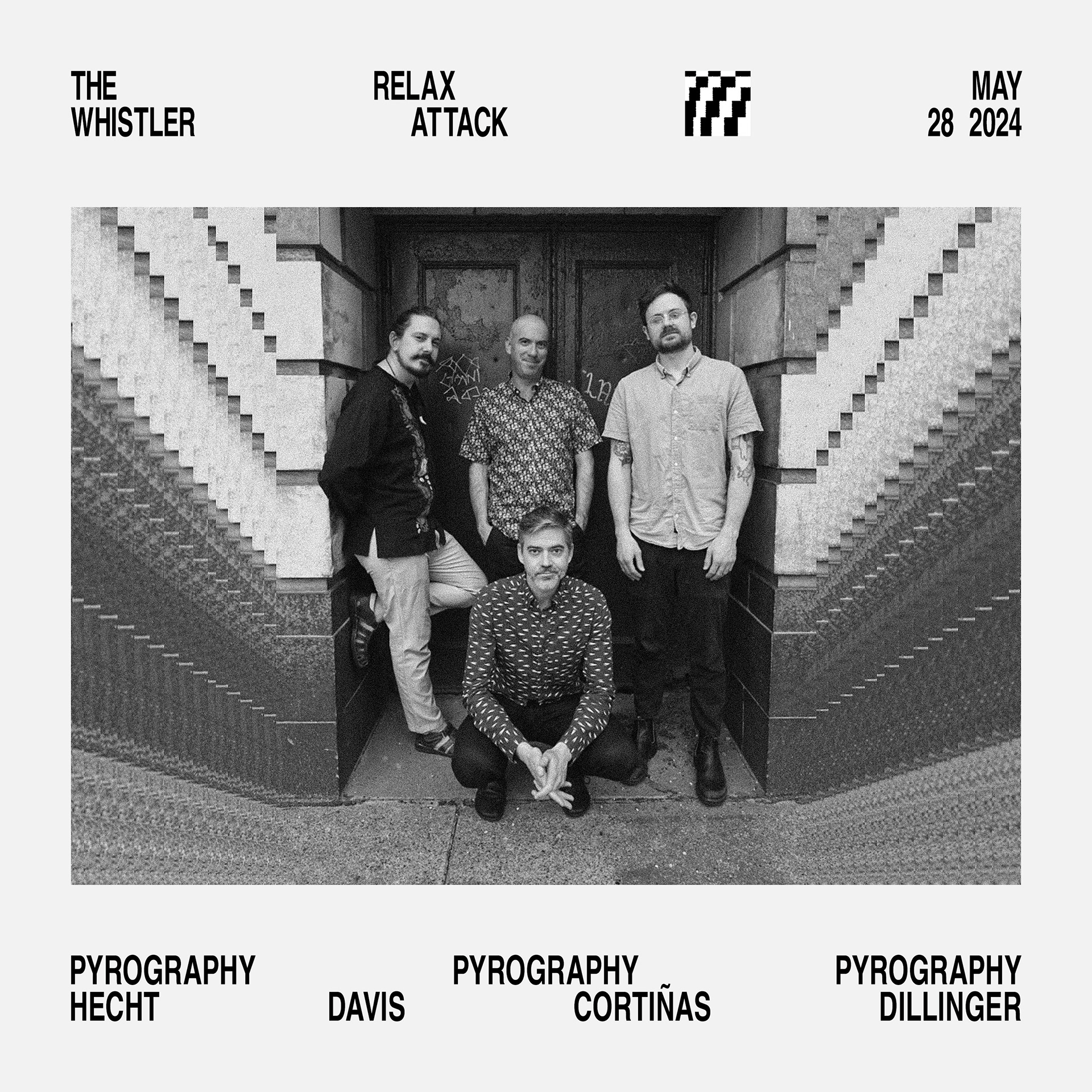
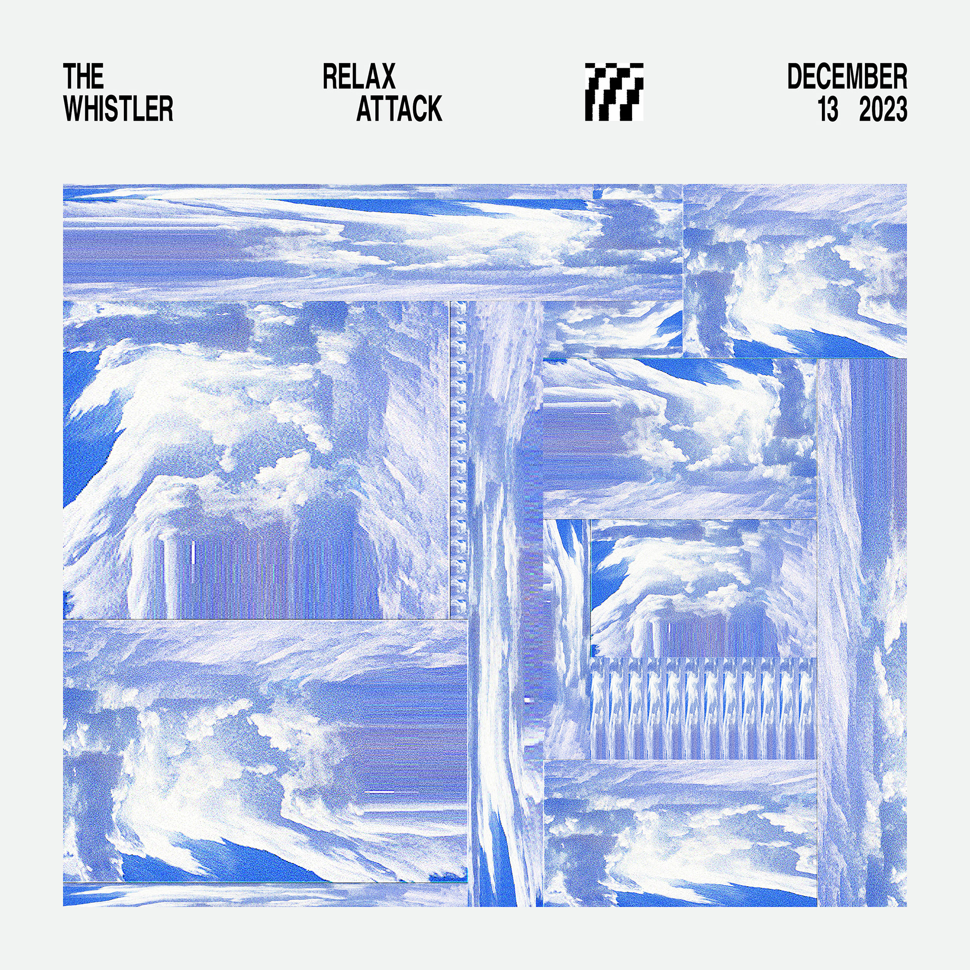
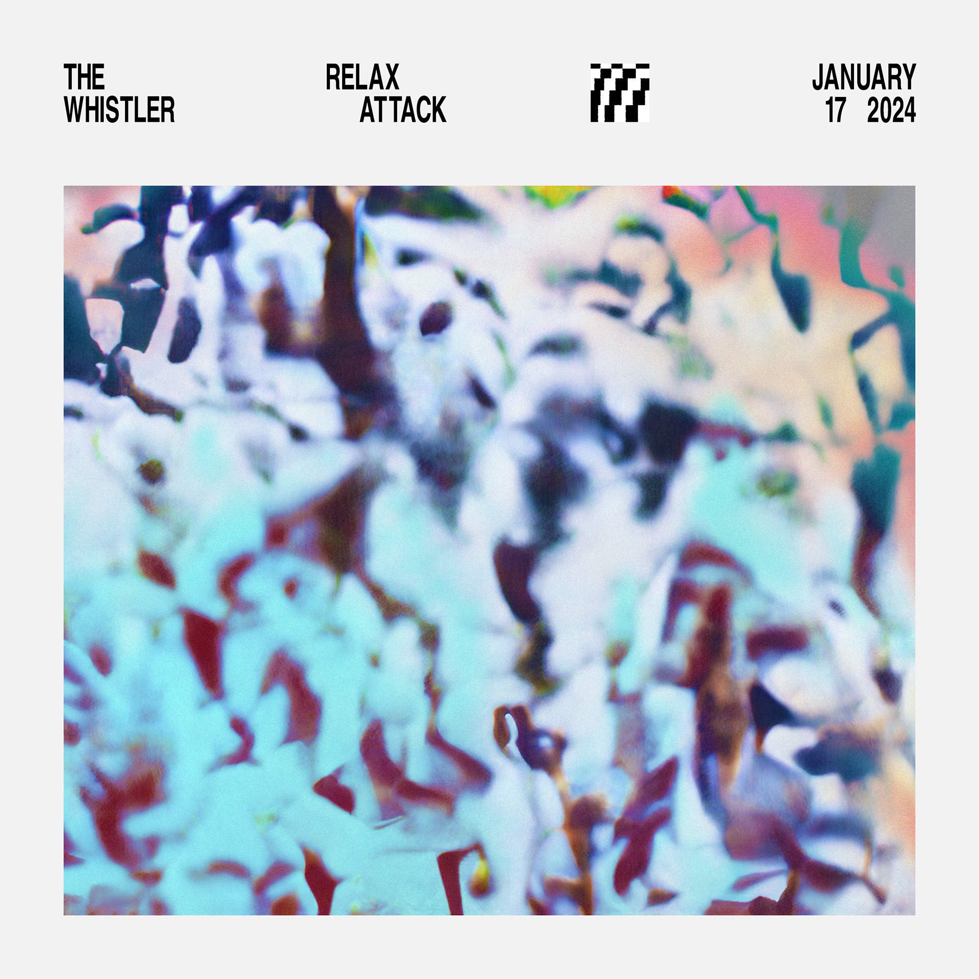
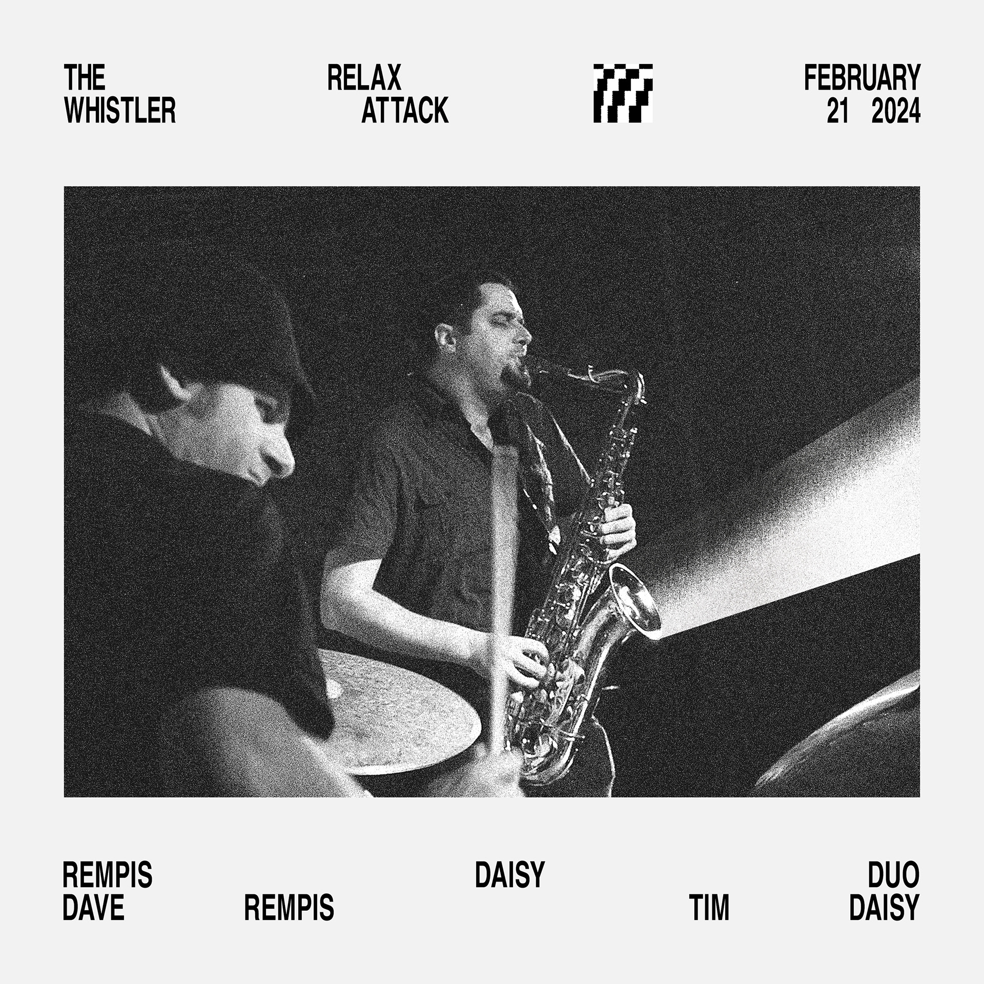
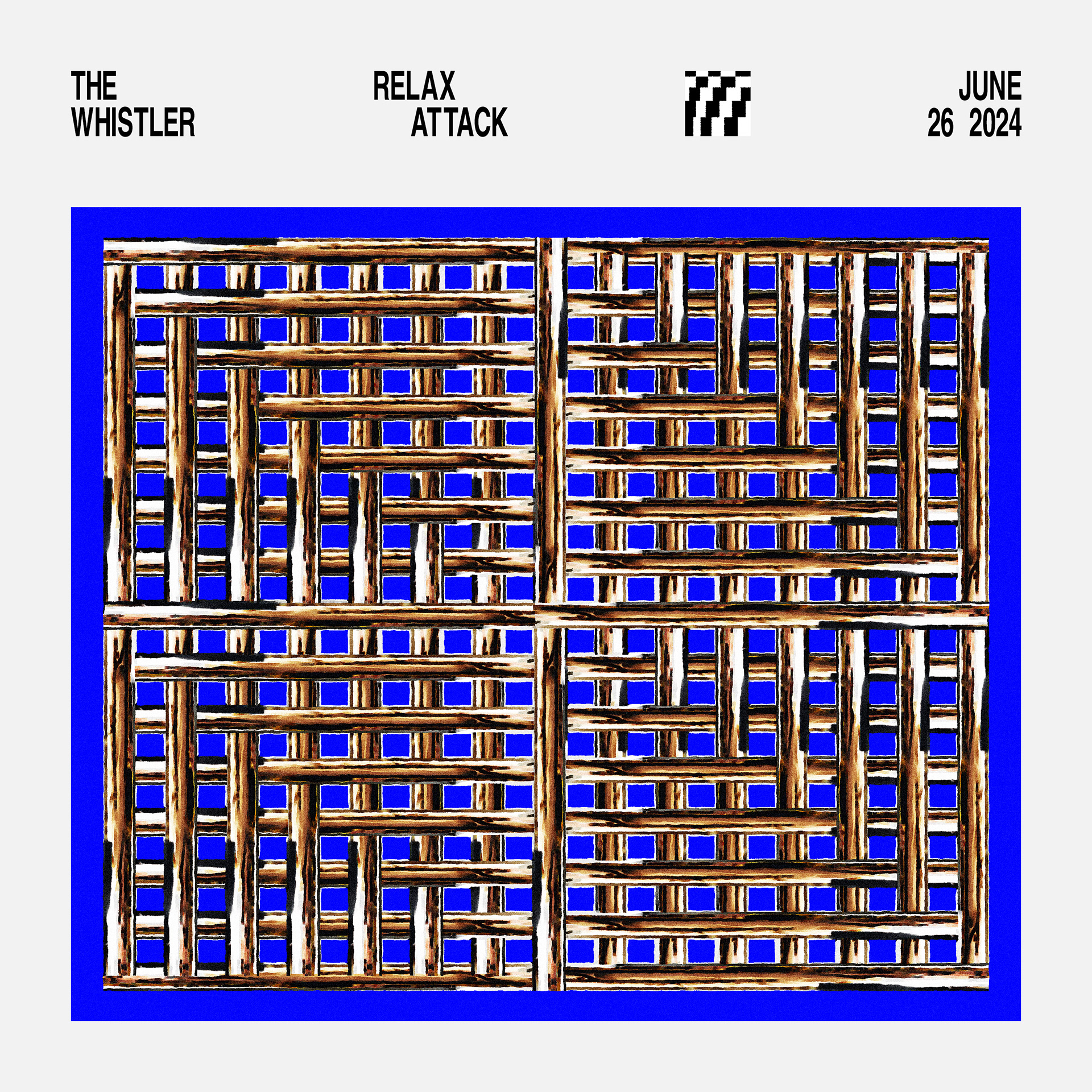
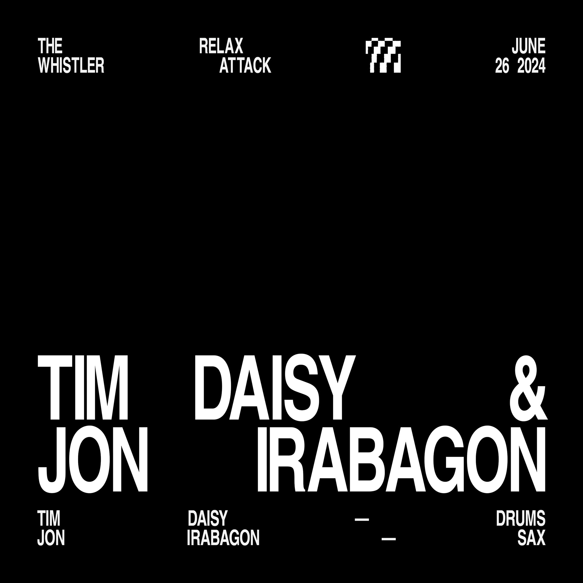
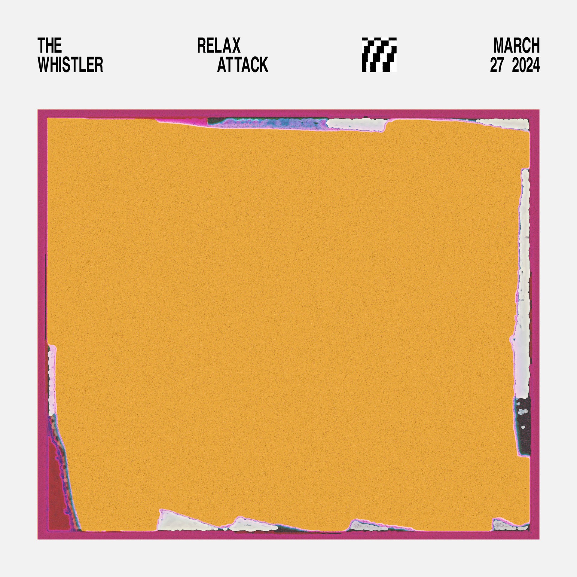
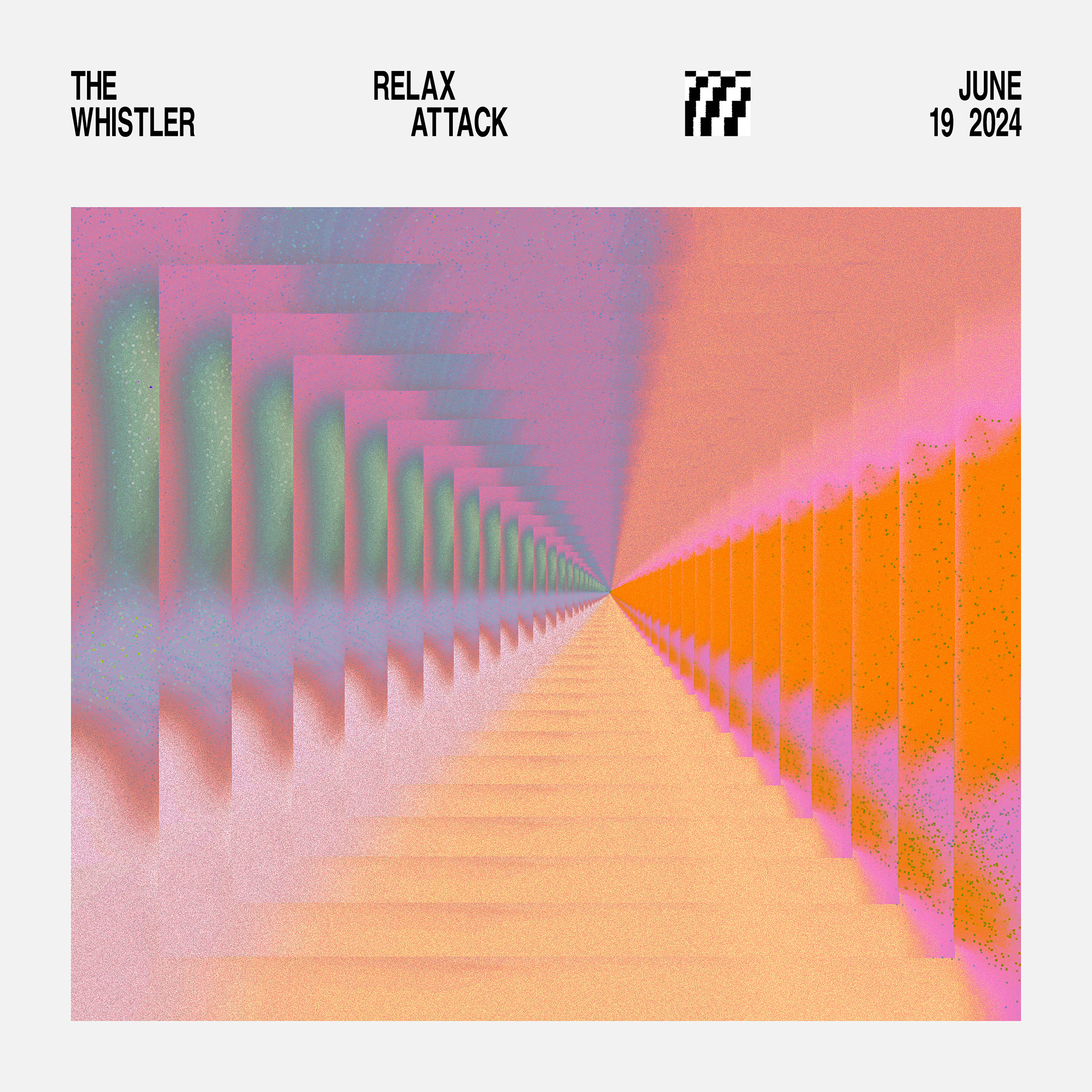
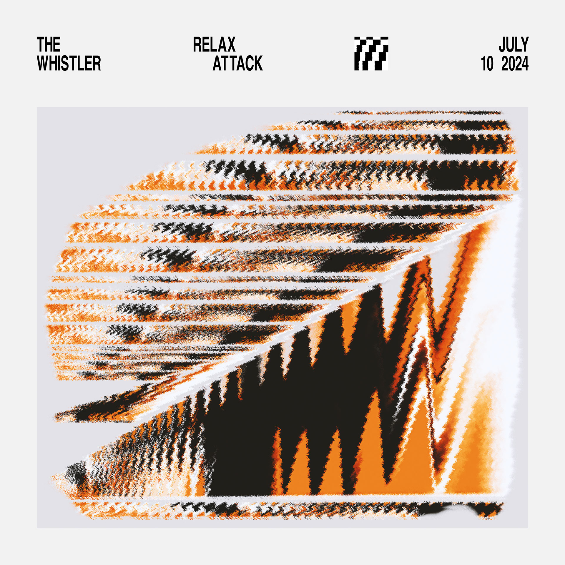
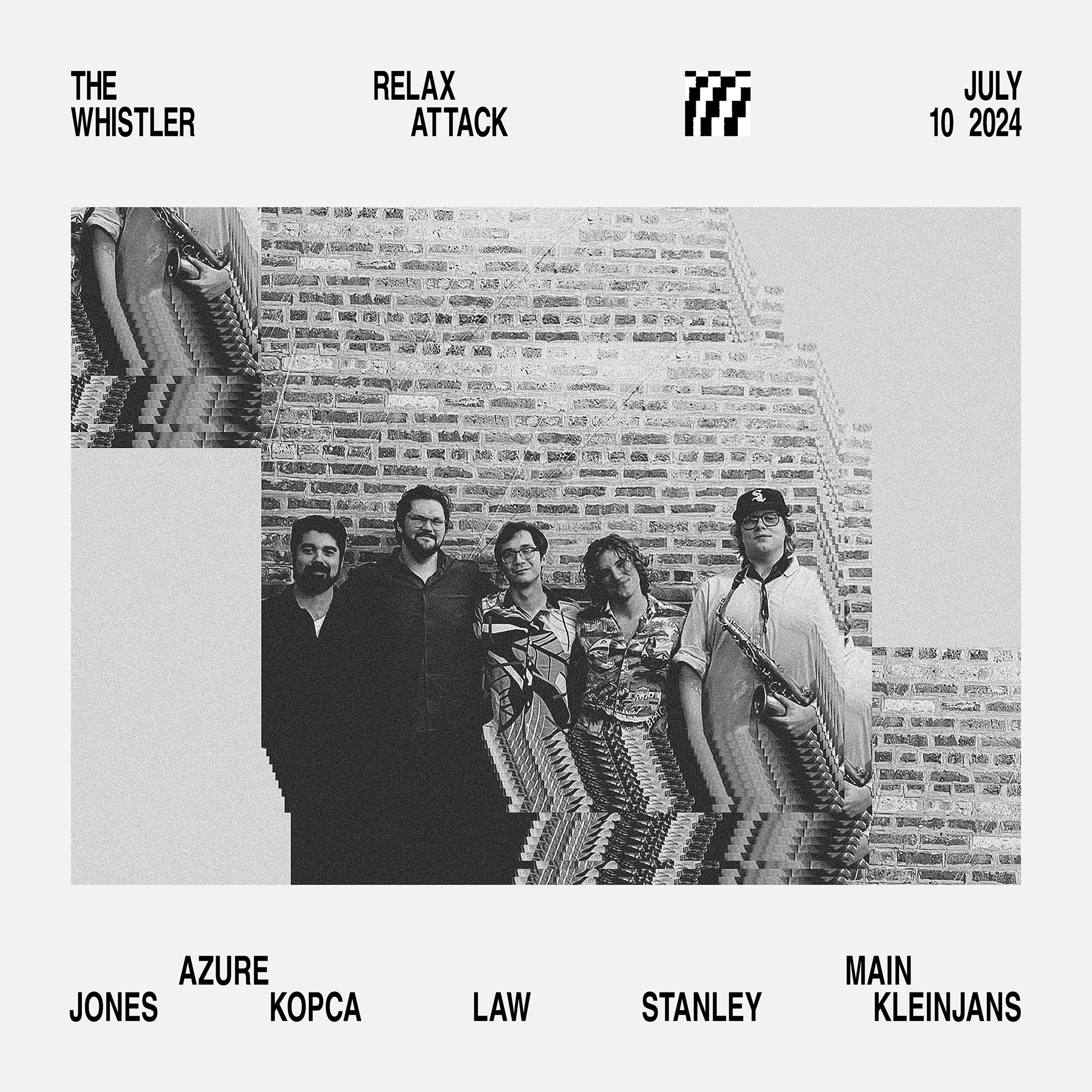
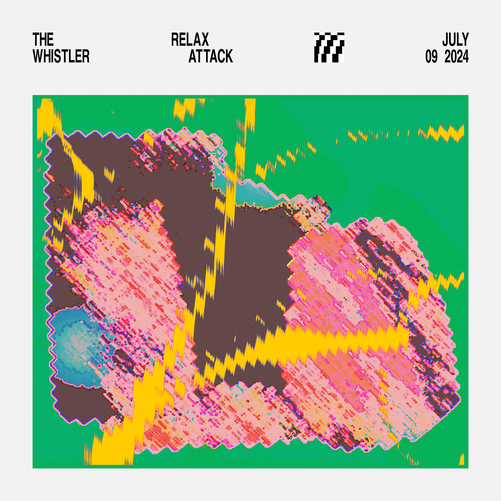
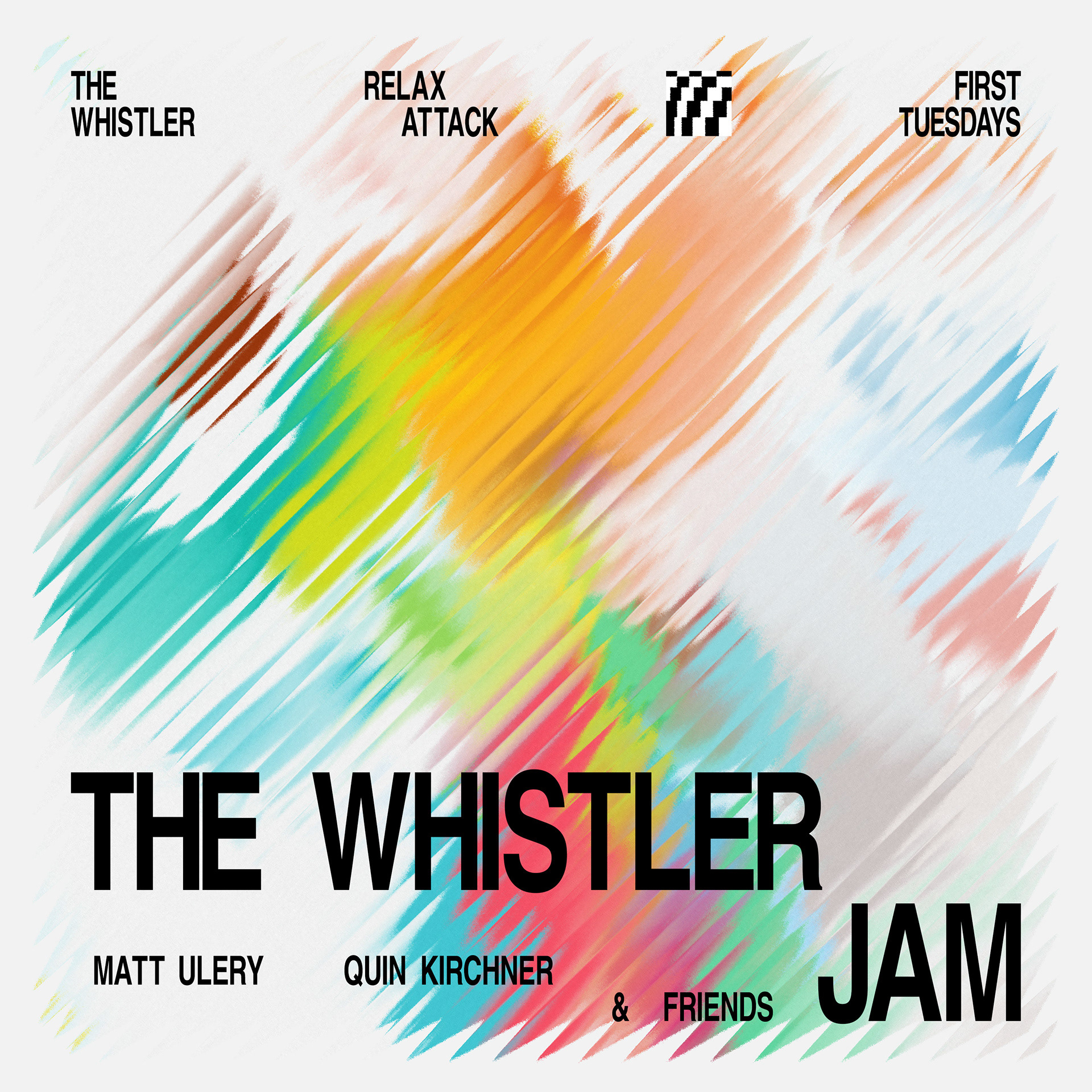
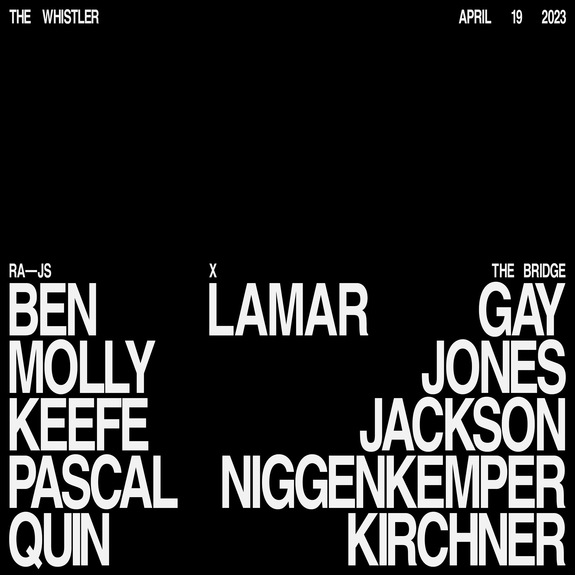
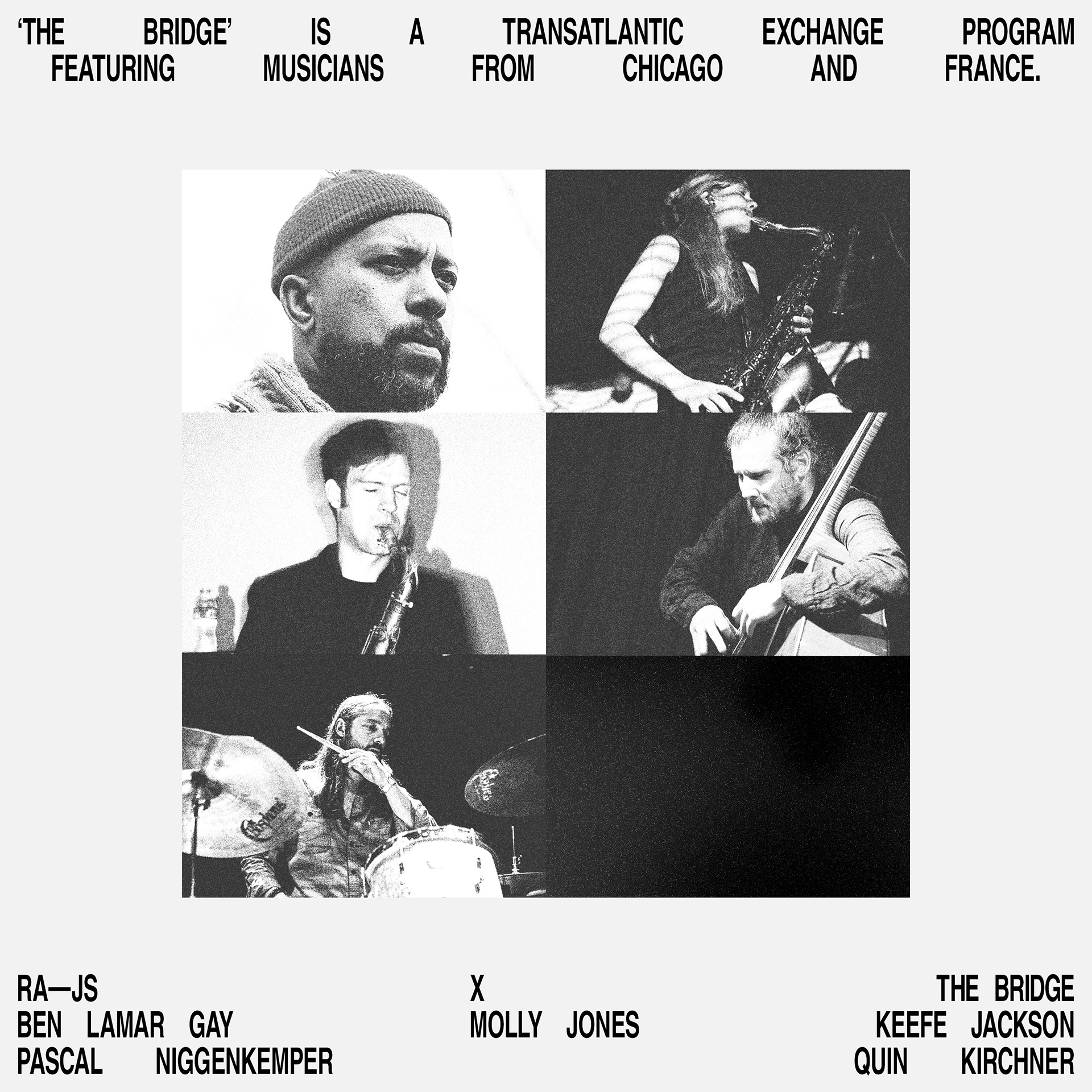
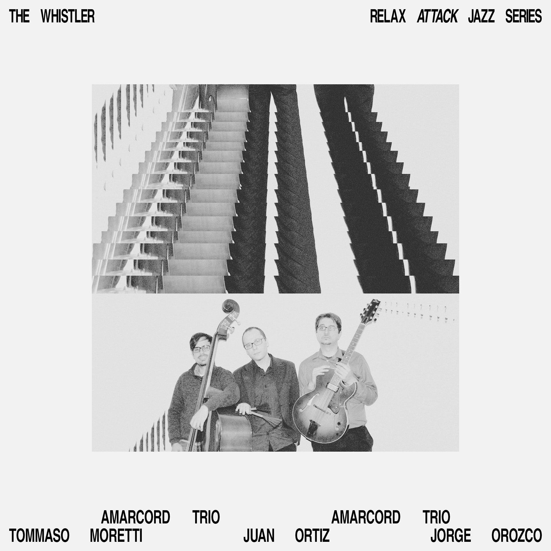
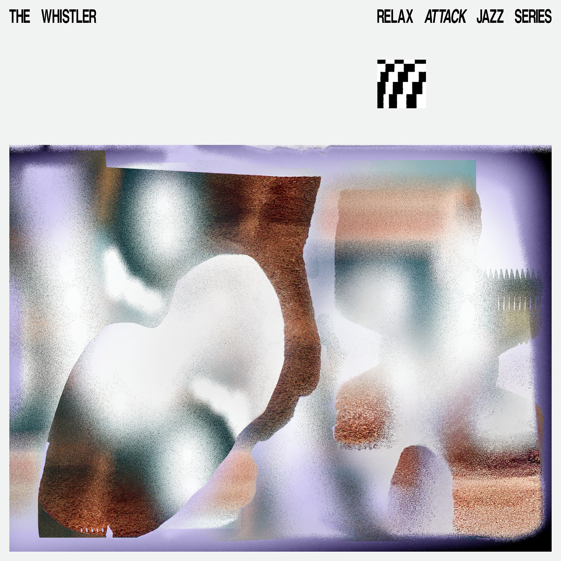
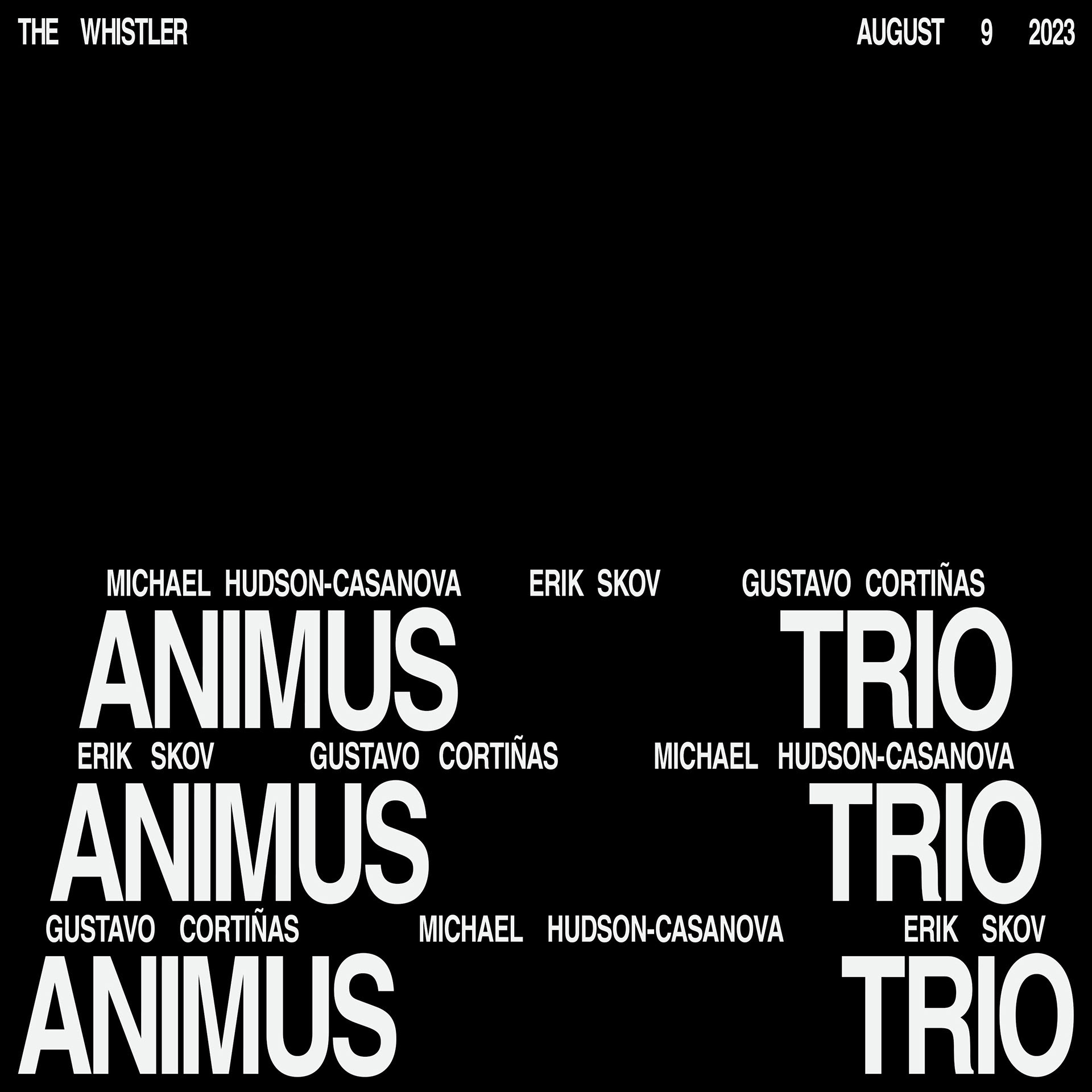
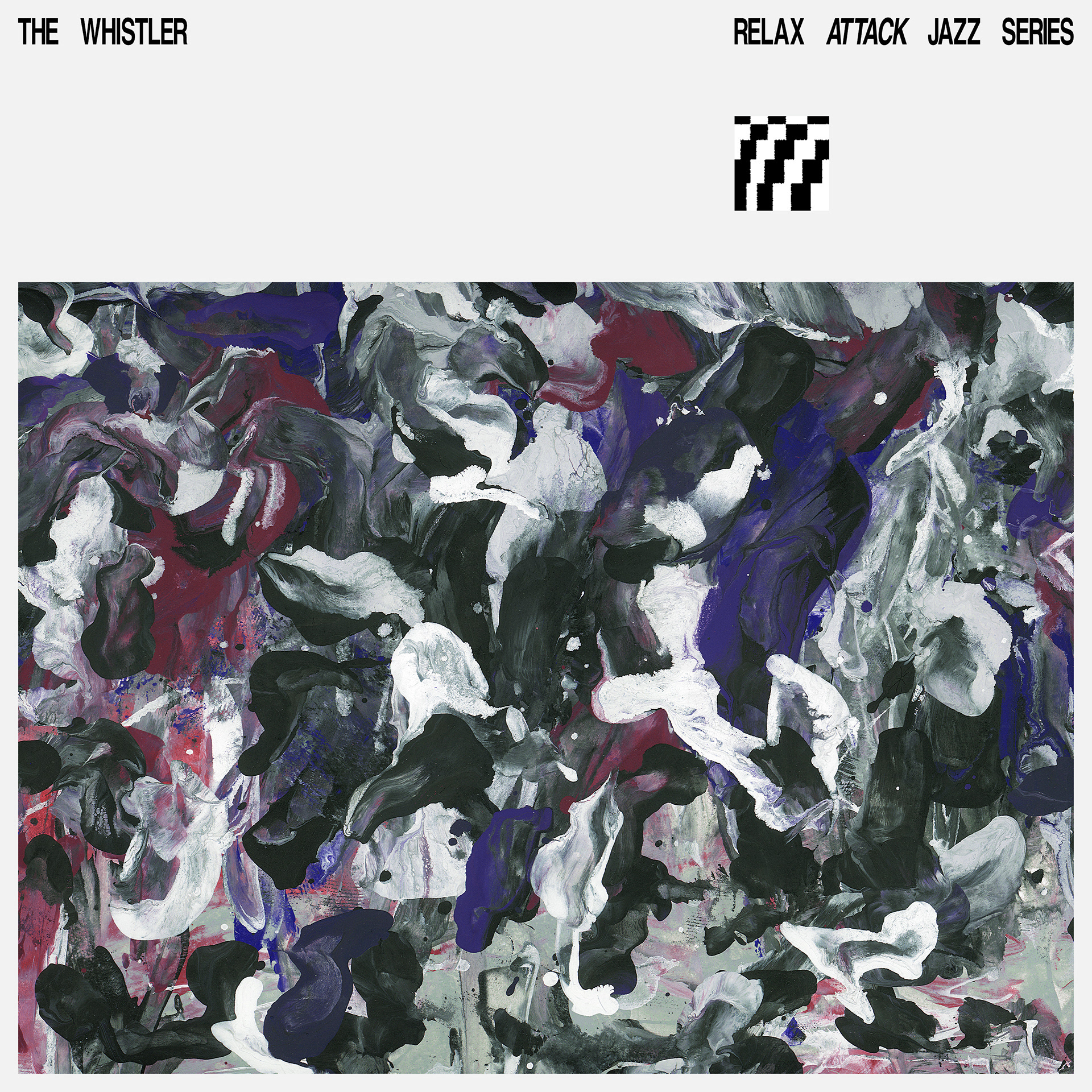
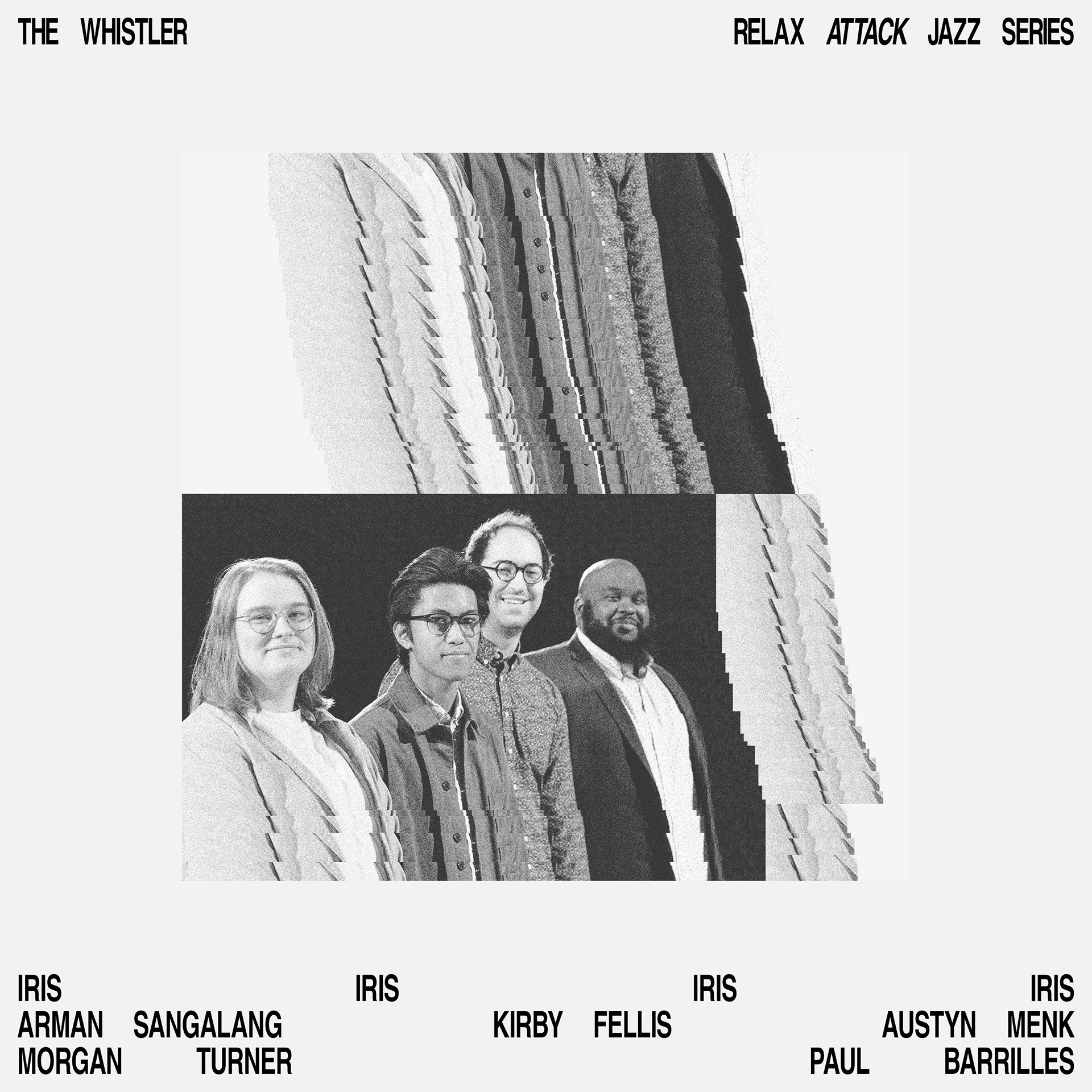
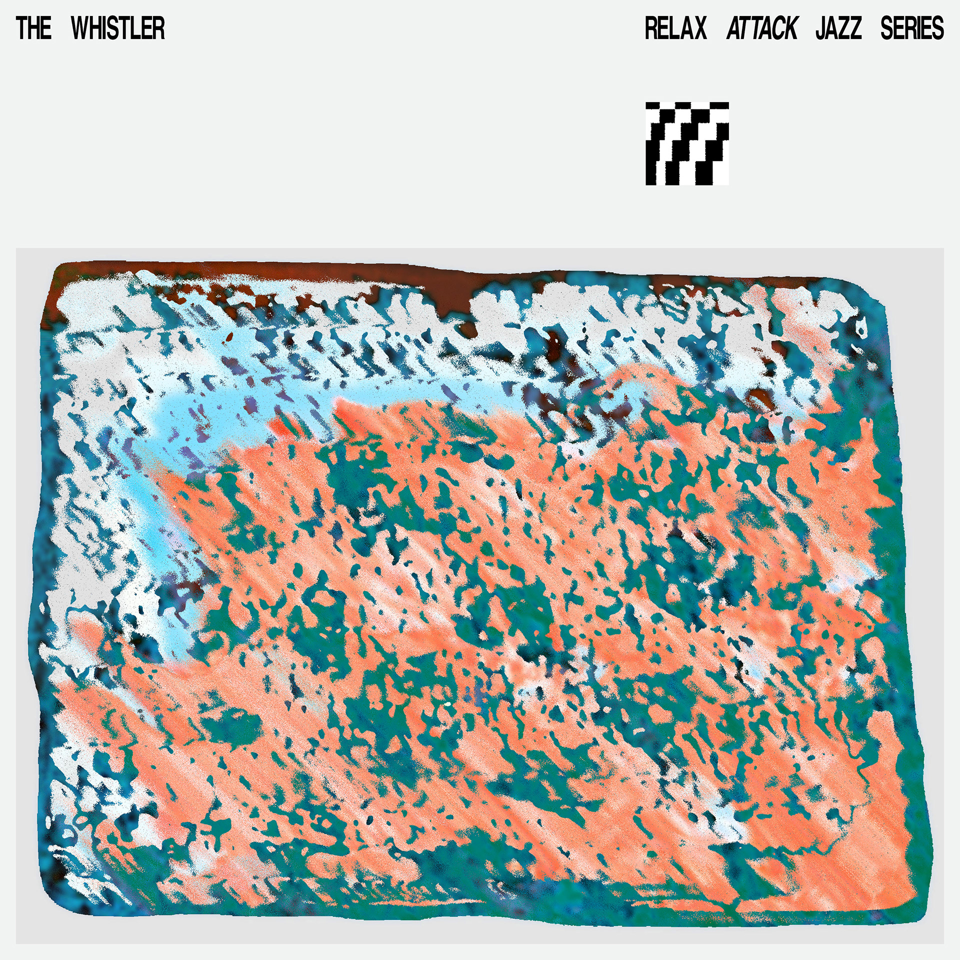
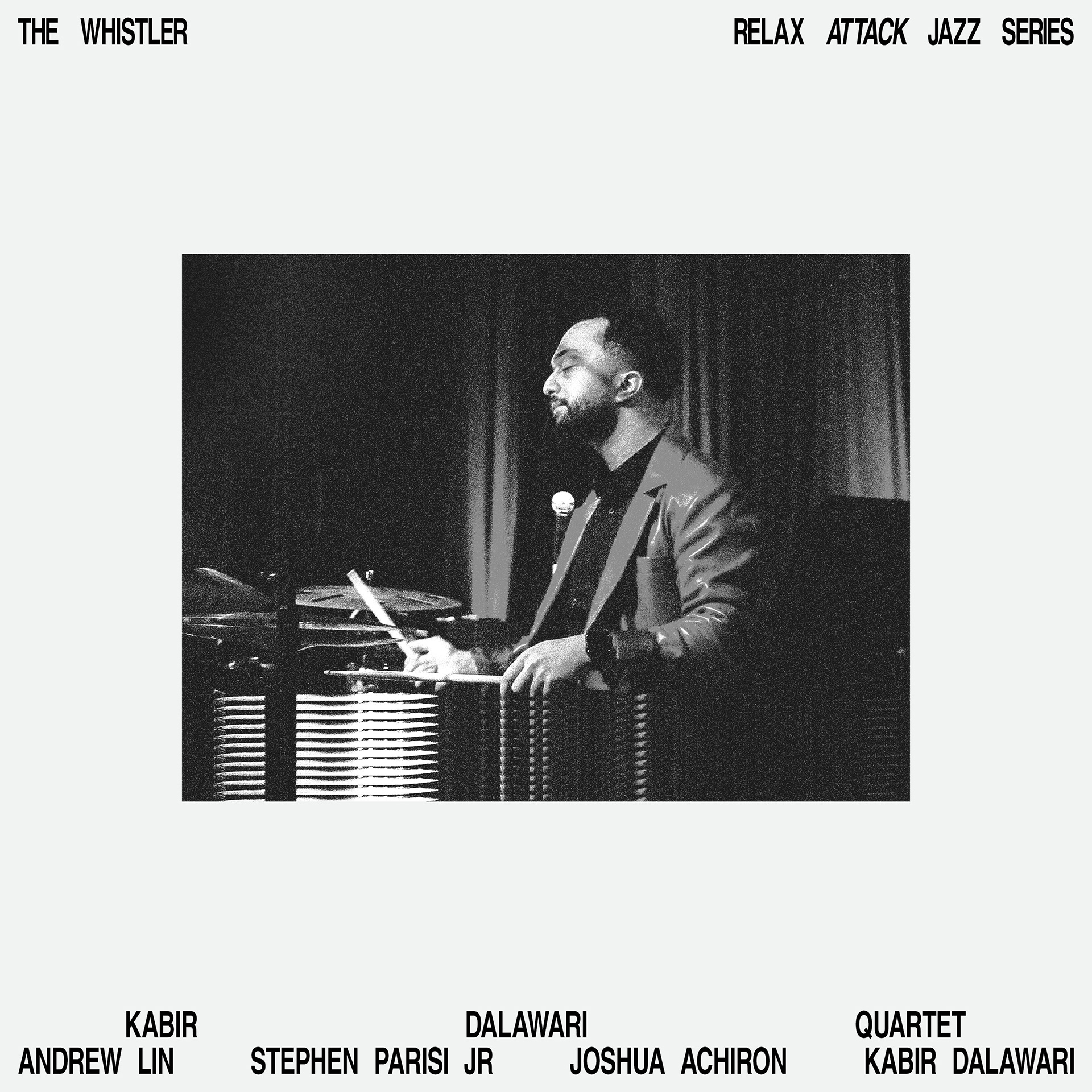
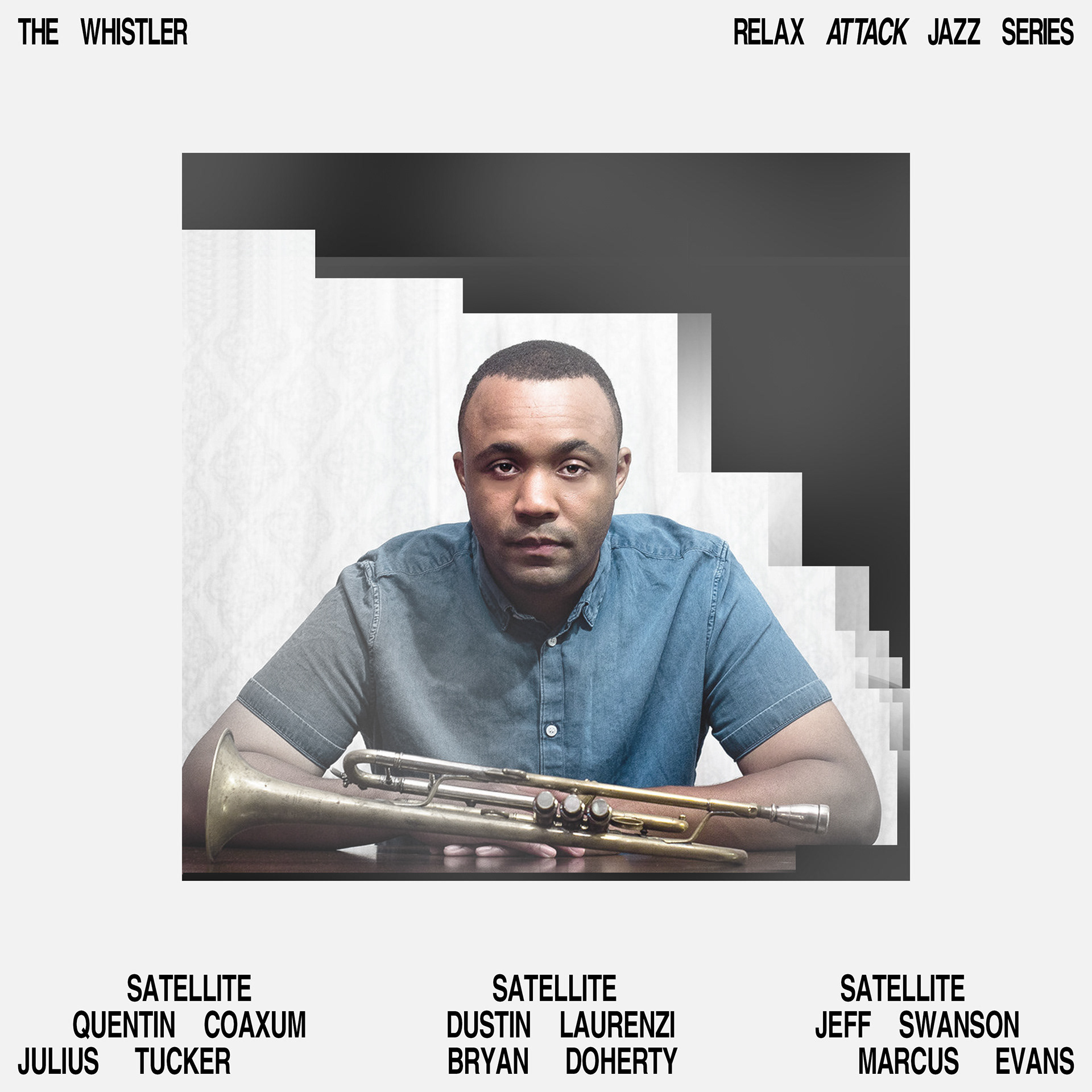
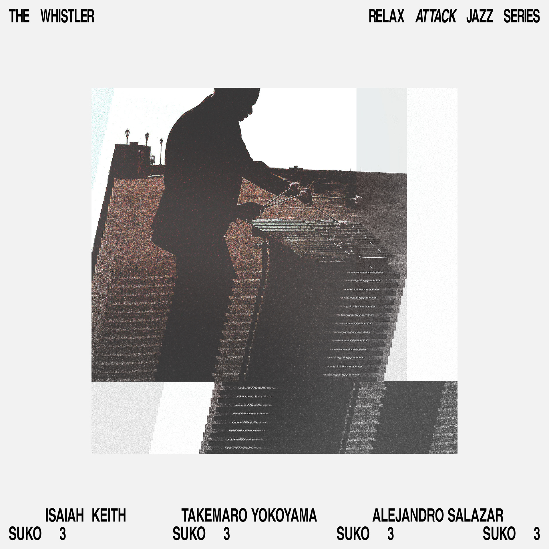
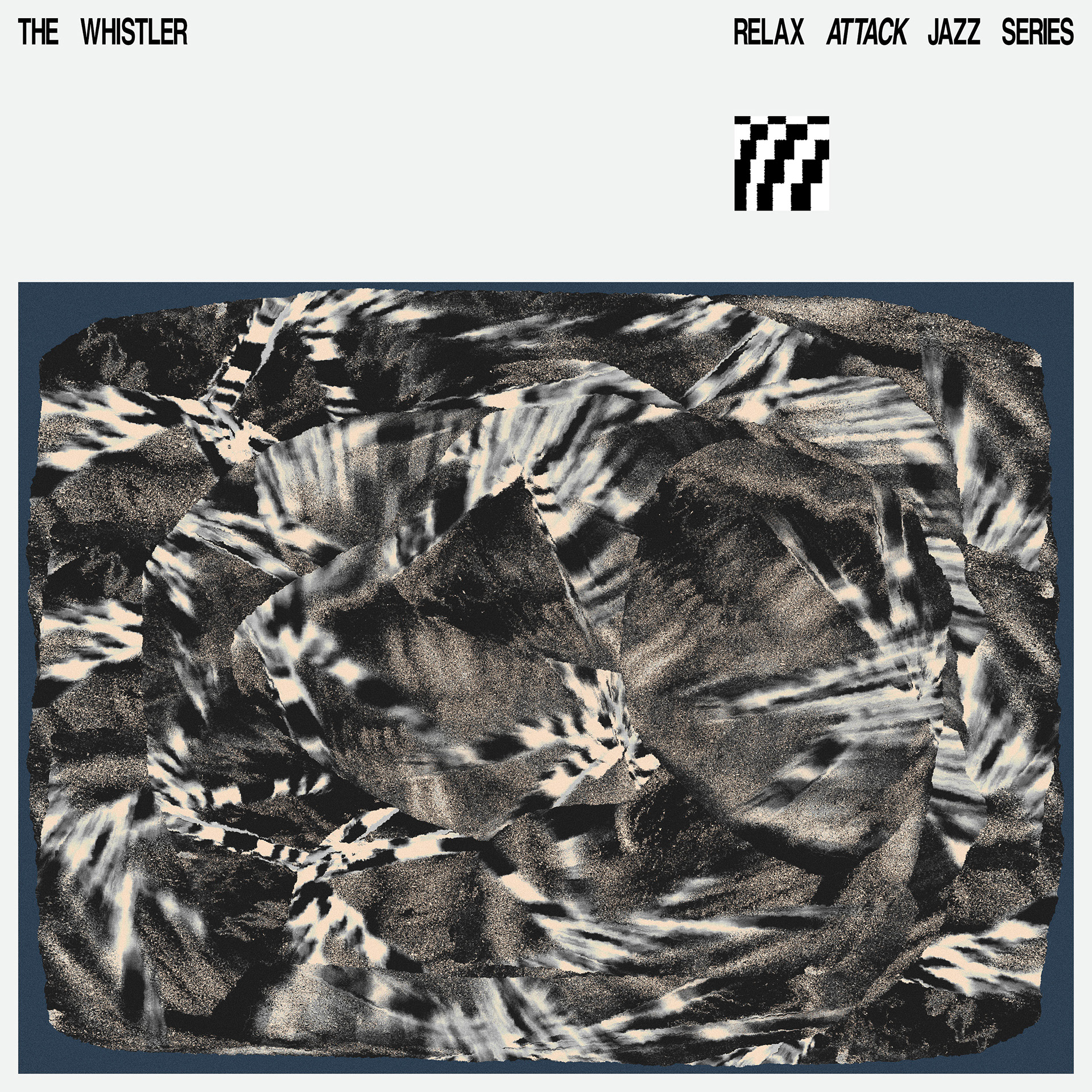
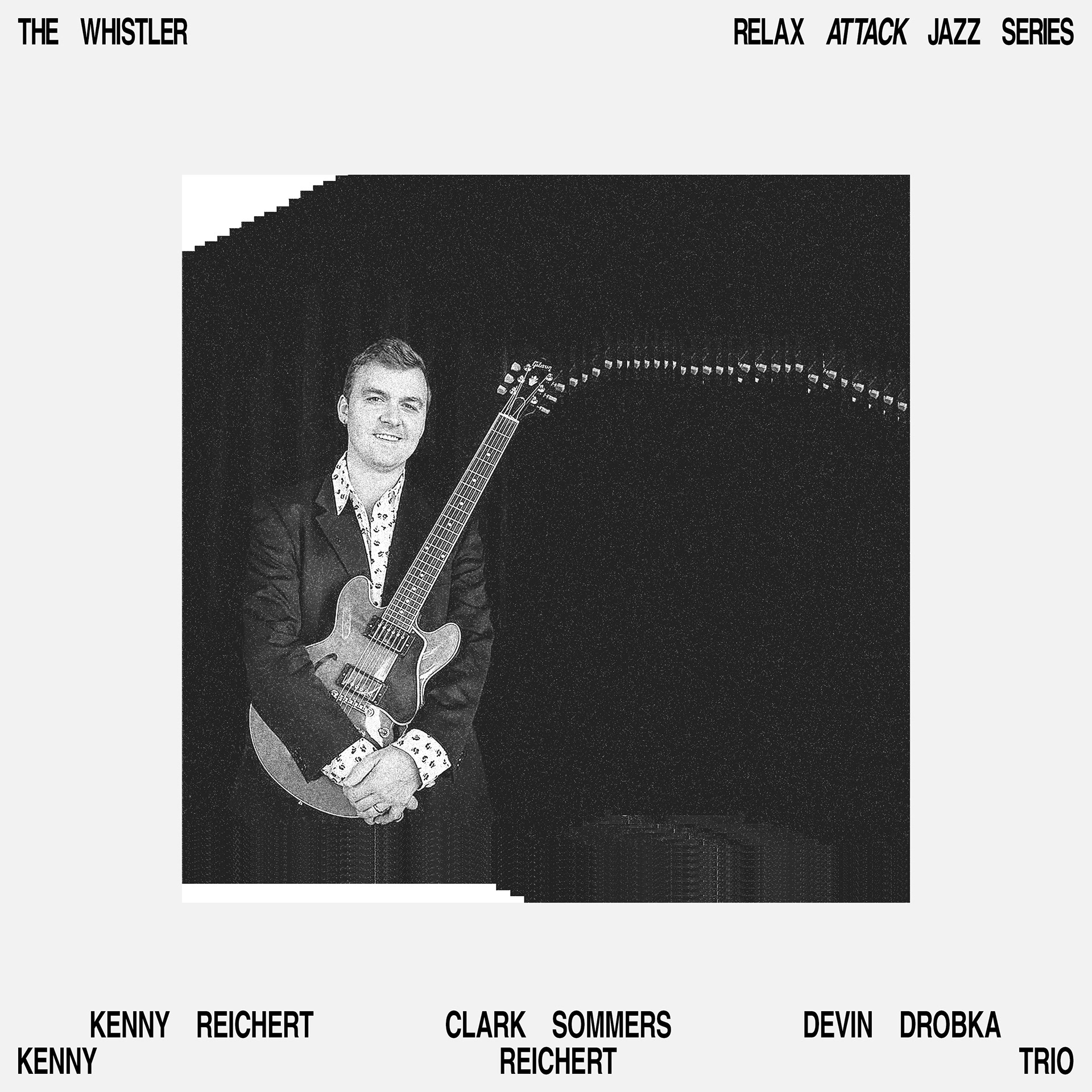
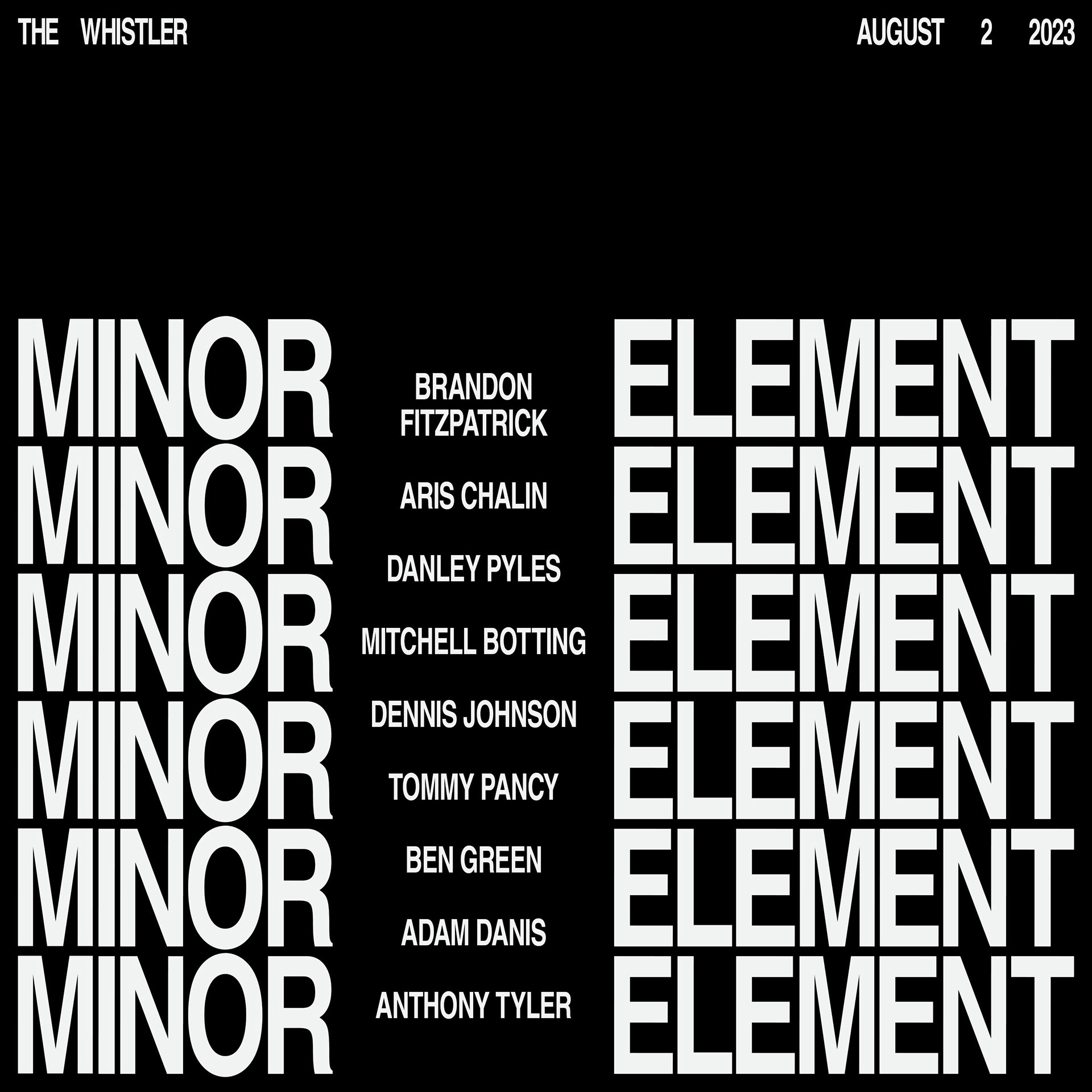
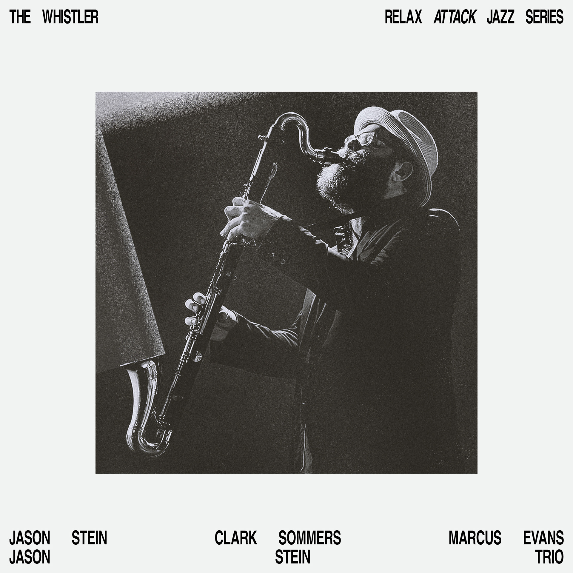
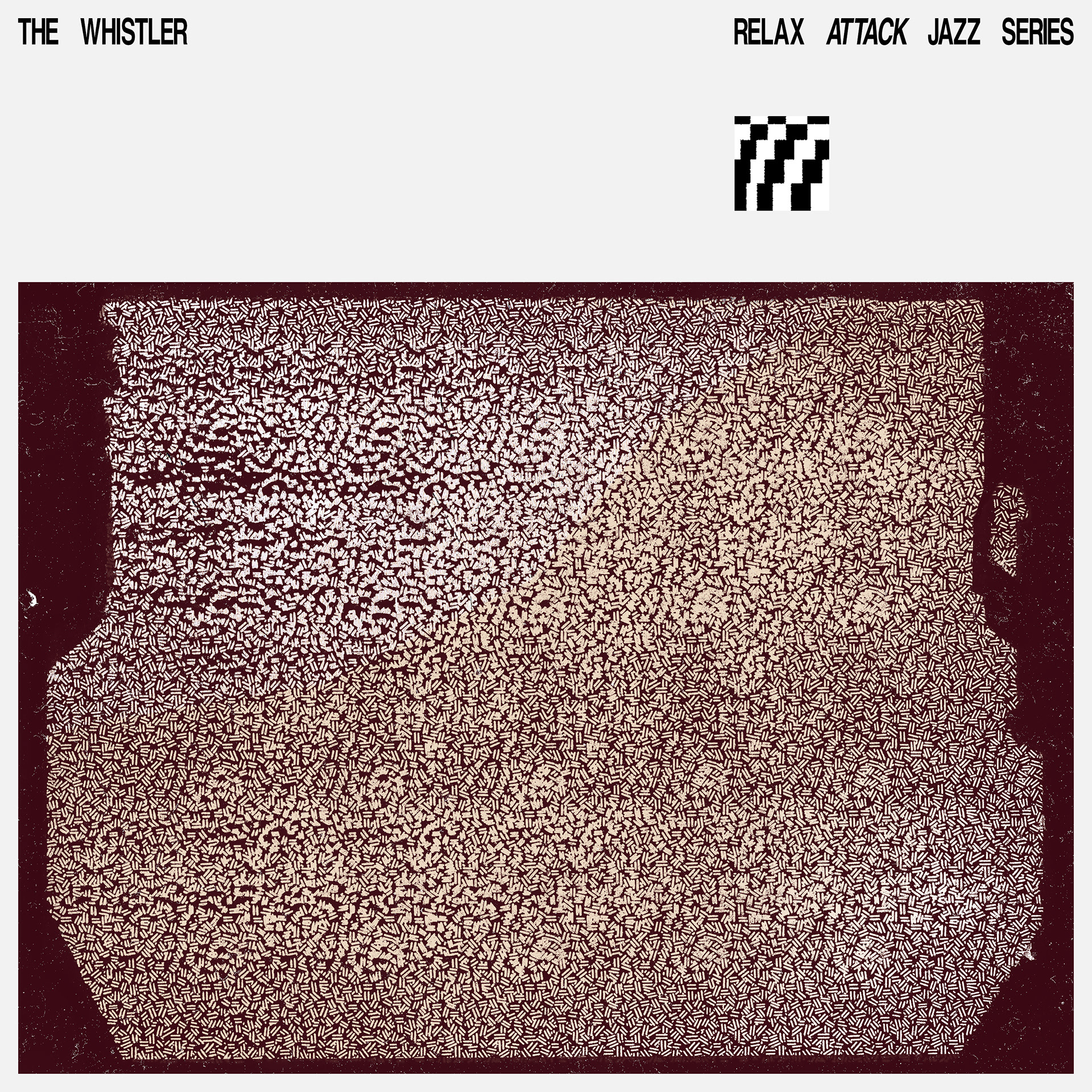
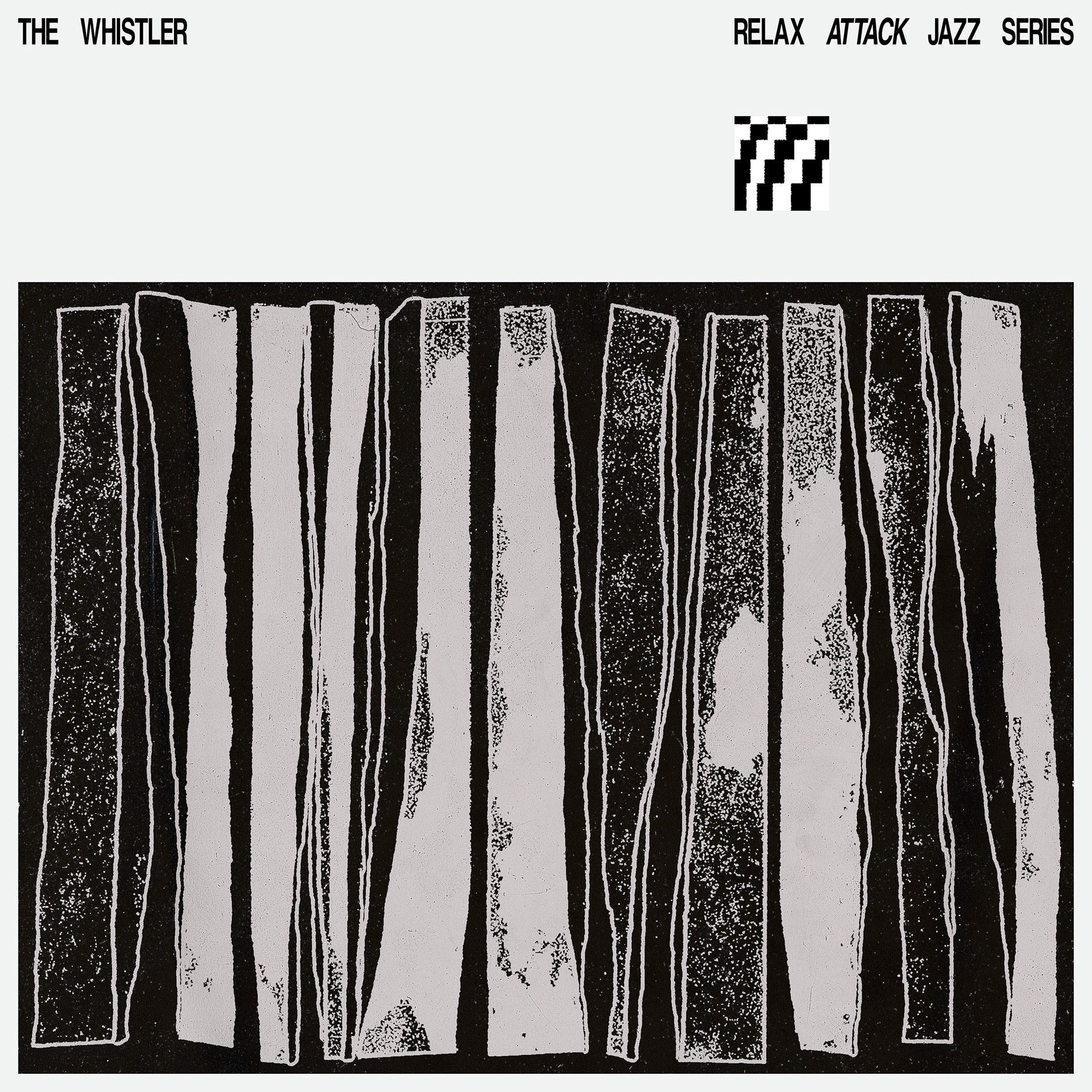
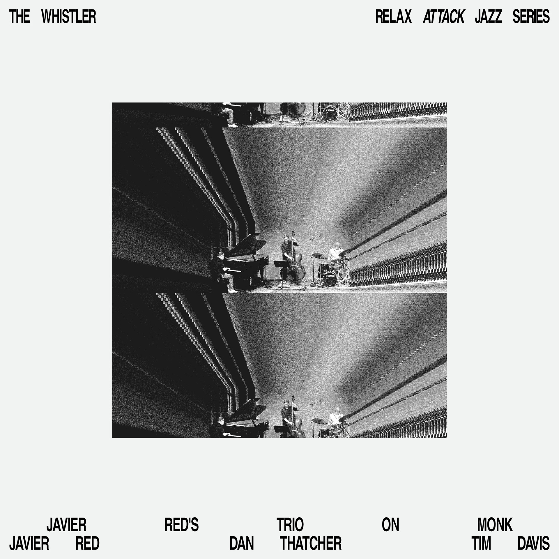
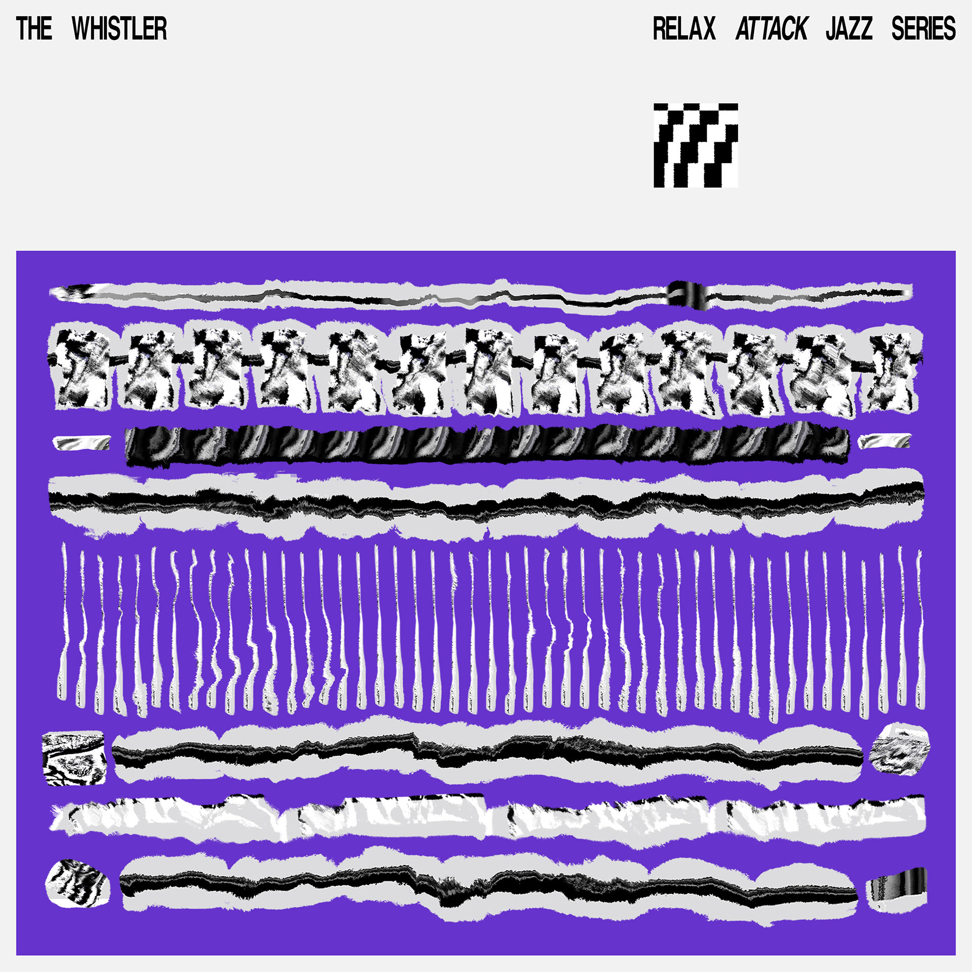
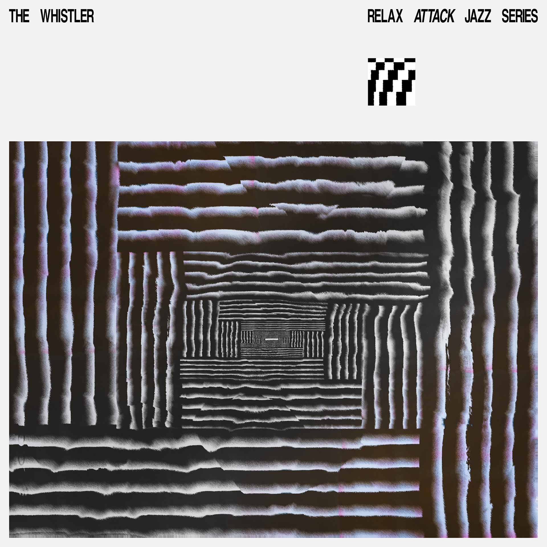
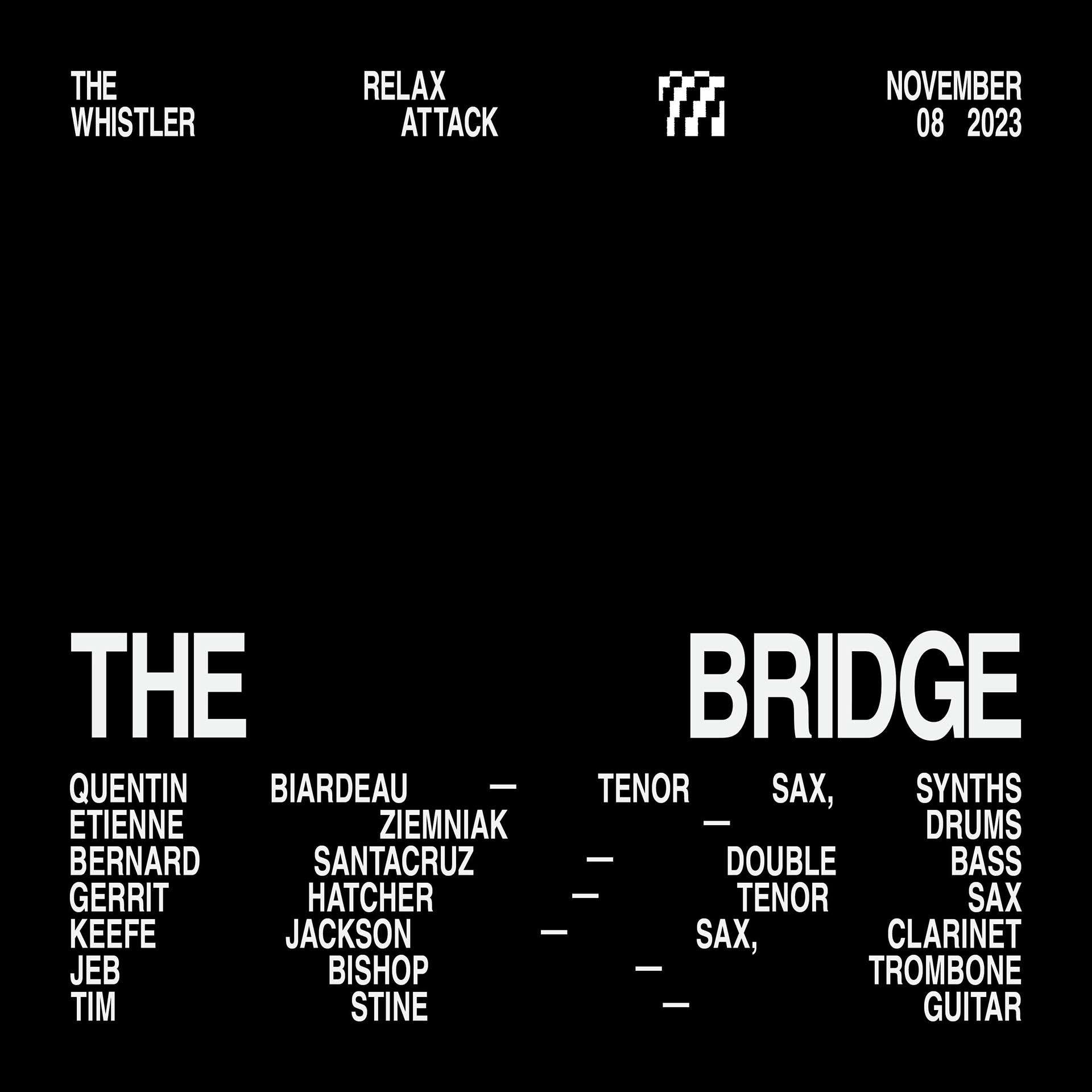
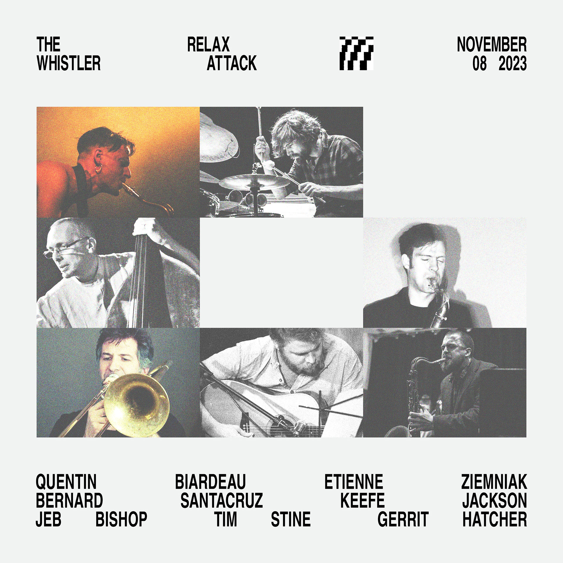
Over the span of about 18 months, I created pieces for RA—JS as well as Whistler Jam, a monthly jam session hosted by two long time RA—JS contributors. As for the art, that spanned the spectrum of borderline figurative to purely textural, with type and imagery treatments ranging from mild to wild in terms of their expression.
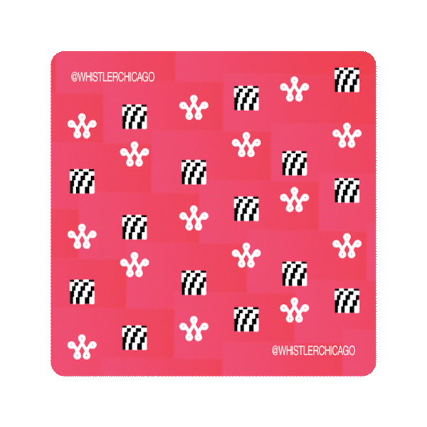

We made coasters using some of the various "boiler plate" IG tiles... it is a cocktail bar after all!
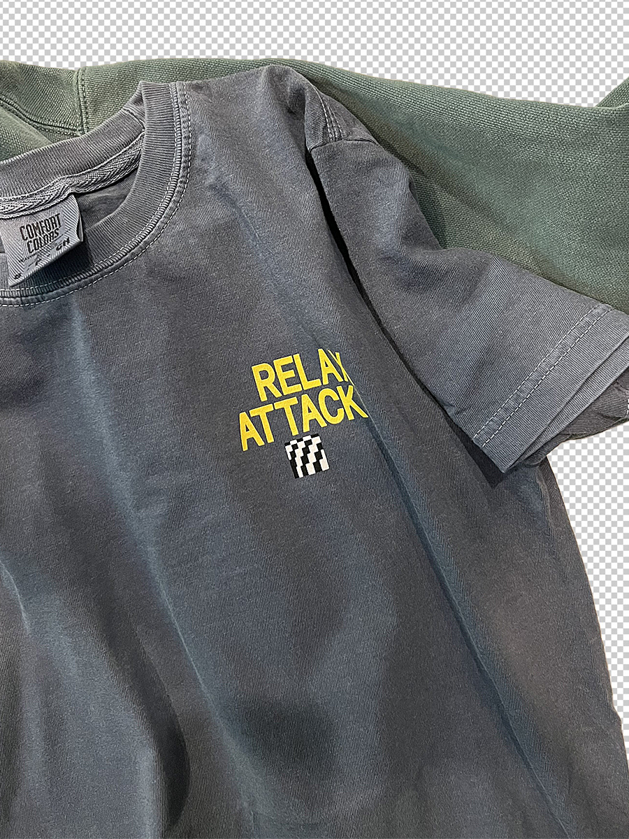
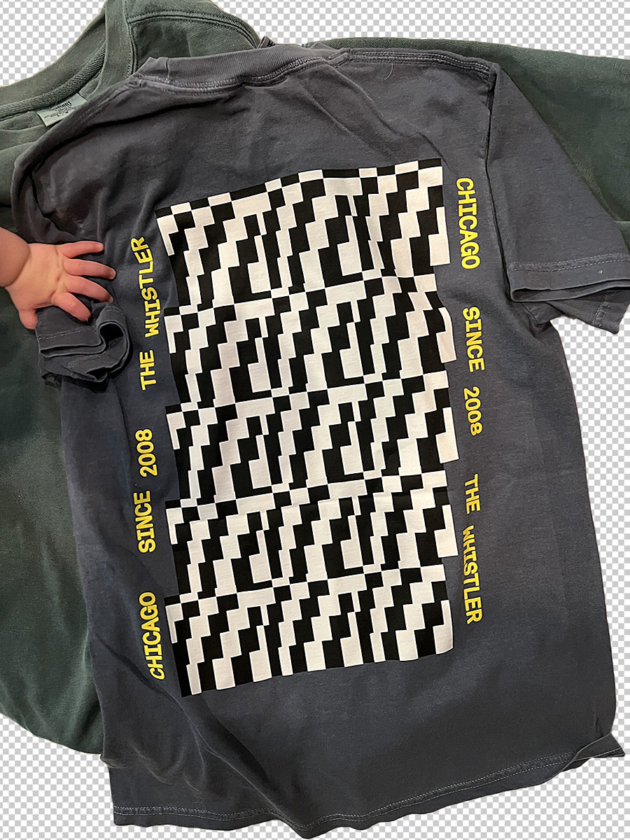
We made some RA—JS shirts as part of the 15 Years of The Whistler (here). Pretty cool.